# SubHeader
A subheader signifies the top of a list or the beginning a subdivision of content and tells the user what the list or subdivision is about.
> **NOTE**
>
> This component is supported since API version 10. Updates will be marked with a superscript to indicate their earliest API version.
## Modules to Import
```ts
import { SubHeader } from '@kit.ArkUI'
```
## Child Components
Not supported
## Attributes
The [universal attributes](ts-universal-attributes-size.md) are supported.
> **NOTE**
>
> The [universal text attributes](ts-universal-attributes-text-style.md) are not supported.
## SubHeader
SubHeader({icon?: ResourceStr, iconSymbolOptions?: SymbolOptions, primaryTitle?: ResourceStr, secondaryTitle?: ResourceStr, select?: SelectOptions, operationType?: OperationType, operationItem?: Array<OperationOption>, operationSymbolOptions?: Array<SymbolOptions>})
**Decorator**: @Component
**System capability**: SystemCapability.ArkUI.ArkUI.Full
**Parameters**
| Name| Type| Mandatory| Decorator| Description|
| -------- | -------- | -------- | -------- | -------- |
| icon | [ResourceStr](ts-types.md#resourcestr) | No| \@Prop | Icon.
**Atomic service API**: This API can be used in atomic services since API version 11.|
| iconSymbolOptions12+ | [SymbolOptions](#symboloptions12) | No| - | Icon symbol options. This parameter is available when **icon** is set to a [symbol glyph](ts-basic-components-symbolGlyph.md).
**Atomic service API**: This API can be used in atomic services since API version 12.|
| primaryTitle | [ResourceStr](ts-types.md#resourcestr) | No| \@Prop | Primary title.
**Atomic service API**: This API can be used in atomic services since API version 11.|
| secondaryTitle | [ResourceStr](ts-types.md#resourcestr) | No| \@Prop | Secondary title.
**Atomic service API**: This API can be used in atomic services since API version 11.|
| select | [SelectOptions](#selectoptions) | No| - | Content and events for selection.
**Atomic service API**: This API can be used in atomic services since API version 11.|
| operationType | [OperationType](#operationtype) | No| \@Prop | Type of operation in the operation area (right).
Default value: **OperationType.BUTTON**
**Atomic service API**: This API can be used in atomic services since API version 11.|
| operationItem | Array<[OperationOption](#operationoption)> | No| - | Items in the operation area (right).
**Atomic service API**: This API can be used in atomic services since API version 11.|
| operationSymbolOptions12+ | Array<[SymbolOptions](#symboloptions12)> | No| - | Icon symbol options.
This parameter is available when **operationType** is set to **OperationType.ICON_GROUP** and **operationItem** is set to an array of items.
**Atomic service API**: This API can be used in atomic services since API version 12.|
| primaryTitleModifier12+ | [TextModifier](ts-universal-attributes-attribute-modifier.md) | No| - | Text attributes of the primary title, such as the font color, font size, and font weight.
**Atomic service API**: This API can be used in atomic services since API version 12.|
| secondaryTitleModifier12+ | [TextModifier](ts-universal-attributes-attribute-modifier.md) | No| - | Text attributes of the secondary title, such as the font color, font size, and font weight.
**Atomic service API**: This API can be used in atomic services since API version 12.|
| titleBuilder12+ | () => void | No| @BuildParam | Content of the custom title area.
**Atomic service API**: This API can be used in atomic services since API version 12.|
| contentMargin12+ | [LocalizedMargin](ts-types.md#localizedmargin12) | No| @Prop | Margin of the content. Negative numbers are not supported.
Default value:
`{start: LengthMetrics.resource(`
`$r('sys.float.margin_left'))`,
`end: LengthMetrics.resource(`
`$r('sys.float.margin_right'))}`
**Atomic service API**: This API can be used in atomic services since API version 12.|
| contentPadding12+ | [LocalizedPadding](ts-types.md#localizedpadding12) | No| @Prop | Padding of the content.
Default value:
If a secondary title, with or without an icon, is displayed on the left:
{start: LengthMetircs.vp(12), end: LengthMetrics.vp(12)}
**Atomic service API**: This API can be used in atomic services since API version 12.|
## OperationType
**Atomic service API**: This API can be used in atomic services since API version 11.
| Name| Value| Description|
| -------- | -------- | -------- |
| TEXT_ARROW | 0 | Text button with a right arrow.|
| BUTTON | 1 | Text button without a right arrow.|
| ICON_GROUP | 2 | Icon-attached button (A maximum of three icons can be configured.)|
| LOADING | 3 | Loading animation.|
## SelectOptions
**Atomic service API**: This API can be used in atomic services since API version 11.
| Name| Type| Mandatory| Description|
| -------- | -------- | -------- | -------- |
| options | Array<[SelectOption](ts-basic-components-select.md#selectoption)> | Yes| Value of an option in the drop-down list box.|
| selected | number | No| Index of the initial selected option in the drop-down list.
The index of the first option is 0.
If this attribute is not set,
the default value **-1** is used, indicating that the option is not selected.|
| value | string | No| Text content of the drop-down list button itself.|
| onSelect | (index: number, value?: string) => void | No| Invoked when an option in the drop-down list box is selected.
- **index**: index of the selected option.
- **value**: value of the selected option.|
## OperationOption
**Atomic service API**: This API can be used in atomic services since API version 11.
| Name| Type| Mandatory| Description|
| -------- | -------- | -------- | -------- |
| value | [ResourceStr](ts-types.md#resourcestr) | Yes| Text content.|
| action | ()=>void | No| Event.|
## SymbolOptions12+
**Atomic service API**: This API can be used in atomic services since API version 12.
| Name| Type| Mandatory| Description|
| -------- | -------- | -------- | -------- |
| fontColor | [ResourceStr](ts-types.md#resourcestr) | No| Color of the [symbol glyph](ts-basic-components-symbolGlyph.md).
Default value: depending on the rendering strategy|
| fontSize | number \|string \|[Resource](ts-types.md#Resource) | No| Size of the [symbol glyph](ts-basic-components-symbolGlyph.md).
Default value: system default value|
| fontWeight | [FontWeight](ts-appendix-enums.md#fontweight)\|number \|string | No| Font weight of the [symbol glyph](ts-basic-components-symbolGlyph.md).
For the number type, the value ranges from 100 to 900, at an interval of 100. A larger value indicates a heavier font weight. The default value is **400**.
For the string type, only strings of the number type are supported, for example, **"400"**, **"bold"**, **"bolder"**, **"lighter"**, **"regular"**, and **"medium"**, which correspond to the enumerated values in **FontWeight**.
Default value: **FontWeight.Normal**|
| renderingStrategy | [SymbolRenderingStrategy](ts-basic-components-symbolGlyph.md#symbolrenderingstrategy11) | No| Rendering strategy of the [symbol glyph](ts-basic-components-symbolGlyph.md).
Default value: **SymbolRenderingStrategy.SINGLE**
**NOTE**
For the resources referenced in **$r('sys.symbol.ohos_*')**, only **ohos_trash_circle**, **ohos_folder_badge_plus**, and **ohos_lungs** support the **MULTIPLE_COLOR** modes.|
| effectStrategy | [SymbolEffectStrategy](ts-basic-components-symbolGlyph.md#symboleffectstrategy11) | No| Effect strategy of the [symbol glyph](ts-basic-components-symbolGlyph.md).
Default value: **SymbolEffectStrategy.NONE**
**NOTE**
For the resources referenced in **$r('sys.symbol.ohos_*')**, only **ohos_wifi** supports the hierarchical effect.|
## Events
The [universal events](ts-universal-events-click.md) are supported.
## Example
### Example 1
```ts
import { promptAction, OperationType, SubHeader } from '@kit.ArkUI'
@Entry
@Component
struct SubHeaderExample {
build() {
Column() {
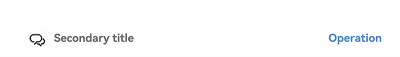
SubHeader({
icon: $r('app.media.ic_public_community_messages'),
secondaryTitle: 'Secondary title',
operationType: OperationType.BUTTON,
operationItem: [{ value: 'Operation',
action: () => {
promptAction.showToast({ message: 'demo' })
}
}]
})
}
}
}
```
### Example 2
```ts
import { promptAction, OperationType, SubHeader } from '@kit.ArkUI'
@Entry
@Component
struct SubHeaderExample {
build() {
Column() {
SubHeader({
primaryTitle: 'Primary title',
secondaryTitle: 'Secondary title',
operationType: OperationType.TEXT_ARROW,
operationItem: [{value:'More',
action: () => {
promptAction.showToast({ message: 'demo' })
}
}]
})
}
}
}
```

### Example 3
```ts
import { promptAction, OperationType, SubHeader } from '@kit.ArkUI'
@Entry
@Component
struct SubHeaderExample {
build() {
Column() {
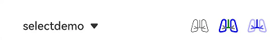
SubHeader({
select: {
options: [{ value: 'aaa' }, { value: 'bbb' }, { value: 'ccc' }],
value: 'selectdemo',
selected: 2,
onSelect: (index: number, value?: string) => {
promptAction.showToast({ message: 'demo' })
}
},
operationType: OperationType.ICON_GROUP,
operationItem: [{
value: $r('app.media.ic_public_community_messages'),
action: () => {
promptAction.showToast({ message: 'demo' })
}
}, {
value: $r('app.media.ic_public_community_messages'),
action: () => {
promptAction.showToast({ message: 'demo' })
}
}, {
value: $r('app.media.ic_public_community_messages'),
action: () => {
promptAction.showToast({ message: 'demo' })
}
}]
})
}
}
}
```

### Example 4
```ts
import { promptAction, OperationType, SubHeader } from '@kit.ArkUI'
@Entry
@Component
struct SubHeaderExample {
build() {
Column() {
SubHeader({
icon: $r('sys.symbol.ohos_wifi'),
iconSymbolOptions: {
effectStrategy: SymbolEffectStrategy.HIERARCHICAL,
},
secondaryTitle: 'Title',
operationType: OperationType.BUTTON,
operationItem: [{ value: 'Operation',
action: () => {
promptAction.showToast({ message: 'demo' })
}
}]
})
}
}
}
```

### Example 5
```ts
import { promptAction, OperationType, SubHeader } from '@kit.ArkUI'
@Entry
@Component
struct SubHeaderExample {
build() {
Column() {
SubHeader({
select: {
options: [{ value: 'aaa' }, { value: 'bbb' }, { value: 'ccc' }],
value: 'selectdemo',
selected: 2,
onSelect: (index: number, value?: string) => {
promptAction.showToast({ message: 'demo' })
}
},
operationType: OperationType.ICON_GROUP,
operationItem: [{
value: $r('sys.symbol.ohos_lungs'),
action: () => {
promptAction.showToast({ message: 'icon1' })
}
}, {
value: $r('sys.symbol.ohos_lungs'),
action: () => {
promptAction.showToast({ message: 'icon2' })
}
}, {
value: $r('sys.symbol.ohos_lungs'),
action: () => {
promptAction.showToast({ message: 'icon3' })
}
}],
operationSymbolOptions: [{
fontWeight: FontWeight.Lighter,
}, {
renderingStrategy: SymbolRenderingStrategy.MULTIPLE_COLOR,
fontColor: [Color.Blue, Color.Grey, Color.Green],
}, {
renderingStrategy: SymbolRenderingStrategy.MULTIPLE_OPACITY,
fontColor: [Color.Blue, Color.Grey, Color.Green],
}]
})
}
}
}
```
### Example 6
```ts
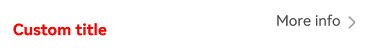
// This example customizes the title content with a titleBuilder object in the SubHeader component.
import { promptAction, OperationType, SubHeader } from '@kit.ArkUI';
@Entry
@Component
struct SubHeaderExample {
@Builder
TitleBuilder(): void {
Text('Custom title')
.fontSize(24)
.fontColor(Color.Red)
.fontWeight(FontWeight.Bold)
}
build() {
Column() {
SubHeader({
titleBuilder: () => {
this.TitleBuilder();
},
primaryTitle: 'Primary title',
secondaryTitle: 'Secondary title',
icon: $r('sys.symbol.ohos_star'),
operationType: OperationType.TEXT_ARROW,
operationItem: [{
value: 'More info',
action: () => {
promptAction.showToast({ message: 'demo'})
}
}]
})
}
}
}
```
### Example 7
```ts
// This example demonstrates how to set the font style, margin, and padding for the primary and secondary titles in the SubHeader component.
import { promptAction, OperationType, SubHeader, LengthMetrics, TextModifier } from '@kit.ArkUI';
@Entry
@Component
struct SubHeaderExample {
@State primaryModifier: TextModifier = new TextModifier().fontColor(Color.Red);
@State secondaryModifier: TextModifier = new TextModifier().fontColor(Color.Red);
build() {
Column() {
SubHeader({
primaryTitle: 'primaryTitle',
secondaryTitle: 'secondaryTitle',
primaryTitleModifier: this.primaryModifier,
secondaryTitleModifier: this.secondaryModifier,
operationType: OperationType.TEXT_ARROW,
operationItem: [{
value: 'More info',
action: () => {
promptAction.showToast({ message: 'demo'})
}
}],
contentMargin: { start: LengthMetrics.vp(20), end: LengthMetrics.vp(20) },
contentPadding: { start: LengthMetrics.vp(20), end: LengthMetrics.vp(20) }
})
}
}
}
```