# ImageSpan
As a child of the [Text](ts-basic-components-text.md) and [ContainerSpan](ts-basic-components-containerspan.md) components, the **ImageSpan** component is used to display inline images.
> **NOTE**
>
> This component is supported since API version 10. Updates will be marked with a superscript to indicate their earliest API version.
## Child Components
Not supported
## APIs
ImageSpan(value: ResourceStr | PixelMap)
**Atomic service API**: This API can be used in atomic services since API version 11.
**System capability**: SystemCapability.ArkUI.ArkUI.Full
**Parameters**
| Name| Type| Mandatory| Description|
| -------- | -------- | -------- | -------- |
| value | [ResourceStr](ts-types.md#resourcestr) \| [PixelMap](../../apis-image-kit/js-apis-image.md#pixelmap7) | Yes| Image source. Both local and online images are supported.
When using an image referenced using a relative path, for example, **ImageSpan("common/test.jpg")**, the **ImageSpan** component cannot be called across bundles or modules. Therefore, you are advised to use **\$r** to reference image resources that need to be used globally.
\- The supported formats include PNG, JPG, BMP, SVG, GIF, and HEIF.
\- Base64 strings are supported. The value format is data:image/[png\|jpeg\|bmp\|webp\|heif];base64,[base64 data], where *[base64 data]* is a Base64 string.
\- Strings with the **file:///data/storage** prefix are supported, which are used to read image resources in the **files** folder in the installation directory of the application. Ensure that the application has the read permission to the files in the specified path.|
## Attributes
The attributes inherit from [BaseSpan](ts-basic-components-span.md#basespan). Among the universal attributes, [size](ts-universal-attributes-size.md#size), [background](ts-universal-attributes-background.md#background), and [border](ts-universal-attributes-border.md#border) are supported.
### alt12+
alt(value: PixelMap)
Sets the placeholder image displayed during loading.
**Atomic service API**: This API can be used in atomic services since API version 12.
**System capability**: SystemCapability.ArkUI.ArkUI.Full
**Parameters**
| Name| Type | Mandatory| Description |
| ------ | -------------------------------------------------------- | ---- | ------------------------------------------------------------ |
| value | [PixelMap](../../apis-image-kit/js-apis-image.md#pixelmap7) | Yes | Placeholder image displayed during loading. The [PixelMap](../../apis-image-kit/js-apis-image.md#pixelmap7) type is supported.
Default value: **null**|
### verticalAlign
verticalAlign(value: ImageSpanAlignment)
Sets the alignment mode of the image relative to the line height.
**Atomic service API**: This API can be used in atomic services since API version 11.
**System capability**: SystemCapability.ArkUI.ArkUI.Full
**Parameters**
| Name| Type | Mandatory| Description |
| ------ | ----------------------------------------- | ---- | ------------------------------------------------------------ |
| value | [ImageSpanAlignment](ts-appendix-enums.md#imagespanalignment10) | Yes | Alignment mode of the image relative to the line height.
Default value: **ImageSpanAlignment.BOTTOM**|
### objectFit
objectFit(value: ImageFit)
Sets the image scale type.
**Atomic service API**: This API can be used in atomic services since API version 11.
**System capability**: SystemCapability.ArkUI.ArkUI.Full
**Parameters**
| Name| Type | Mandatory| Description |
| ------ | ----------------------------------------- | ---- | ------------------------------------------- |
| value | [ImageFit](ts-appendix-enums.md#imagefit) | Yes | Image scale type.
Default value: **ImageFit.Cover**|
### colorFilter14+
colorFilter(value: ColorFilter | DrawingColorFilter)
Sets the color filter for the image.
**Atomic service API**: This API can be used in atomic services since API version 14.
**System capability**: SystemCapability.ArkUI.ArkUI.Full
**Parameters**
| Name| Type | Mandatory| Description |
| ------ | --------------------------------------- | ---- | ------------------------------------------------------------ |
| value | [ColorFilter](ts-types.md#colorfilter9) \| [DrawingColorFilter](../../apis-arkgraphics2d/js-apis-graphics-drawing.md#colorfilter) | Yes | 1. Color filter of the image. The input parameter is a 4 x 5 RGBA transformation matrix.
The first row of the matrix represents a vector value of R (red), the second row represents a vector value of G (green), the third row represents a vector value of B (blue), and the fourth row represents a vector value of A (alpha). The four rows represent different RGBA vector values.
If the matrix contains entries of 1 on the diagonal and entries of 0 in other places, the original color of the image is retained.
**Calculation rule:**
If the input filter matrix is as follows:

Wherein the color is [R, G, B, A].
Then the color after filtering is [R', G', B', A'].

2. The ColorFilter type of **@ohos.graphics.drawing** can be used as the input parameter.
**NOTE**
The DrawingColorfilter type can be used in atomic services. The SVG image to set as the source must have the **stroke** attribute.|
## Events
Among all the universal events, only the [click event](ts-universal-attributes-click.md) is supported. The following events are also supported.
### onComplete12+
onComplete(callback: ImageCompleteCallback)
Triggered when the image is successfully loaded or decoded. The size of the loaded image is returned.
**Atomic service API**: This API can be used in atomic services since API version 12.
**System capability**: SystemCapability.ArkUI.ArkUI.Full
**Parameters**
| Name | Type | Mandatory| Description |
| -------- | ------------------------------------------ | ---- | -------------------------- |
| callback | [ImageCompleteCallback](#imagecompletecallback12) | Yes | Callback triggered when the image is successfully loaded or decoded.|
### onError12+
onError(callback: ImageErrorCallback)
Triggered when an error occurs during image loading.
**Atomic service API**: This API can be used in atomic services since API version 12.
**System capability**: SystemCapability.ArkUI.ArkUI.Full
**Parameters**
| Name | Type | Mandatory| Description |
| -------- | ------------------------------------------ | ---- | -------------------------- |
| callback | [ImageErrorCallback](ts-basic-components-image.md#imageerrorcallback9) | Yes | Callback triggered when an error occurs during image loading.|
## ImageCompleteCallback12+
type ImageCompleteCallback = (result: ImageLoadResult) => void
Triggered when the image is successfully loaded.
**Atomic service API**: This API can be used in atomic services since API version 12.
**System capability**: SystemCapability.ArkUI.ArkUI.Full
| Name| Type | Mandatory| Description |
| ------ | -------------------------- | ---- | ---------------------------------- |
| result | [ImageLoadResult](#imageloadresult12) | Yes | Object returned after the callback is triggered when an image is successfully loaded or decoded.|
## ImageLoadResult12+
Object returned after the callback is triggered when an image is successfully loaded or decoded.
**Atomic service API**: This API can be used in atomic services since API version 12.
**System capability**: SystemCapability.ArkUI.ArkUI.Full
| Name | Type | Mandatory| Description |
| ---------------------------- | ------ | ---- | ------------------------------------------------------------ |
| width | number | Yes | Width of the image.
Unit: pixel |
| height | number | Yes | Height of the image.
Unit: pixel |
| componentWidth | number | Yes | Width of the component.
Unit: pixel |
| componentHeight | number | Yes | Height of the component.
Unit: pixel |
| loadingStatus | number | Yes | Loading status of the image.
**NOTE**
If the return value is **0**, the image is successfully loaded. If the return value is **1**, the image is successfully decoded.|
| contentWidth | number | Yes | Actual rendered width of the image.
Unit: pixel
**NOTE**
This parameter is valid only when the return value of **loadingStatus** is **1**.|
| contentHeight | number | Yes | Actual rendered height of the image.
Unit: pixel
**NOTE**
This parameter is valid only when the return value of **loadingStatus** is **1**.|
| contentOffsetX | number | Yes | Offset of the rendered content relative to the component on the x-axis.
Unit: pixel
**NOTE**
This parameter is valid only when the return value of **loadingStatus** is **1**.|
| contentOffsetY | number | Yes | Offset of the rendered content relative to the component on the y-axis
Unit: pixel
**NOTE**
This parameter is valid only when the return value of **loadingStatus** is **1**.|
## Example
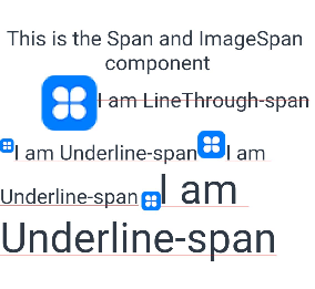
### Example 1: Setting the Alignment Mode
This example demonstrates the alignment and scaling effects of the **ImageSpan** component using the **verticalAlign** and **objectFit** attributes.
```ts
// xxx.ets
@Entry
@Component
struct SpanExample {
build() {
Flex({ direction: FlexDirection.Column, alignItems: ItemAlign.Center, justifyContent: FlexAlign.Center }) {
Text() {
Span('This is the Span and ImageSpan component').fontSize(25).textCase(TextCase.Normal)
.decoration({ type: TextDecorationType.None, color: Color.Pink })
}.width('100%').textAlign(TextAlign.Center)
Text() {
ImageSpan($r('app.media.icon'))
.width('200px')
.height('200px')
.objectFit(ImageFit.Fill)
.verticalAlign(ImageSpanAlignment.CENTER)
Span('I am LineThrough-span')
.decoration({ type: TextDecorationType.LineThrough, color: Color.Red }).fontSize(25)
ImageSpan($r('app.media.icon'))
.width('50px')
.height('50px')
.verticalAlign(ImageSpanAlignment.TOP)
Span('I am Underline-span')
.decoration({ type: TextDecorationType.Underline, color: Color.Red }).fontSize(25)
ImageSpan($r('app.media.icon'))
.size({ width: '100px', height: '100px' })
.verticalAlign(ImageSpanAlignment.BASELINE)
Span('I am Underline-span')
.decoration({ type: TextDecorationType.Underline, color: Color.Red }).fontSize(25)
ImageSpan($r('app.media.icon'))
.width('70px')
.height('70px')
.verticalAlign(ImageSpanAlignment.BOTTOM)
Span('I am Underline-span')
.decoration({ type: TextDecorationType.Underline, color: Color.Red }).fontSize(50)
}
.width('100%')
.textIndent(50)
}.width('100%').height('100%').padding({ left: 0, right: 0, top: 0 })
}
}
```
### Example 2: Setting the Background Style
This example demonstrates the effect of setting a background style for text using the **textBackgroundStyle** attribute.
```ts
// xxx.ets
@Component
@Entry
struct Index {
build() {
Column() {
Text() {
ImageSpan($r('app.media.app_icon'))
.width('60vp')
.height('60vp')
.verticalAlign(ImageSpanAlignment.CENTER)
.textBackgroundStyle({color: Color.Green, radius: "5vp"})
}
}.width('100%').alignItems(HorizontalAlign.Center)
}
}
```

### Example 3: Adding Events to an Image
This example demonstrates how to add load success and load error events to the **ImageSpan** component using **onComplete** and **onError**.
```ts
// xxx.ets
@Entry
@Component
struct Index {
@State src: ResourceStr = $r('app.media.icon');
build(){
Column(){
Text(){
ImageSpan(this.src)
.width(100).height(100)
.onError((err)=>{
console.log("onError:" + err.message)
})
.onComplete((event)=>{
console.log("onComplete: " + event.loadingStatus)
})
}
}.width('100%').height('100%')
}
}
```
### Example 4: Setting the Color Filter
This example demonstrates the effect of setting a color filter for the **ImageSpan** component using the **colorFilter** attribute.
```ts
// xxx.ets
import { drawing, common2D } from '@kit.ArkGraphics2D';
@Entry
@Component
struct SpanExample {
private ColorFilterMatrix: number[] = [0.239, 0, 0, 0, 0, 0, 0.616, 0, 0, 0, 0, 0, 0.706, 0, 0, 0, 0, 0, 1, 0];
@State DrawingColorFilterFirst: ColorFilter | undefined = new ColorFilter(this.ColorFilterMatrix)
build() {
Flex({ direction: FlexDirection.Column, alignItems: ItemAlign.Center, justifyContent: FlexAlign.Center }) {
Text() {
ImageSpan($r('app.media.icon'))
.width('50px')
.height('50px')
.colorFilter(this.DrawingColorFilterFirst)
}
.width('50%')
Flex({ direction: FlexDirection.Column, alignItems: ItemAlign.Center, justifyContent: FlexAlign.Center }) {
Text() {
ImageSpan($r('app.media.icon'))
.width('50px')
.height('50px')
.colorFilter(drawing.ColorFilter.createBlendModeColorFilter({ alpha: 255, red: 112, green: 112, blue: 112 }, drawing.BlendMode.SRC))
}
.width('50%')
}.width('100%').height('10%')
}.width('200%').height('100%')
}
}
```

### Example 5: Setting a Placeholder Image
This example shows how a placeholder image is used in the **ImageSpan** component during the process of loading an image from the Internet.
```ts
// xxx.ets
import { http } from '@kit.NetworkKit'
import { image } from '@kit.ImageKit'
import { BusinessError } from '@kit.BasicServicesKit'
@Entry
@Component
struct SpanExample {
@State imageAlt: PixelMap | undefined = undefined
httpRequest() {
// Enter an image URL.
http.createHttp().request("https://www.example.com/xxx.png", (error: BusinessError, data: http.HttpResponse) => {
if (error) {
console.error(`http request failed with. Code: ${error.code}, message: ${error.message}`)
} else {
console.log(`http request success.`)
let imageData: ArrayBuffer = data.result as ArrayBuffer
let imageSource: image.ImageSource = image.createImageSource(imageData)
class tmp {
height: number = 100
width: number = 100
}
let option: Record = {
'alphaType': 0, // Alpha type.
'editable': false, // Whether the image is editable.
'pixelFormat': 3, // Pixel format.
'scaleMode': 1, // Scale mode.
'size': { height: 100, width: 100 }
}
// Image size.
imageSource.createPixelMap(option).then((pixelMap: PixelMap) => {
this.imageAlt = pixelMap
})
}
})
}
build() {
Column() {
Button("Get Online Image")
.onClick(() => {
this.httpRequest()
})
Text() {
// Enter an image URL.
ImageSpan('https://www.example.com/xxx.png')
.alt(this.imageAlt)
.width(300)
.height(300)
}
}.width('100%').height(250).padding({ left: 35, right: 35, top: 35 })
}
}
```