# LoadingProgress
The **LoadingProgress** component is used to create a loading animation.
The loading animation stops when the component is invisible. The component's visibility is determined by the value of **ratios** in the [onVisibleAreaChange](./ts-universal-component-visible-area-change-event.md#onvisibleareachange) event callback: If the value is greater than 0, the component is visible.
> **NOTE**
>
> This component is supported since API version 8. Updates will be marked with a superscript to indicate their earliest API version.
## Child Components
Not supported
## APIs
LoadingProgress()
Creates a **LoadingProgress** component.
**Widget capability**: This API can be used in ArkTS widgets since API version 9.
**Atomic service API**: This API can be used in atomic services since API version 11.
**System capability**: SystemCapability.ArkUI.ArkUI.Full
## Attributes
In addition to the [universal attributes](ts-universal-attributes-size.md), the following attributes are supported.
### color
color(value: ResourceColor)
Sets the foreground color for the **LoadingProgress** component.
**Widget capability**: This API can be used in ArkTS widgets since API version 9.
**Atomic service API**: This API can be used in atomic services since API version 11.
**System capability**: SystemCapability.ArkUI.ArkUI.Full
**Parameters**
| Name| Type | Mandatory| Description |
| ------ | ------------------------------------------ | ---- | ------------------------------------------------------------ |
| value | [ResourceColor](ts-types.md#resourcecolor) | Yes | Foreground color of the **LoadingProgress** component.
Default value:
API version 10 or earlier: **'#99666666'**
API version 11 or later: **'#ff666666'**|
### enableLoading10+
enableLoading(value: boolean)
Sets whether to show the loading animation. The component still takes up space in the layout when the loading animation is not shown. The universal attribute [Visibility.Hidden](ts-universal-attributes-visibility.md#visibility) hides the entire component area, including the borders and paddings. In contrast, **enableLoading=false** only hides the loading animation itself and does not affect the borders or other elements.
**Atomic service API**: This API can be used in atomic services since API version 11.
**System capability**: SystemCapability.ArkUI.ArkUI.Full
**Parameters**
| Name| Type | Mandatory| Description |
| ------ | ------- | ---- | ---------------------------------------------- |
| value | boolean | Yes | Whether to show the loading animation.
Default value: **true**|
### contentModifier12+
contentModifier(modifier: ContentModifier\)
Creates a content modifier.
**Atomic service API**: This API can be used in atomic services since API version 12.
**System capability**: SystemCapability.ArkUI.ArkUI.Full
**Parameters**
| Name| Type | Mandatory| Description |
| ------ | --------------------------------------------- | ---- | ------------------------------------------------ |
| modifier | [ContentModifier\](#loadingprogressconfiguration12)| Yes | Content modifier to apply to the current component.
**modifier**: content modifier. You need a custom class to implement the **ContentModifier** API.|
## Events
The [universal events](ts-universal-events-click.md) are supported.
## LoadingProgressConfiguration12+
You need a custom class to implement the **ContentModifier** API.
**Atomic service API**: This API can be used in atomic services since API version 12.
**System capability**: SystemCapability.ArkUI.ArkUI.Full
| Name | Type | Read Only | Optional | Description |
| ------ | ------ | ------ |-------------------------------- |-------------------------------- |
| enableLoading | boolean | No| No|Whether to show the loading animation.
Default value: **true**|
## Example
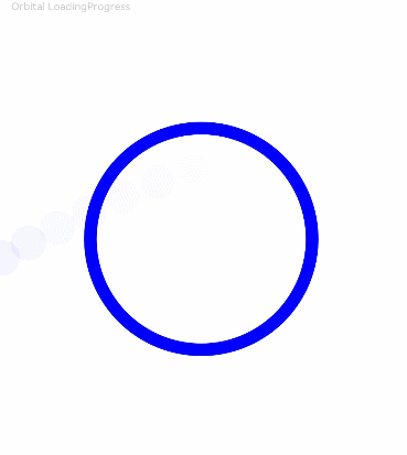
### Example 1
```ts
// xxx.ets
@Entry
@Component
struct LoadingProgressExample {
build() {
Column({ space: 5 }) {
Text('Orbital LoadingProgress ').fontSize(9).fontColor(0xCCCCCC).width('90%')
LoadingProgress()
.color(Color.Blue)
.layoutWeight(1)
}.width('100%').margin({ top: 5 })
}
}
```
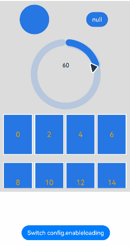
### Example 2
```ts
// This example implements a custom component, enabling the component's visibility to be switched through a button. When the button is clicked, config.enableLoading is switched to false, and the component is not displayed.
// xxx.ets
import { hilog } from '@kit.PerformanceAnalysisKit'
import { promptAction } from '@kit.ArkUI'
class MyLoadingProgressStyle implements ContentModifier {
enableLoading: boolean = false
constructor(enableLoading: boolean) {
this.enableLoading = enableLoading
}
applyContent(): WrappedBuilder<[LoadingProgressConfiguration]> {
return wrapBuilder(buildLoadingProgress)
}
}
let arr1: string[] = ["0", "1", "2", "3", "4", "5", "6", "7", "8", "9", "10", "11", "12", "13", "14", "15", "16", "17", "18", "19"]
let arr2: string[] = ["0", "1", "2", "3", "4", "5", "6", "7", "8", "9"]
@Builder
function buildLoadingProgress(config: LoadingProgressConfiguration) {
Column({ space: 8 }) {
Row() {
Column() {
Circle({
width: ((config.contentModifier as MyLoadingProgressStyle).enableLoading) ? 100 : 80,
height: ((config.contentModifier as MyLoadingProgressStyle).enableLoading) ? 100 : 80
})
.fill(((config.contentModifier as MyLoadingProgressStyle).enableLoading) ? Color.Grey : 0x2577e3)
}.width('50%')
Column() {
Button('' + ((config.contentModifier as MyLoadingProgressStyle).enableLoading))
.onClick((event: ClickEvent) => {
promptAction.showToast({
message: ((config.contentModifier as MyLoadingProgressStyle).enableLoading) + ''
})
})
.fontColor(Color.White)
.backgroundColor(((config.contentModifier as MyLoadingProgressStyle).enableLoading) ? Color.Grey : 0x2577e3)
}.width('50%')
}
Row() {
Column() {
Gauge({
value: (config.contentModifier as MyLoadingProgressStyle).enableLoading?50:30, min: 11, max: 100
}) {
Column() {
Text('60')
.maxFontSize("180sp")
.minFontSize("160.0vp")
.fontWeight(FontWeight.Medium)
.fontColor("#ff182431")
.width('40%')
.height('30%')
.textAlign(TextAlign.Center)
.margin({ top: '22.2%' })
.textOverflow({ overflow: TextOverflow.Ellipsis })
.maxLines(1)
}.width('100%').height('100%')
}
.colors(((config.contentModifier as MyLoadingProgressStyle).enableLoading) ? Color.Grey : 0x2577e3)
.width(200)
.strokeWidth(18)
.padding(5)
.trackShadow({ radius: 7, offsetX: 7, offsetY: 7 })
.height(200)
}.width('100%')
}
Column() {
List({ space: 20, initialIndex: 0 }) {
ForEach(arr2, (item: string) => {
ListItem() {
Text((config.contentModifier as MyLoadingProgressStyle).enableLoading ? '' + item : Number(item) * 2 + '')
.width('100%')
.height('100%')
.fontColor((config.contentModifier as MyLoadingProgressStyle).enableLoading ? Color.White : Color.Orange)
.fontSize((config.contentModifier as MyLoadingProgressStyle).enableLoading ? 16 : 20)
.textAlign(TextAlign.Center)
.backgroundColor((config.contentModifier as MyLoadingProgressStyle).enableLoading ? Color.Grey : 0x2577e3)
}
.height(110)
.border({
width: 2,
color: Color.White
})
}, (item: string) => item)
}
.height(200)
.width('100%')
.friction(0.6)
.lanes({ minLength: (config.contentModifier as MyLoadingProgressStyle).enableLoading?40:80, maxLength: (config.contentModifier as MyLoadingProgressStyle).enableLoading?40:80 })
.scrollBar(BarState.Off)
}
}.width("100%").padding(10)
}
@Entry
@Component
struct LoadingProgressDemoExample {
@State loadingProgressList: (boolean | undefined | null)[] = [undefined, true, null, false]
@State widthList: (number | string)[] = ['110%', 220, '40%', 80]
@State loadingProgressIndex: number = 0
@State clickFlag: number = 0
scroller: Scroller = new Scroller()
build() {
Column() {
Scroll(this.scroller) {
Column({ space: 5 }) {
Column() {
LoadingProgress()
.color('#106836')
.size({ width: '100%' })
.contentModifier(new MyLoadingProgressStyle(this.loadingProgressList[this.loadingProgressIndex]))
}.width('100%').backgroundColor(0xdcdcdc)
}.width('100%').margin({ top: 5 })
}.height('85%')
Button ('Switch config.enableloading').onClick () => {
this.clickFlag++
this.loadingProgressIndex = (this.loadingProgressIndex + 1) % this.loadingProgressList.length
console.log('enableLoading:' + this.loadingProgressList[this.loadingProgressIndex])
}).margin(20)
}
}
}
```