# RichEditor
**RichEditor** is a component that supports interactive text editing and mixture of text and imagery.
> **NOTE**
>
> This component is supported since API version 10. Updates will be marked with a superscript to indicate their earliest API version.
## Child Components
Not supported
## APIs
RichEditor(value: RichEditorOptions)
**Atomic service API**: This API can be used in atomic services since API version 11.
**System capability**: SystemCapability.ArkUI.ArkUI.Full
**Parameters**
| Name | Type | Mandatory | Description |
| ----- | --------------------------------------- | ---- | ----------- |
| value | [RichEditorOptions](#richeditoroptions) | Yes | Options for initializing the component.|
RichEditor(options: RichEditorStyledStringOptions)12+
**Parameters**
| Name | Type | Mandatory | Description |
| ----- | --------------------------------------- | ---- | ----------- |
| options | [RichEditorStyledStringOptions](#richeditorstyledstringoptions12) | Yes | Options for initializing the component.|
## Attributes
In addition to the [universal attributes](ts-universal-attributes-size.md), the following attributes are supported.
> **NOTE**
>
> The **align** attribute supports only the start, center, and end options.
>
> The **borderImage** attribute is not supported.
### customKeyboard
customKeyboard(value: CustomBuilder, options?: KeyboardOptions)
Sets a custom keyboard.
When a custom keyboard is set, activating the text box opens the specified custom component, instead of the system input method.
The custom keyboard's height can be set through the **height** attribute of the custom component's root node, and its width is fixed at the default value.
The custom keyboard cannot obtain focus, but it blocks gesture events.
By default, the custom keyboard is closed when the input component loses the focus.
When a custom keyboard is set, the text box does not support camera input, even when the device supports.
**Atomic service API**: This API can be used in atomic services since API version 11.
**System capability**: SystemCapability.ArkUI.ArkUI.Full
**Parameters**
| Name | Type | Mandatory| Description |
| --------------------- | ------------------------------------------- | ---- | -------------------------------- |
| value | [CustomBuilder](ts-types.md#custombuilder8) | Yes | Custom keyboard.
**Atomic service API**: This API can be used in atomic services since API version 11.|
| options12+ | [KeyboardOptions](#keyboardoptions12) | No | Whether to support keyboard avoidance.|
### bindSelectionMenu
bindSelectionMenu(spanType: RichEditorSpanType, content: CustomBuilder, responseType: ResponseType | RichEditorResponseType,
options?: SelectionMenuOptions)
Sets the custom context menu on text selection. If the custom menu is too long, embed a [Scroll](./ts-container-scroll.md) component to prevent the keyboard from being blocked.
**Atomic service API**: This API can be used in atomic services since API version 11.
**System capability**: SystemCapability.ArkUI.ArkUI.Full
**Parameters**
| Name | Type | Mandatory| Description |
| ------------ | ------------------------------------------------------------ | ---- | --------------------------------------------------------- |
| spanType | [RichEditorSpanType](#richeditorspantype) | Yes | Menu type.
Default value:
RichEditorSpanType.TEXT |
| content | [CustomBuilder](ts-types.md#custombuilder8) | Yes | Menu content. |
| responseType | [ResponseType](ts-appendix-enums.md#responsetype8) \| [RichEditorResponseType](#richeditorresponsetype11) | Yes | Response type of the menu.
Default value:
ResponseType.LongPress |
| options | [SelectionMenuOptions](#selectionmenuoptions10) | No | Menu options. |
### copyOptions
copyOptions(value: CopyOptions)
Specifies whether copy and paste is allowed for text content.
If **copyOptions** is not set to **CopyOptions.None**, long-pressing the text content displays the context menu. If a custom context menu is defined through **bindSelectionMenu** or other approaches, it will be displayed.
If **copyOptions** is set to **CopyOptions.None**, the copy, cut, and AI-powered writing features are not available.
**Widget capability**: This API can be used in ArkTS widgets since API version 10.
**Atomic service API**: This API can be used in atomic services since API version 11.
**System capability**: SystemCapability.ArkUI.ArkUI.Full
**Parameters**
| Name| Type | Mandatory| Description |
| ------ | ------------------------------------------------ | ---- | ------------------------------------------------------------ |
| value | [CopyOptions](ts-appendix-enums.md#copyoptions9) | Yes | Whether copy and paste is allowed for text content.
Default value: **CopyOptions.LocalDevice**
**Widget capability**: This API can be used in ArkTS widgets since API version 10.|
### enableDataDetector11+
enableDataDetector(enable: boolean)
Enables recognition for special entities within the text.
For this API to work, the target device must provide the text recognition capability.
If **enableDataDetector** is set to **true** and **dataDetectorConfig** is not set, all types of entities will be recognized, and the **color** and **decoration** attributes of the recognized entities will be changed to the following styles:
```ts
color: '#ff007dff'
decoration:{
type: TextDecorationType.Underline,
color: '#ff007dff',
style: TextDecorationStyle.SOLID
}
```
Touching and right-clicking an entity with the mouse will pop up the corresponding entity operation menu based on the type of entity, while left-clicking an entity with the mouse will directly respond to the first option of the menu.
This API does not work for the node text of **addBuilderSpan**.
When **copyOption** is set to **CopyOptions.None**, the menu displayed after an entity is clicked does not provide the text selection or copy functionality.
**Atomic service API**: This API can be used in atomic services since API version 12.
**System capability**: SystemCapability.ArkUI.ArkUI.Full
**Parameters**
| Name| Type | Mandatory| Description |
| ------ | ------- | ---- | --------------------------------- |
| enable | boolean | Yes | Whether to enable text recognition.
Default value: **false**|
### dataDetectorConfig11+
dataDetectorConfig(config: TextDataDetectorConfig)
Configures text recognition settings.
This API must be used together with [enableDataDetector](#enabledatadetector11). It takes effect only when **enableDataDetector** is set to **true**.
When entities A and B overlap, the following rules are followed:
1. If A ⊂ B, retain B. Otherwise, retain A.
2. When A ⊄ B and B ⊄ A: If A.start < B.start, retain A; otherwise, retain B.
**Atomic service API**: This API can be used in atomic services since API version 12.
**System capability**: SystemCapability.ArkUI.ArkUI.Full
**Parameters**
| Name| Type | Mandatory| Description |
| ------ | ----------------------------------------------------------- | ---- | ------------------------------------------------------------ |
| config | [TextDataDetectorConfig](ts-text-common.md#textdatadetectorconfig11) | Yes | Text recognition configuration.|
### enablePreviewText12+
enablePreviewText(enable: boolean)
Sets whether to enable preview text.
**Atomic service API**: This API can be used in atomic services since API version 12.
**System capability**: SystemCapability.ArkUI.ArkUI.Full
**Parameters**
| Name| Type | Mandatory| Description |
| ------ | ------- | ---- | --------------------------------- |
| enable | boolean | Yes | Whether to enable preview text.
Default value: **true**|
> **NOTE**
>
> This API is disabled by default in C API scenarios. To enable preview text in such scenarios, set [metadata](../../../../application-dev/quick-start/module-structure.md#internal-structure-of-the-metadata-attribute) in the **module.json5** file of the project as follows:
> ```json
> "metadata": [
> {
> "name": "can_preview_text",
> "value": "true",
> }
> ]
> ```
### placeholder12+
placeholder(value: ResourceStr, style?: PlaceholderStyle)
Sets the placeholder text, which is displayed when there is no input.
**Atomic service API**: This API can be used in atomic services since API version 12.
**System capability**: SystemCapability.ArkUI.ArkUI.Full
**Parameters**
| Name| Type | Mandatory| Description |
| ------ | --------------------------------------- | ---- | ------------------------------------------------------- |
| value | [ResourceStr](ts-types.md#resourcestr) | Yes | Placeholder text. |
| style | [PlaceholderStyle](#placeholderstyle12) | No | Style of the placeholder text.
By default, the style follows the theme.|
### caretColor12+
caretColor(value: ResourceColor)
Sets the color of the caret and selection handle in the text box.
**Atomic service API**: This API can be used in atomic services since API version 12.
**System capability**: SystemCapability.ArkUI.ArkUI.Full
**Parameters**
| Name| Type | Mandatory| Description |
| ------ | ------------------------------------------ | ---- | -------------------------------------- |
| value | [ResourceColor](ts-types.md#resourcecolor) | Yes | Color of the cursor and selection handle in the text box.
Default value: **'#007DFF'**|
### selectedBackgroundColor12+
selectedBackgroundColor(value: ResourceColor)
Sets the background color of the selected text. If the opacity is not set, a 20% opacity will be used.
**Atomic service API**: This API can be used in atomic services since API version 12.
**System capability**: SystemCapability.ArkUI.ArkUI.Full
**Parameters**
| Name| Type | Mandatory| Description |
| ------ | ------------------------------------------ | ---- | ------------------------------------------ |
| value | [ResourceColor](ts-types.md#resourcecolor) | Yes | Background color of the selected text.
By default, a 20% opacity is applied.|
### editMenuOptions12+
editMenuOptions(editMenu: EditMenuOptions)
Sets the extended options of the custom context menu on selection, including the text content, icon, and callback.
**Atomic service API**: This API can be used in atomic services since API version 12.
**Atomic service API**: This API can be used in atomic services since API version 12.
**System capability**: SystemCapability.ArkUI.ArkUI.Full
**Parameters**
| Name| Type | Mandatory| Description |
| ------ | --------------------------------------------- | ---- | --------------------------------------------- |
| editMenu | [EditMenuOptions](ts-text-common.md#editmenuoptions)| Yes | Extended options of the custom context menu on selection.|
### enterKeyType12+
enterKeyType(value: EnterKeyType)
Sets the Enter key type of the soft keyboard.
**Atomic service API**: This API can be used in atomic services since API version 12.
**System capability**: SystemCapability.ArkUI.ArkUI.Full
**Parameters**
| Name| Type | Mandatory| Description |
| ------ | ------ | ---- | ----------------------------------- |
| value | [EnterKeyType](ts-types.md#enterkeytype)| Yes | Type of the Enter key.
Default value: **EnterKeyType.NEW_LINE**|
### enableKeyboardOnFocus12+
enableKeyboardOnFocus(isEnabled: boolean)
Sets whether to enable the input method when the **RichEditor** component obtains focus in a way other than clicking.
**Atomic service API**: This API can be used in atomic services since API version 12.
**System capability**: SystemCapability.ArkUI.ArkUI.Full
**Parameters**
| Name| Type| Mandatory| Description|
| ------ | ------- | ---- | ----------------------------------------------------------- |
| isEnabled | boolean | Yes | Whether to enable the input method when the component obtains focus in a way other than clicking.
Default value: **true**|
### barState13+
barState(state: BarState)
Sets the scrollbar display mode when the **RichEditor** text box is editable.
**Atomic service API**: This API can be used in atomic services since API version 13.
**System capability**: SystemCapability.ArkUI.ArkUI.Full
**Parameters**
| Name| Type| Mandatory| Description|
| ------ | ----------------------------------------- | ---- | ------------------------------------------------------ |
| state | [BarState](ts-appendix-enums.md#barstate) | Yes | Scrollbar display mode when the text box is editable.
Default value: **BarState.Auto**|
### enableHapticFeedback13+
enableHapticFeedback(isEnabled: boolean)
Sets whether haptic feedback is enabled.
**Atomic service API**: This API can be used in atomic services since API version 13.
**System capability**: SystemCapability.ArkUI.ArkUI.Full
| Name| Type | Mandatory | Description |
| ------ | --------------------------------------------- |-----|-------------------------------------------------------------------------------------|
| isEnabled | boolean | Yes | Whether haptic feedback is enabled.
**true** (default): Haptic feedback is enabled.
**false**: Haptic feedback is disabled.
Whether this parameter takes effect after being set to true depends on hardware support.|
## Events
In addition to the [universal events](ts-universal-events-click.md), [OnDidChangeCallback](ts-text-common.md#ondidchangecallback12), [StyledStringChangedListener](ts-text-common.md#styledstringchangedlistener12), [StyledStringChangeValue](ts-text-common.md#styledstringchangevalue12), and the following events are supported.
### onReady
onReady(callback:Callback\)
Triggered when initialization of the component is completed.
**Atomic service API**: This API can be used in atomic services since API version 11.
**System capability**: SystemCapability.ArkUI.ArkUI.Full
**Parameters**
| Name | Type | Mandatory | Description |
| ----- | --------------------------------------- | ---- | ----------- |
| callback |Callback\ | Yes | Callback invoked when initialization of the **RichEditor** component is complete. |
### onSelect
onSelect(callback:Callback\<[RichEditorSelection](#richeditorselection)\>)
Triggered when content is selected.
If a mouse device is used for selection, this callback is invoked when the left mouse button is double-clicked to select content and invoked again when the button is released.
If a finger is used for selection, this callback is invoked by a long press and invoked again when the finger is released.
This callback is not supported when the **RichEditor** component constructed with [RichEditorStyledStringOptions](#richeditorstyledstringoptions12) is used.
**Atomic service API**: This API can be used in atomic services since API version 11.
**System capability**: SystemCapability.ArkUI.ArkUI.Full
**Parameters**
| Name| Type | Mandatory| Description |
| ------ | ------------------------------------------- | ---- | -------------------- |
| callback | Callback\<[RichEditorSelection](#richeditorselection)\> | Yes | Callback invoked when content is selected.
[RichEditorSelection](#richeditorselection) indicates information about all the selected spans. |
### aboutToIMEInput
aboutToIMEInput(callback:Callback\<[RichEditorInsertValue](#richeditorinsertvalue), boolean\>)
Triggered when content is about to be entered in the input method.
This callback is not supported when the **RichEditor** component constructed with [RichEditorStyledStringOptions](#richeditorstyledstringoptions12) is used.
**Atomic service API**: This API can be used in atomic services since API version 11.
**System capability**: SystemCapability.ArkUI.ArkUI.Full
**Parameters**
| Name| Type | Mandatory| Description |
| ------ | ------------------------------------------- | ---- | -------------------- |
| callback | Callback\<[RichEditorInsertValue](#richeditorinsertvalue), boolean\> | Yes | Callback invoked when content is about to be entered in the input method.
[RichEditorInsertValue](#richeditorinsertvalue) indicates whether content will be entered in the input method.
**true**: The component adds the content.
**false**: The component does not add the content. |
### onDidIMEInput12+
onDidIMEInput(callback:Callback\)
Triggered when text input in the input method is complete.
This callback is not supported when the **RichEditor** component constructed with [RichEditorStyledStringOptions](#richeditorstyledstringoptions12) is used.
**Atomic service API**: This API can be used in atomic services since API version 12.
**System capability**: SystemCapability.ArkUI.ArkUI.Full
**Parameters**
| Name| Type | Mandatory| Description |
| ------ | ------------------------------------------- | ---- | -------------------- |
| callback | Callback\<[TextRange](ts-text-common.md#textrange12)\> | Yes| Callback invoked when text input in the input method is complete.
**TextRange** indicates the text range for the current input. |
### onIMEInputComplete
onIMEInputComplete(callback:Callback\<[RichEditorTextSpanResult](#richeditortextspanresult)\>)
Triggered when text input in the input method is complete.
This callback is not supported when the **RichEditor** component constructed with [RichEditorStyledStringOptions](#richeditorstyledstringoptions12) is used.
**Atomic service API**: This API can be used in atomic services since API version 11.
**System capability**: SystemCapability.ArkUI.ArkUI.Full
**Parameters**
| Name| Type | Mandatory| Description |
| ------ | ------------------------------------------- | ---- | -------------------- |
| callback | Callback\<[RichEditorTextSpanResult](#richeditortextspanresult)\> | Yes| Callback invoked when text input in the input method is complete.
[RichEditorTextSpanResult](#richeditortextspanresult) indicates the text span information after text input is complete. |
### aboutToDelete
aboutToDelete(callback:Callback\<[RichEditorDeleteValue](#richeditordeletevalue), boolean\>)
Triggered when content is about to be deleted in the input method.
This callback is not supported when the **RichEditor** component constructed with [RichEditorStyledStringOptions](#richeditorstyledstringoptions12) is used.
**Atomic service API**: This API can be used in atomic services since API version 11.
**System capability**: SystemCapability.ArkUI.ArkUI.Full
**Parameters**
| Name| Type | Mandatory| Description |
| ------ | ------------------------------------------- | ---- | -------------------- |
| callback | Callback\<[RichEditorDeleteValue](#richeditordeletevalue), boolean\> | Yes| Callback invoked when content is about to be deleted in the input method. It is executed when a candidate word is touched in preview text.
[RichEditorDeleteValue](#richeditordeletevalue) indicates the text or image span where the content to be deleted is located.
**true**: Content is deleted.
**false**: Content is not deleted. |
### onDeleteComplete
onDeleteComplete(callback:Callback\)
Triggered when deletion in the input method is completed.
This callback is not supported when the **RichEditor** component constructed with [RichEditorStyledStringOptions](#richeditorstyledstringoptions12) is used.
**Atomic service API**: This API can be used in atomic services since API version 11.
**System capability**: SystemCapability.ArkUI.ArkUI.Full
**Parameters**
| Name | Type | Mandatory | Description |
| ----- | --------------------------------------- | ---- | ----------- |
| callback |Callback\ | Yes | Callback invoked when deletion in the input method is completed.|
### onPaste11+
onPaste(callback: [PasteEventCallback](#pasteeventcallback12) )
Triggered when the paste is about to be completed. You can use this API to override the default system behavior so that both images and text can be pasted.
**Atomic service API**: This API can be used in atomic services since API version 12.
**System capability**: SystemCapability.ArkUI.ArkUI.Full
**Parameters**
| Name| Type | Mandatory| Description |
| ------ | ------- | ---- | ----------------------------- |
| callback | [PasteEventCallback](#pasteeventcallback12) | Yes | Callback invoked when the paste is about to be completed.|
### onSelectionChange12+
onSelectionChange(callback:Callback\<[RichEditorRange](#richeditorrange)\>)
Triggered when the content selection area changes or the caret position changes in the editing state. In the case of caret position changes, the start position of the content selection area is equal to the end position.
**Atomic service API**: This API can be used in atomic services since API version 12.
**System capability**: SystemCapability.ArkUI.ArkUI.Full
**Parameters**
| Name | Type | Mandatory | Description |
| ----- | --------------------------------------- | ---- | ----------- |
| callback |Callback\<[RichEditorRange](#richeditorrange)\> | Yes | Callback invoked when the content selection area changes or the caret position changes in the editing state.
[RichEditorRange](#richeditorrange) indicates the start and end positions of the content selection area. |
### onEditingChange12+
onEditingChange(callback: Callback\)
Triggered when the editing state of all content in the component changes.
**Atomic service API**: This API can be used in atomic services since API version 12.
**System capability**: SystemCapability.ArkUI.ArkUI.Full
**Parameters**
| Name | Type | Mandatory | Description |
| ----- | --------------------------------------- | ---- | ----------- |
| callback | Callback\ | Yes | Callback invoked when the editing state of all content in the component changes. The value **true** indicates the editing state, and **false** indicates the non-editing state.|
### onSubmit12+
onSubmit(callback: SubmitCallback)
Triggered when the Enter key on the soft keyboard is pressed.
**Atomic service API**: This API can be used in atomic services since API version 12.
**System capability**: SystemCapability.ArkUI.ArkUI.Full
**Parameters**
| Name| Type | Mandatory| Description |
| ------ | ------- | ---- | ----------------------------- |
| callback | [SubmitCallback](#submitcallback12) | Yes | Callback used to return the result.|
### onWillChange12+
onWillChange(callback: Callback\)
Triggered when any addition or deletion operation is about to be performed in the component.
This callback is not supported when the **RichEditor** component constructed with [RichEditorStyledStringOptions](#richeditorstyledstringoptions12) is used.
**Atomic service API**: This API can be used in atomic services since API version 12.
**System capability**: SystemCapability.ArkUI.ArkUI.Full
**Parameters**
| Name| Type| Mandatory| Description|
| -- | -- | -- | -- |
| callback | Callback\<[RichEditorChangeValue](#richeditorchangevalue12) , boolean\> | Yes | [RichEditorChangeValue](#richeditorchangevalue12) indicates the text and image change information. **boolean** indicates whether the current text and images are allowed to be changed. The value **true** means that the text and images are allowed to be changed, and **false** means the opposite.|
### onDidChange12+
onDidChange(callback: OnDidChangeCallback)
Triggered after an addition or deletion operation is performed in the component. This callback is not executed if there is no actual addition or deletion of text.
This callback is not supported when the **RichEditor** component constructed with [RichEditorStyledStringOptions](#richeditorstyledstringoptions12) is used.
**Atomic service API**: This API can be used in atomic services since API version 12.
**System capability**: SystemCapability.ArkUI.ArkUI.Full
**Parameters**
| Name| Type| Mandatory| Description|
| -- | -- | -- | -- |
| callback | [OnDidChangeCallback](ts-text-common.md#ondidchangecallback12) | Yes| Content range before and after the text and image change.|
### onCut12+
onCut(callback: Callback\)
Triggered when text is about to be cut. By default, only plain text can be cut. You can use this method to override the system's default behavior and implement the cutting of text and images.
**Atomic service API**: This API can be used in atomic services since API version 12.
**System capability**: SystemCapability.ArkUI.ArkUI.Full
**Parameters**
| Name | Type | Mandatory | Description |
| ----- | --------------------------------------- | ---- | ----------- |
| callback |Callback\<[CutEvent](#cutevent12)\> | Yes | Custom cut event. |
### onCopy12+
onCopy(callback: Callback\)
Triggered when text is about to be copied. By default, only plain text can be copied. You can use this method to override the system's default behavior and implement the copying of text and images.
**Atomic service API**: This API can be used in atomic services since API version 12.
**System capability**: SystemCapability.ArkUI.ArkUI.Full
**Parameters**
| Name | Type | Mandatory | Description |
| ----- | --------------------------------------- | ---- | ----------- |
| callback |Callback\<[CopyEvent](#copyevent12)\> | Yes | Custom copy event. |
## RichEditorInsertValue
Describes the text to be inserted.
**System capability**: SystemCapability.ArkUI.ArkUI.Full
| Name | Type | Mandatory | Description |
| ------------ | ------ | ---- | ---------- |
| insertOffset | number | Yes | Offset of the text to be inserted.
**Atomic service API**: This API can be used in atomic services since API version 11.|
| insertValue | string | Yes | Content of the text to be inserted.
**Atomic service API**: This API can be used in atomic services since API version 11. |
| previewText12+ | string | No | Content of the preview text to be inserted.
**Atomic service API**: This API can be used in atomic services since API version 12.|
## RichEditorDeleteValue
Provides information about the delete operation and the deleted content.
**Atomic service API**: This API can be used in atomic services since API version 11.
**System capability**: SystemCapability.ArkUI.ArkUI.Full
| Name | Type | Mandatory | Description |
| --------------------- | ---------------------------------------- | ---- | ------------------- |
| offset | number | Yes | Offset of the deleted content. |
| direction | [RichEditorDeleteDirection](#richeditordeletedirection) | Yes | Direction of the delete operation. |
| length | number | Yes | Length of the deleted content. |
| richEditorDeleteSpans | Array<[RichEditorTextSpanResult](#richeditortextspanresult) \| [RichEditorImageSpanResult](#richeditorimagespanresult)> | Yes | Information about the deleted text or image span.|
## RichEditorDeleteDirection
Enumerates the directions of the delete operation.
**Atomic service API**: This API can be used in atomic services since API version 11.
**System capability**: SystemCapability.ArkUI.ArkUI.Full
| Name | Description |
| -------- | ---------- |
| BACKWARD | Backward.|
| FORWARD | Forward.|
## RichEditorTextSpanResult
Provides the text span information.
**System capability**: SystemCapability.ArkUI.ArkUI.Full
| Name | Type | Mandatory | Description |
| ----------------------------- | ---------------------------------------- | ---- | ---------------------- |
| spanPosition | [RichEditorSpanPosition](#richeditorspanposition) | Yes | Span position.
**Atomic service API**: This API can be used in atomic services since API version 11.|
| value | string | Yes | Content of the text span or symbol ID.
**Atomic service API**: This API can be used in atomic services since API version 11.|
| textStyle | [RichEditorTextStyleResult](#richeditortextstyleresult) | Yes | Text span style.
**Atomic service API**: This API can be used in atomic services since API version 11.|
| offsetInSpan | [number, number] | Yes | Start and end positions of the valid content in the text span.
**Atomic service API**: This API can be used in atomic services since API version 11.|
| valueResource11+ | [Resource](ts-types.md#resource) | No | Content of the **SymbolSpan** component.
**Atomic service API**: This API can be used in atomic services since API version 12. |
| symbolSpanStyle11+ | [RichEditorSymbolSpanStyle](#richeditorsymbolspanstyle11) | No | Style of the **SymbolSpan** component.
**Atomic service API**: This API can be used in atomic services since API version 12.|
| paragraphStyle12+ | [RichEditorParagraphStyle](#richeditorparagraphstyle11) | No | Paragraph style.
**Atomic service API**: This API can be used in atomic services since API version 12.|
| previewText12+ | string | No | Content of the preview text.
**Atomic service API**: This API can be used in atomic services since API version 12.|
## RichEditorSpanPosition
Provides the span position information.
**Atomic service API**: This API can be used in atomic services since API version 11.
**System capability**: SystemCapability.ArkUI.ArkUI.Full
| Name | Type | Mandatory | Description |
| --------- | ---------------- | ---- | --------------------------- |
| spanIndex | number | Yes | Span index. |
| spanRange | [number, number] | Yes | Start and end positions of the span content in the **RichEditor** component.|
## RichEditorSpanType
Provides the span type information.
**System capability**: SystemCapability.ArkUI.ArkUI.Full
| Name | Value | Description |
| ----- | ---- | ------------ |
| TEXT | 0 | Text span.
**Atomic service API**: This API can be used in atomic services since API version 11. |
| IMAGE | 1 | Image span.
**Atomic service API**: This API can be used in atomic services since API version 11. |
| MIXED | 2 | Mixed span, which contains both text and imagery.
**Atomic service API**: This API can be used in atomic services since API version 11. |
| BUILDER12+ | 3 | Builder span.
**Atomic service API**: This API can be used in atomic services since API version 12. |
## RichEditorResponseType11+
Provides the response type of the menu.
**Atomic service API**: This API can be used in atomic services since API version 12.
**System capability**: SystemCapability.ArkUI.ArkUI.Full
| Name | Description |
| ---------- | ------------- |
| LONG_PRESS | The menu is displayed when the component is long-pressed. |
| RIGHT_CLICK | The menu is displayed when the component is right-clicked.|
| SELECT | The menu is displayed when the component is selected.|
## RichEditorTextStyleResult
Provides the text span style information returned by the backend.
**System capability**: SystemCapability.ArkUI.ArkUI.Full
| Name | Type | Mandatory | Description |
| ---------- | ---------------------------------------- | ---- | ------------ |
| fontColor | [ResourceColor](ts-types.md#resourcecolor) | Yes | Font color.
**Atomic service API**: This API can be used in atomic services since API version 11.|
| fontSize | number | Yes | Font size. The default unit is fp.
**Atomic service API**: This API can be used in atomic services since API version 11.|
| fontStyle | [FontStyle](ts-appendix-enums.md#fontstyle) | Yes | Font style.
**Atomic service API**: This API can be used in atomic services since API version 11.|
| fontWeight | number | Yes | Font weight.
**Atomic service API**: This API can be used in atomic services since API version 11.|
| fontFamily | string | Yes | Font family.
**Atomic service API**: This API can be used in atomic services since API version 11.|
| decoration | [DecorationStyleResult](ts-text-common.md#decorationstyleresult12) | Yes | Text decorative line.
**Atomic service API**: This API can be used in atomic services since API version 11.|
| textShadow12+ | Array<[ShadowOptions](ts-universal-attributes-image-effect.md#shadowoptions)> | No | Text shadow.
**Atomic service API**: This API can be used in atomic services since API version 12.|
| lineHeight12+ | number | No | Line height. The default unit is fp.
**Atomic service API**: This API can be used in atomic services since API version 12.|
| letterSpacing12+| number | No | Letter spacing. The default unit is fp.
**Atomic service API**: This API can be used in atomic services since API version 12.|
| fontFeature12+ | string | No| Font feature.
**Atomic service API**: This API can be used in atomic services since API version 12.|
> **NOTE**
>
> While **fontWeight** in **RichEditorTextStyle** sets the font weight, **fontWeight** in **RichEditorTextStyleResult** returns the set font weight after conversion to digits.
>
> The table below lists the conversion mappings.
>
> | fontWeight in RichEditorTextStyle | fontWeight in RichEditorTextStyleResult |
> | ---- | ----------------------------------- |
> | 100 | 0 |
> | 200 | 1 |
> | 300 | 2 |
> | 400 | 3 |
> | 500 | 4 |
> | 600 | 5 |
> | 700 | 6 |
> | 800 | 7 |
> | 900 | 8 |
> | Lighter | 12 |
> | Normal | 10 |
> | Regular | 14 |
> | Medium | 13 |
> | Bold | 9 |
> | Bolder | 11 |
>
> The conversion mappings between the **fontWeight** parameters in **RichEditorSymbolSpanStyle** and **RichEditorSymbolSpanStyleResult** are the same as those between the **fontWeight** parameters in **RichEditorTextStyle** and **RichEditorTextStyleResult**.
## RichEditorSymbolSpanStyleResult11+
Provides the symbol span style information returned by the backend.
**Atomic service API**: This API can be used in atomic services since API version 12.
**System capability**: SystemCapability.ArkUI.ArkUI.Full
| Name| Type| Mandatory| Description |
| ------ | -------- | ---- | -------------------------------------- |
| fontColor | Array\<[ResourceColor](ts-types.md#resourcecolor)\> | Yes| Color of the symbol span.
Default value: depending on the rendering strategy|
| fontSize | number \| string \| [Resource](ts-types.md#resource) | Yes| Size of the symbol span. The default unit is fp.
The default value follows the theme.|
| fontWeight | number \| [FontWeight](ts-appendix-enums.md#fontweight) \| string | Yes| Weight of the symbol span.
For the number type, the value ranges from 100 to 900, at an interval of 100. A larger value indicates a heavier font weight. The default value is **400**.
For the string type, only strings of the number type are supported, for example, **"400"**, **"bold"**, **"bolder"**, **"lighter"**, **"regular"**, and **"medium"**, which correspond to the enumerated values in **FontWeight**.
Default value: **FontWeight.Normal**|
| renderingStrategy | [SymbolRenderingStrategy](ts-basic-components-symbolGlyph.md#symbolrenderingstrategy11) | Yes| Rendering strategy of the symbol span.
Default value: **SymbolRenderingStrategy.SINGLE**|
| effectStrategy | [SymbolEffectStrategy](ts-basic-components-symbolGlyph.md#symboleffectstrategy11) | Yes| Effect strategy of the symbol span.
Default value: **SymbolEffectStrategy.NONE**|
## RichEditorImageSpanResult
Provides the image information returned by the backend.
**Atomic service API**: This API can be used in atomic services since API version 11.
**System capability**: SystemCapability.ArkUI.ArkUI.Full
| Name | Type | Mandatory | Description |
|------------------|-------------------------------------------------------------------|-----|------------------|
| spanPosition | [RichEditorSpanPosition](#richeditorspanposition) | Yes | Span position.|
| valuePixelMap | [PixelMap](../../apis-image-kit/js-apis-image.md#pixelmap7) | No | Image content.|
| valueResourceStr | [ResourceStr](ts-types.md#resourcestr) | No | Image resource ID.|
| imageStyle | [RichEditorImageSpanStyleResult](#richeditorimagespanstyleresult) | Yes| Image style.|
| offsetInSpan | [number, number] | Yes| Start and end positions of the image in the span.|
## RichEditorImageSpanStyleResult
Provides the image span style information returned by the backend.
**System capability**: SystemCapability.ArkUI.ArkUI.Full
| Name | Type | Mandatory | Description |
| ------------- | ---------------------------------------- | ---- | --------- |
| size | [number, number] | Yes | Width and height of the image, in px. Default value: varies by the value of **objectFit**. If the value of **objectFit** is **Cover**, the image height is the component height minus the top and bottom paddings, and the image width is the component width minus the left and right paddings.
**Atomic service API**: This API can be used in atomic services since API version 11.|
| verticalAlign | [ImageSpanAlignment](ts-basic-components-imagespan.md#imagespanalignment) | Yes | Vertical alignment mode of the image.
**Atomic service API**: This API can be used in atomic services since API version 11.|
| objectFit | [ImageFit](ts-appendix-enums.md#imagefit) | Yes | Scale mode of the image.
**Atomic service API**: This API can be used in atomic services since API version 11.|
| layoutStyle12+ | [RichEditorLayoutStyle](#richeditorlayoutstyle11) | No | Image layout style.
**Atomic service API**: This API can be used in atomic services since API version 12.|
## RichEditorLayoutStyle11+
**Atomic service API**: This API can be used in atomic services since API version 12.
**System capability**: SystemCapability.ArkUI.ArkUI.Full
|Name|Type|Mandatory| Description|
| ------------- | ----------------------- | ---- | ------------------------------------------------------------ |
|margin | [Dimension](ts-types.md#dimension10) \| [Margin](ts-types.md#margin) | No | Margins in different directions of the component.
When the parameter is of the **Dimension** type, the four margins take effect.|
|borderRadius | [Dimension](ts-types.md#dimension10) \| [BorderRadiuses](ts-types.md#borderradiuses9) | No | Radius of the rounded corners of the component.
If of the **Dimension** type, this parameter cannot be set in percentage.|
## RichEditorOptions
Defines the options for initializing the **RichEditor** component.
**Atomic service API**: This API can be used in atomic services since API version 11.
**System capability**: SystemCapability.ArkUI.ArkUI.Full
| Name | Type | Mandatory | Description |
| ---------- | ---------------------------------------- | ---- | ------- |
| controller | [RichEditorController](#richeditorcontroller) | Yes | Controller for the **RichEditor** component.|
## RichEditorStyledStringOptions12+
Defines the options for initializing the **RichEditor** component.
**Atomic service API**: This API can be used in atomic services since API version 12.
**System capability**: SystemCapability.ArkUI.ArkUI.Full
| Name | Type | Mandatory | Description |
| ---------- | ---------------------------------------- | ---- | ------- |
| controller | [RichEditorStyledStringController](#richeditorstyledstringcontroller12) | Yes | Controller for the **RichEditor** component.|
## RichEditorChangeValue12+
**Atomic service API**: This API can be used in atomic services since API version 12.
**System capability**: SystemCapability.ArkUI.ArkUI.Full
| Name | Type | Mandatory | Description |
| --------------------- | ---------------------------------------- | ---- | ------------------- |
| rangeBefore | [TextRange](ts-text-common.md#textrange12) | Yes | Start and end indexes of the content to be replaced.|
| replacedSpans | Array<[RichEditorTextSpanResult](#richeditortextspanresult)> | Yes | Information about the text span after the change.|
| replacedImageSpans | Array<[RichEditorImageSpanResult](#richeditorimagespanresult)> | Yes | Information about the image span after the change.|
| replacedSymbolSpans | Array<[RichEditorTextSpanResult](#richeditortextspanresult)> | Yes | Information about the symbol span after the change.|
## RichEditorBaseController12+
Represents the base class of the **RichEditor** component controller.
### getCaretOffset10+
getCaretOffset(): number
Obtains the current cursor position.
**Atomic service API**: This API can be used in atomic services since API version 11.
**System capability**: SystemCapability.ArkUI.ArkUI.Full
**Return value**
| Type | Description |
| ------ | --------- |
| number | Cursor position.|
### setCaretOffset10+
setCaretOffset(offset: number): boolean
Sets the cursor position.
**Atomic service API**: This API can be used in atomic services since API version 11.
**System capability**: SystemCapability.ArkUI.ArkUI.Full
**Parameters**
| Name | Type | Mandatory | Description |
| ------ | ------ | ---- | -------------------- |
| offset | number | Yes | Offset of the cursor. If it exceeds the range of all content, the setting will fail.|
**Return value**
| Type | Description |
| ------- | --------- |
| boolean | Whether the cursor position is set successfully.|
### closeSelectionMenu10+
closeSelectionMenu(): void
Closes the custom or default context menu on selection.
**Atomic service API**: This API can be used in atomic services since API version 11.
**System capability**: SystemCapability.ArkUI.ArkUI.Full
### getTypingStyle11+
getTypingStyle(): RichEditorTextStyle
Obtains the preset typing style.
**Atomic service API**: This API can be used in atomic services since API version 12.
**System capability**: SystemCapability.ArkUI.ArkUI.Full
**Return value**
| Type | Description |
| ---------------------------------------- | ------- |
| [RichEditorTextStyle](#richeditortextstyle) | Preset typing style.|
### setTypingStyle11+
setTypingStyle(value: RichEditorTextStyle): void
Sets the preset typing style.
**Atomic service API**: This API can be used in atomic services since API version 12.
**System capability**: SystemCapability.ArkUI.ArkUI.Full
**Parameters**
| Name | Type | Mandatory | Description |
| ----- | ---------------------------------------- | ---- | ----- |
| value | [RichEditorTextStyle](#richeditortextstyle) | Yes | Preset typing style.|
### setSelection11+
setSelection(selectionStart: number, selectionEnd: number, options?: SelectionOptions): void
Sets the range of content selection. The selected content is highlighted.
If both **selectionStart** and **selectionEnd** are set to **-1**, the entire content is selected.
If this API is called when the text box is not focused, the selected effect is not displayed.
Since API version 12, on 2-in-1 devices, regardless of the value of **options**, calling the **setSelection** API will not display the menu. In addition, if there is already a menu present within the component, calling the **setSelection** API will close the menu.
On non-2-in-1 devices, when **options** is set to **MenuPolicy.DEFAULT**, the following rules apply:
1. If the component has a selection handle menu, calling the API will not close the menu, and the menu position will be adjusted.
2. If the component has a menu without a selection handle, calling the API will not close the menu, and the menu position will remain unchanged.
3. If there is no menu within the component, calling the API will not display the menu.
**Atomic service API**: This API can be used in atomic services since API version 12.
**System capability**: SystemCapability.ArkUI.ArkUI.Full
**Parameters**
| Name | Type | Mandatory | Description |
| -------------- | ------ | ---- | ------- |
| selectionStart | number | Yes | Start position of the selection.|
| selectionEnd | number | Yes | End position of the selection.|
| options12+ | [SelectionOptions](ts-types.md#selectionoptions12) | No | Configuration of options.|
### isEditing12+
isEditing(): boolean
Obtains the editing state of this **RichEditor** component.
**Atomic service API**: This API can be used in atomic services since API version 12.
**System capability**: SystemCapability.ArkUI.ArkUI.Full
**Return value**
| Type | Description |
| ------- | ----------------------------- |
| boolean | Editing state. The value **true** indicates the editing state, and **false** indicates the non-editing state.|
### stopEditing12+
stopEditing(): void
Exits the editing state.
**Atomic service API**: This API can be used in atomic services since API version 12.
**System capability**: SystemCapability.ArkUI.ArkUI.Full
### getLayoutManager12+
getLayoutManager(): LayoutManager
Obtains a **LayoutManager** object.
**Atomic service API**: This API can be used in atomic services since API version 12.
**System capability**: SystemCapability.ArkUI.ArkUI.Full
**Return value**
| Type | Description |
| ---------------------------------------- | ------- |
| [LayoutManager](ts-text-common.md#LayoutManager12) | **LayoutManager** object.|
### getPreviewText12+
getPreviewText(): PreviewText
Obtains the preview text.
**Atomic service API**: This API can be used in atomic services since API version 12.
**System capability**: SystemCapability.ArkUI.ArkUI.Full
**Return value**
| Type | Description |
| ---------------------------------------- | ------- |
| [PreviewText](ts-text-common.md#previewtext12) | Preview text.|
## RichEditorController
Implements the **RichEditor** component controller. Inherits from [RichEditorBaseController](#richeditorbasecontroller12).
### Objects to Import
```
controller: RichEditorController = new RichEditorController()
```
### addTextSpan
addTextSpan(value: string, options?: RichEditorTextSpanOptions): number
Adds a text span. If the cursor in the component is blinking, the cursor position is updated to be after the inserted text span.
**Atomic service API**: This API can be used in atomic services since API version 11.
**System capability**: SystemCapability.ArkUI.ArkUI.Full
**Parameters**
| Name | Type | Mandatory | Description |
| ------- | ---------------------------------------- | ---- | ----- |
| value | string | Yes | Text content.|
| options | [RichEditorTextSpanOptions](#richeditortextspanoptions) | No | Text options.|
**Return value**
| Type | Description |
| ------ | -------------------- |
| number | Position of the added text span.|
### addImageSpan
addImageSpan(value: PixelMap | ResourceStr, options?: RichEditorImageSpanOptions): number
Adds an image span. If the cursor in the component is blinking, the cursor position is updated to be after the inserted image span.
To avoid potential loading issues, do not directly add a network image.
**Atomic service API**: This API can be used in atomic services since API version 11.
**System capability**: SystemCapability.ArkUI.ArkUI.Full
**Parameters**
| Name | Type | Mandatory | Description |
| ------- | ---------------------------------------- | ---- | ----- |
| value | [PixelMap](../../apis-image-kit/js-apis-image.md#pixelmap7)\|[ResourceStr](ts-types.md#resourcestr) | Yes | Image content.|
| options | [RichEditorImageSpanOptions](#richeditorimagespanoptions) | No | Image options.|
**Return value**
| Type | Description |
| ------ | -------------------- |
| number | Position of the added image span.|
### addBuilderSpan11+
addBuilderSpan(value: CustomBuilder, options?: RichEditorBuilderSpanOptions): number
Adds a custom builder span.
> **NOTE**
>
> - This API adds a builder span to take up space in the layout. It calls the system **measure** method to calculate the actual length, width, and position.
> - You can use [RichEditorBuilderSpanOptions](#richeditorbuilderspanoptions11) to set the index of the builder in the **RichEditor** component (with one character as the unit).
> - This builder span is unfocusable, draggable, and equipped with certain universal attributes. It behaves similarly to an image span in terms of placeholder and deletion functionality, and it is treated as a single character in length.
> - Custom menus set using [bindSelectionMenu](#bindselectionmenu) are not supported.
> - The information about the builder span cannot be obtained through [getSpans](#getspans), [getSelection](#getselection11), [onSelect](#onselect), or [aboutToDelete](#abouttodelete).
> - The builder span cannot be updated using [updateSpanStyle](#updatespanstyle) or [updateParagraphStyle](#updateparagraphstyle11).
> - Copying or pasting the builder span does not take effect.
> - The layout constraints of the builder span are passed in from the **RichEditor** component. If the size of the outermost component in the builder span is not set, the size of the **RichEditor** is used as the value of **maxSize**.
> - The gesture event mechanism of the builder span is the same as the universal gesture event mechanism. If transparent transmission is not set in the builder, only the child components in the builder respond.
> - If the cursor in the component is blinking, the cursor position is updated to be after the inserted image span.
The following universal attributes are supported: [size](ts-universal-attributes-size.md#size), [padding](ts-universal-attributes-size.md#padding), [margin](ts-universal-attributes-size.md#margin), [aspectRatio](ts-universal-attributes-layout-constraints.md#aspectratio), [borderStyle](ts-universal-attributes-border.md#borderstyle), [borderWidth](ts-universal-attributes-border.md#borderwidth), [borderColor](ts-universal-attributes-border.md#bordercolor), [borderRadius](ts-universal-attributes-border.md#borderradius), [backgroundColor](ts-universal-attributes-background.md#backgroundcolor), [backgroundBlurStyle](ts-universal-attributes-background.md#backgroundblurstyle9), [opacity](ts-universal-attributes-opacity.md), [blur](ts-universal-attributes-image-effect.md#blur), [backdropBlur](ts-universal-attributes-background.md#backdropblur), [shadow](ts-universal-attributes-image-effect.md#shadow), [grayscale](ts-universal-attributes-image-effect.md#grayscale), [brightness](ts-universal-attributes-image-effect.md#brightness), [saturate](ts-universal-attributes-image-effect.md#saturate),
[contrast](ts-universal-attributes-image-effect.md#contrast), [invert](ts-universal-attributes-image-effect.md#invert), [sepia](ts-universal-attributes-image-effect.md#sepia), [hueRotate](ts-universal-attributes-image-effect.md#huerotate), [colorBlend](ts-universal-attributes-image-effect.md#colorblend7), [linearGradientBlur](ts-universal-attributes-image-effect.md#lineargradientblur12), [clip](ts-universal-attributes-sharp-clipping.md#clip12), [mask](ts-universal-attributes-sharp-clipping.md#mask12), [foregroundBlurStyle](ts-universal-attributes-foreground-blur-style.md#foregroundblurstyle), [accessibilityGroup](ts-universal-attributes-accessibility.md#accessibilitygroup), [accessibilityText](ts-universal-attributes-accessibility.md#accessibilitytext), [accessibilityDescription](ts-universal-attributes-accessibility.md#accessibilitydescription), [accessibilityLevel](ts-universal-attributes-accessibility.md#accessibilitylevel), [sphericalEffect](ts-universal-attributes-image-effect.md#sphericaleffect12), [lightUpEffect](ts-universal-attributes-image-effect.md#lightupeffect12), [pixelStretchEffect](ts-universal-attributes-image-effect.md#pixelstretcheffect12)
**Atomic service API**: This API can be used in atomic services since API version 12.
**System capability**: SystemCapability.ArkUI.ArkUI.Full
**Parameters**
| Name | Type | Mandatory | Description |
| ------- | ---------------------------------------- | ---- | ---------- |
| value | [CustomBuilder](ts-types.md#custombuilder8) | Yes | Custom component. |
| options | [RichEditorBuilderSpanOptions](#richeditorbuilderspanoptions11) | No | Builder options.|
**Return value**
| Type | Description |
| ------ | ---------------------- |
| number | Position of the added builder span.|
### addSymbolSpan11+
addSymbolSpan(value: Resource, options?: RichEditorSymbolSpanOptions ): number
Adds a symbol image. If the cursor in the component is blinking, the cursor position is updated to be after the inserted symbol span.
Currently, gestures, copying, and dragging are not supported.
**Atomic service API**: This API can be used in atomic services since API version 12.
**System capability**: SystemCapability.ArkUI.ArkUI.Full
**Parameters**
| Name | Type | Mandatory | Description |
| ------- | ---------------------------------------- | ---- | ----- |
| value | [Resource](ts-types.md#resource) | Yes | Content of the symbol span.|
| options | [RichEditorSymbolSpanOptions](#richeditorsymbolspanoptions11) | No | Options of the symbol span.|
**Return value**
| Type | Description |
| ------ | --------------------- |
| number | Position of the added symbol span.|
### updateSpanStyle
updateSpanStyle(value: RichEditorUpdateTextSpanStyleOptions | RichEditorUpdateImageSpanStyleOptions | RichEditorUpdateSymbolSpanStyleOptions): void
Updates the text, image, or symbol span style.
If only part of a span is updated, the span is split into multiple spans based on the updated part and the non-updated part.
Calling this API will not close the custom context menu on selection by default.
**Atomic service API**: This API can be used in atomic services since API version 11.
**System capability**: SystemCapability.ArkUI.ArkUI.Full
**Parameters**
| Name| Type| Mandatory| Description |
| ------ | -------- | ---- | -------------------------------------- |
| value | [RichEditorUpdateTextSpanStyleOptions](#richeditorupdatetextspanstyleoptions) \| [RichEditorUpdateImageSpanStyleOptions](#richeditorupdateimagespanstyleoptions) \| [RichEditorUpdateSymbolSpanStyleOptions](#richeditorupdatesymbolspanstyleoptions11) | Yes| Style options of the text, image, or symbol span.|
> **NOTE**
>
> If the value of **start** is greater than that of **end**, the value **0** will be used as **start** and infinity as **end**.
### updateParagraphStyle11+
updateParagraphStyle(value: RichEditorParagraphStyleOptions): void
Updates the paragraph style.
**Atomic service API**: This API can be used in atomic services since API version 12.
**System capability**: SystemCapability.ArkUI.ArkUI.Full
**Parameters**
| Name | Type | Mandatory | Description |
| ----- | ---------------------------------------- | ---- | ---------- |
| value | [RichEditorParagraphStyleOptions](#richeditorparagraphstyleoptions11) | Yes | Information about the paragraph style.|
### getSpans
getSpans(value?: RichEditorRange): Array
Obtains span information.
**Atomic service API**: This API can be used in atomic services since API version 11.
**System capability**: SystemCapability.ArkUI.ArkUI.Full
**Parameters**
| Name | Type | Mandatory | Description |
| ----- | ----------------------------------- | ---- | ----------- |
| value | [RichEditorRange](#richeditorrange) | No | Range of the target span.|
**Return value**
| Type | Description |
| ---------------------------------------- | ------------ |
| Array<[RichEditorTextSpanResult](#richeditortextspanresult) \| [RichEditorImageSpanResult](#richeditorimagespanresult)> | Text and image span information.|
### deleteSpans
deleteSpans(value?: RichEditorRange): void
Deletes the text and image spans in a specified range.
**Atomic service API**: This API can be used in atomic services since API version 11.
**System capability**: SystemCapability.ArkUI.ArkUI.Full
**Parameters**
| Name | Type | Mandatory | Description |
| ----- | ----------------------------------- | ---- | ------------------- |
| value | [RichEditorRange](#richeditorrange) | No | Range of the target spans. If this parameter is left empty, all text and image spans will be deleted.|
### getParagraphs11+
getParagraphs(value?: RichEditorRange): Array\
Obtains the specified paragraphs.
**Atomic service API**: This API can be used in atomic services since API version 12.
**System capability**: SystemCapability.ArkUI.ArkUI.Full
**Parameters**
| Name | Type | Mandatory | Description |
| ----- | ----------------------------------- | ---- | ---------- |
| value | [RichEditorRange](#richeditorrange) | No | Range of the paragraphs to obtain.|
**Return value**
| Type | Description |
| ---------------------------------------- | -------- |
| Array\<[RichEditorParagraphResult](#richeditorparagraphresult11)> | Information about the selected paragraphs.|
### getSelection11+
getSelection(): RichEditorSelection
Obtains the selected content. If no text is selected, the information about the span where the caret is located is returned.
**Atomic service API**: This API can be used in atomic services since API version 12.
**System capability**: SystemCapability.ArkUI.ArkUI.Full
**Return value**
| Type | Description |
| ---------------------------------------- | ------- |
| [RichEditorSelection](#richeditorselection) | Provides information about the selected content.|
### fromStyledString12+
fromStyledString(value: StyledString): Array\
Converts a styled string into a span.
**Atomic service API**: This API can be used in atomic services since API version 12.
**System capability**: SystemCapability.ArkUI.ArkUI.Full
**Parameters**
| Name | Type | Mandatory | Description |
| ----- | ----------------------------------- | ---- | ---------- |
| value | [StyledString](ts-universal-styled-string.md#styledstring) | Yes | Styled string before conversion.|
**Return value**
| Type | Description |
| ---------------------------------------- | ------- |
| Array<[RichEditorSpan](#richeditorspan12)> | Text and image span information.|
**Error codes**
For details about the error codes, see [Universal Error Codes](../../errorcode-universal.md).
| ID| Error Message |
| -------- | ------------------------------ |
| 401 | The parameter check failed. |
### toStyledString12+
toStyledString(value: RichEditorRange): StyledString
Converts the component content within the given range into a styled string.
**Atomic service API**: This API can be used in atomic services since API version 12.
**System capability**: SystemCapability.ArkUI.ArkUI.Full
**Parameters**
| Name | Type | Mandatory | Description |
| ----- | ----------------------------------- | ---- | ---------- |
| value | [RichEditorRange](#richeditorrange) | Yes | Source range.|
**Return value**
| Type | Description |
| ---------------------------------------- | -------- |
| [StyledString](ts-universal-styled-string.md#styledstring) | Styled string after conversion.|
**Error codes**
For details about the error codes, see [Universal Error Codes](../../errorcode-universal.md).
| ID| Error Message |
| -------- | ------------------------------ |
| 401 | The parameter check failed. |
## RichEditorStyledStringController12+
Represents the controller of the **RichEditor** component constructed using the styled string. Inherits from [RichEditorBaseController](#richeditorbasecontroller12).
### Objects to Import
```
controller: RichEditorStyledStringController = new RichEditorStyledStringController()
```
### getSelection12+
getSelection(): RichEditorRange
Obtains the current selection range of the **RichEditor** component.
**Atomic service API**: This API can be used in atomic services since API version 12.
**System capability**: SystemCapability.ArkUI.ArkUI.Full
**Return value**
| Type | Description |
| ---------------------------------------- | ------- |
| [RichEditorRange](#richeditorrange) | Selection range.|
### setStyledString12+
setStyledString(styledString: StyledString): void
Sets the styled string displayed in the **RichEditor** component.
**Atomic service API**: This API can be used in atomic services since API version 12.
**System capability**: SystemCapability.ArkUI.ArkUI.Full
**Parameters**
| Name | Type | Mandatory | Description |
| ----- | ------ | ---- | ------------------- |
| styledString | [StyledString](ts-universal-styled-string.md#styledstring) | Yes | Styled string.
**NOTE**
The child class [MutableStyledString](ts-universal-styled-string.md#mutablestyledstring) of **StyledString** can also serve as the argument.|
### getStyledString12+
getStyledString(): MutableStyledString;
Obtains the styled string displayed in the **RichEditor** component.
**Atomic service API**: This API can be used in atomic services since API version 12.
**System capability**: SystemCapability.ArkUI.ArkUI.Full
**Return value**
| Type | Description |
| ------- | ----------------------------- |
| [MutableStyledString](ts-universal-styled-string.md#mutablestyledstring) | Styled string displayed in the **RichEditor** component.|
### onContentChanged12+
onContentChanged(listener: StyledStringChangedListener): void
Register a callback for text content changes, which will be invoked when the text content is changed by the backend program.
**Atomic service API**: This API can be used in atomic services since API version 12.
**System capability**: SystemCapability.ArkUI.ArkUI.Full
**Parameters**
| Name | Type | Mandatory | Description |
| ----- | ------ | ---- | ------------------- |
| listener | [StyledStringChangedListener](ts-text-common.md#styledstringchangedlistener12) | Yes | Callback listener for text content changes.|
## RichEditorSelection
Provides information about the selected content.
**Atomic service API**: This API can be used in atomic services since API version 11.
**System capability**: SystemCapability.ArkUI.ArkUI.Full
| Name | Type | Mandatory | Description |
| --------- | ---------------------------------------- | ---- | ------- |
| selection | [number, number] | Yes | Range of the selected. |
| spans | Array<[RichEditorTextSpanResult](#richeditortextspanresult)\| [RichEditorImageSpanResult](#richeditorimagespanresult)> | Yes | Span information.|
## RichEditorRange
Defines the range of the **RichEditor**.
Inherits [RichEditorRange](#richeditorrange).
**Atomic service API**: This API can be used in atomic services since API version 11.
**System capability**: SystemCapability.ArkUI.ArkUI.Full
| Name | Type | Mandatory| Description |
| ----- | ------ | ---- | ------------------------------------------------------------ |
| start | number | No | Start position of the span whose style needs to be updated. If this parameter is left empty or set to a negative value, the value **0** will be used. |
| end | number | No | End position of the span whose style needs to be updated. If this parameter is left empty or set to a value beyond the range, it indicates infinity.|
## RichEditorSpanStyleOptions
Defines the text span style options.
Inherits [RichEditorRange](#richeditorrange).
**Atomic service API**: This API can be used in atomic services since API version 11.
**System capability**: SystemCapability.ArkUI.ArkUI.Full
## RichEditorUpdateTextSpanStyleOptions
Defines the text span style options.
Inherits [RichEditorSpanStyleOptions](#richeditorspanstyleoptions).
**Atomic service API**: This API can be used in atomic services since API version 11.
**System capability**: SystemCapability.ArkUI.ArkUI.Full
| Name | Type | Mandatory| Description |
| --------- | ------------------------------------------- | ---- | ---------- |
| textStyle | [RichEditorTextStyle](#richeditortextstyle) | Yes | Text style.|
## RichEditorUpdateImageSpanStyleOptions
Defines the image span style options.
Inherits [RichEditorSpanStyleOptions](#richeditorspanstyleoptions).
**Atomic service API**: This API can be used in atomic services since API version 11.
**System capability**: SystemCapability.ArkUI.ArkUI.Full
| Name | Type | Mandatory | Description |
| ---------- | ---------------------------------------- | ---- | ------------------------------- |
| imageStyle | [RichEditorImageSpanStyle](#richeditorimagespanstyle) | Yes | Image style. |
## RichEditorUpdateSymbolSpanStyleOptions11+
Defines the symbol span style options.
Inherits [RichEditorSpanStyleOptions](#richeditorspanstyleoptions).
**Atomic service API**: This API can be used in atomic services since API version 12.
**System capability**: SystemCapability.ArkUI.ArkUI.Full
| Name | Type | Mandatory| Description |
| ----------- | --------------------------------------------------------- | ---- | ---------- |
| symbolStyle | [RichEditorSymbolSpanStyle](#richeditorsymbolspanstyle11) | Yes | Style of the symbol span.|
## RichEditorParagraphStyleOptions11+
Defines the paragraph style options.
Inherits [RichEditorSpanStyleOptions](#richeditorspanstyleoptions).
**Atomic service API**: This API can be used in atomic services since API version 12.
**System capability**: SystemCapability.ArkUI.ArkUI.Full
| Name | Type | Mandatory | Description |
| ----- | ---------------------------------------- | ---- | ---------------------------------- |
| style | [RichEditorParagraphStyle](#richeditorparagraphstyle11) | Yes | Paragraph style. |
> **NOTE**
>
> Applicable scope of the API: spans involved in the specified range.
## RichEditorParagraphStyle11+
Describes the paragraph style.
**Atomic service API**: This API can be used in atomic services since API version 12.
**System capability**: SystemCapability.ArkUI.ArkUI.Full
| Name | Type | Mandatory | Description |
| ------------- | ---------------------------------------- | ---- | ------------------ |
| textAlign | [TextAlign](ts-appendix-enums.md#textalign) | No | Horizontal alignment mode of the text.
Default value: **TextAlign.START**
**Atomic service API**: This API can be used in atomic services since API version 12.|
| leadingMargin | [Dimension](ts-types.md#dimension10) \| [LeadingMarginPlaceholder](#leadingmarginplaceholder11) | No | Indent of the paragraph. It has no effect if the paragraph starts with an image or builder span. If of the **Dimension** type, this parameter cannot be set in percentage. Default value: **{"size":["0.00px","0.00px"]}**
**Atomic service API**: This API can be used in atomic services since API version 12.|
| wordBreak12+ | [WordBreak](ts-appendix-enums.md#wordbreak11) | No | Word break rule.
Default value: **WordBreak.BREAK_WORD** |
| lineBreakStrategy12+ | [LineBreakStrategy](ts-appendix-enums.md#linebreakstrategy12) | No| Line break rule.
Default value: **LineBreakStrategy.GREEDY**
This parameter takes effect when **wordBreak** is not set to **breakAll**. Hyphens are not supported.|
## LeadingMarginPlaceholder11+
Describes the leading margin placeholder, which dictates the distance between the left edges of the paragraph and the component.
**System capability**: SystemCapability.ArkUI.ArkUI.Full
| Name | Type | Mandatory | Description |
| -------- | ---------------------------------------- | ---- | -------------- |
| pixelMap | [PixelMap](../../apis-image-kit/js-apis-image.md#pixelmap7) | Yes | Image content.
**Atomic service API**: This API can be used in atomic services since API version 12.|
| size | \[[Dimension](ts-types.md#dimension10), [Dimension](ts-types.md#dimension10)\] | Yes | Image size. This parameter cannot be set in percentage.
**Atomic service API**: This API can be used in atomic services since API version 12.|
## RichEditorParagraphResult11+
Describes the returned paragraph information.
**Atomic service API**: This API can be used in atomic services since API version 12.
**System capability**: SystemCapability.ArkUI.ArkUI.Full
| Name | Type | Mandatory | Description |
| ----- | ---------------------------------------- | ---- | ------- |
| style | [RichEditorParagraphStyle](#richeditorparagraphstyle11) | Yes | Paragraph style. |
| range | \[number, number\] | Yes | Start and end positions of the paragraph.|
## RichEditorTextSpanOptions
Describes the options for adding a text span.
**System capability**: SystemCapability.ArkUI.ArkUI.Full
| Name | Type | Mandatory | Description |
| ---------------------------- | ---------------------------------------- | ---- | -------------------------- |
| offset | number | No | Position of the text span to be added. If this parameter is omitted, the paragraph is added to the end of all content.
If the value specified is less than 0, the paragraph is placed at the beginning of all content. If the value is greater than the length of all content, the paragraph is placed at the end of all content.
**Atomic service API**: This API can be used in atomic services since API version 11.|
| style | [RichEditorTextStyle](#richeditortextstyle) | No | Style of the text span to be added. If this parameter is left empty, the default text style will be used.
**Atomic service API**: This API can be used in atomic services since API version 11.|
| paragraphStyle11+ | [RichEditorParagraphStyle](#richeditorparagraphstyle11) | No | Paragraph style.
**Atomic service API**: This API can be used in atomic services since API version 12.|
| gesture11+ | [RichEditorGesture](#richeditorgesture11) | No | Behavior-triggered callback. If this parameter is left empty, only the default system behavior is supported.
**Atomic service API**: This API can be used in atomic services since API version 12.|
## RichEditorTextStyle
Provides the text style information.
**System capability**: SystemCapability.ArkUI.ArkUI.Full
| Name | Type | Mandatory | Description |
| ------------------------ | ---------------------------------------- | ---- | ---------------------------------------- |
| fontColor | [ResourceColor](ts-types.md#resourcecolor) | No | Font color.
Default value: **$r('sys.color.font_primary')**
**Atomic service API**: This API can be used in atomic services since API version 11.|
| fontSize | [Length](ts-types.md#length) \| number | No | Font size. If **Length** is of the number type, the unit fp is used. The default value is **16**. The value cannot be a percentage. If the font size is set to 0, the default font size is used.
**Atomic service API**: This API can be used in atomic services since API version 11.|
| fontStyle | [FontStyle](ts-appendix-enums.md#fontstyle) | No | Font style.
Default value: **FontStyle.Normal**
**Atomic service API**: This API can be used in atomic services since API version 11.|
| fontWeight | number \| [FontWeight](ts-appendix-enums.md#fontweight) \| string | No | Font weight.
For the number type, the value ranges from 100 to 900, at an interval of 100. A larger value indicates a heavier font weight. The default value is **400**.
For the string type, only strings of the number type are supported, for example, **"400"**, **"bold"**, **"bolder"**, **"lighter"**, **"regular"**, and **"medium"**, which correspond to the enumerated values in **FontWeight**.
Default value: **FontWeight.Normal**
**Atomic service API**: This API can be used in atomic services since API version 11.|
| fontFamily | [ResourceStr](ts-types.md#resourcestr) | No | Font family. The HarmonyOS Sans font and [register custom fonts](../js-apis-font.md) are supported.
Default font: **'HarmonyOS Sans'**
**Atomic service API**: This API can be used in atomic services since API version 11.|
| decoration | [DecorationStyleInterface](ts-universal-styled-string.md#decorationstyleinterface) | No | Style and color of the text decorative line.
Default value of **type**: **TextDecorationType.None**
Default value of **color**: same as the font color
Default value of **style**: **TextDecorationStyle.SOLID**
**Atomic service API**: This API can be used in atomic services since API version 11.|
| textShadow11+ | [ShadowOptions](ts-universal-attributes-image-effect.md#shadowoptions) \| Array<[ShadowOptions](ts-universal-attributes-image-effect.md#shadowoptions)> | No | Text shadow. It supports input parameters in an array to implement multiple text shadows.
**NOTE**
Only the shadow blur radius, shadow color, and shadow offset can be set.
**Atomic service API**: This API can be used in atomic services since API version 12.|
| lineHeight12+ | number \| string \| [Resource](ts-types.md#resource) | No |Text line height. If the value is less than or equal to 0, the line height is not limited and the font size is adaptive. If the value is of the number type, the unit fp is used. The value cannot be a percentage.
**Atomic service API**: This API can be used in atomic services since API version 12.|
| letterSpacing12+ | number \| string | No | Letter spacing. If the value is negative, the text is compressed. A negative value too small may result in the text being compressed to 0 and no content being displayed. If the value is of the number type, the unit fp is used. The value cannot be a percentage.
**Atomic service API**: This API can be used in atomic services since API version 12.|
| fontFeature12+ | string | No| Font feature, for example, monospaced digits. If this parameter is not set, monospaced digits are used as the default value. If invalid characters are set, the default value is retrained.
Format: normal \| \
Syntax for \: \ \[ \ \| on \| off ]
There can be multiple **\** values, which are separated by commas (,).
For example, the input format for monospaced clock fonts is "ss01" on.
For details about the supported font features, see [Font Feature List](ts-basic-components-text.md#fontfeature12).
Font features are advanced typographic features, such as ligatures and monospace, for OpenType fonts. They are typically used in custom fonts and require the support of the font itself.
For more information about the font features, see [Low-level font feature settings control: the font-feature-settings property](https://www.w3.org/TR/css-fonts-3/#font-feature-settings-prop) and [The Complete CSS Demo for OpenType Features](https://sparanoid.com/lab/opentype-features/).
**Atomic service API**: This API can be used in atomic services since API version 12.|
## PlaceholderStyle12+
Defines the style of the placeholder text.
**Atomic service API**: This API can be used in atomic services since API version 12.
**System capability**: SystemCapability.ArkUI.ArkUI.Full
| Name | Type | Mandatory | Description |
| ---------------------------- | ---------------------------------------- | ---- | -------------------------- |
| font | [Font](ts-types.md#font) | No | Style of the placeholder text.
The default value follows the theme.|
| fontColor | [ResourceColor](ts-types.md#resourcecolor) | No | Color of the placeholder text.
The default value follows the theme.|
## RichEditorImageSpanOptions
Defines the options for adding an image span.
**System capability**: SystemCapability.ArkUI.ArkUI.Full
| Name | Type | Mandatory | Description |
| --------------------- | ---------------------------------------- | ---- | -------------------------- |
| offset | number | No | Position of the image span to be added. If this parameter is omitted, the paragraph is added to the end of all content.
If the value specified is less than 0, the paragraph is placed at the beginning of all content. If the value is greater than the length of all content, the paragraph is placed at the end of all content.
**Atomic service API**: This API can be used in atomic services since API version 11.|
| imageStyle | [RichEditorImageSpanStyle](#richeditorimagespanstyle) | No | Image style. If this parameter is left empty, the default image style will be used.
**Atomic service API**: This API can be used in atomic services since API version 11.|
| gesture11+ | [RichEditorGesture](#richeditorgesture11) | No | Behavior-triggered callback. If this parameter is left empty, only the default system behavior is supported.
**Atomic service API**: This API can be used in atomic services since API version 12.|
| onHover14+ | [onHoverCallback](#onhovercallback14) | No | Callback triggered on mouse hover. If this parameter is not specified, no corresponding action is taken.
**Atomic service API**: This API can be used in atomic services since API version 14.|
## RichEditorImageSpanStyle
Provides the image span style information.
**System capability**: SystemCapability.ArkUI.ArkUI.Full
| Name | Type | Mandatory | Description |
| ------------------------- | ---------------------------------------- | ---- | ---------------------------------------- |
| size | [[Dimension](ts-types.md#dimension10), [Dimension](ts-types.md#dimension10)] | No | Width and height of the image. Default value: varies by the value of **objectFit**. If the value of **objectFit** is **Cover**, the image height is the component height minus the top and bottom paddings, and the image width is the component width minus the left and right paddings. Values using percentage notation are not supported.
**Atomic service API**: This API can be used in atomic services since API version 11. |
| verticalAlign | [ImageSpanAlignment](ts-basic-components-imagespan.md#imagespanalignment) | No | Vertical alignment mode of the image.
Default value: **ImageSpanAlignment.BOTTOM**
**Atomic service API**: This API can be used in atomic services since API version 11.|
| objectFit | [ImageFit](ts-appendix-enums.md#imagefit) | No | Scale mode of the image.
Default value: **ImageFit.Cover**
**Atomic service API**: This API can be used in atomic services since API version 11. |
| layoutStyle11+ | [RichEditorLayoutStyle](#richeditorlayoutstyle11) | No | Image layout style. Default value: **{"borderRadius":"","margin":""}**
**Atomic service API**: This API can be used in atomic services since API version 12. |
## RichEditorSymbolSpanOptions11+
Defines offset position for adding the symbol span and the symbol span style.
**Atomic service API**: This API can be used in atomic services since API version 12.
**System capability**: SystemCapability.ArkUI.ArkUI.Full
| Name | Type | Mandatory | Description |
| ------ | ---------------------------------------- | ---- | -------------------------- |
| offset | number | No | Position of the symbol span to be added. If this parameter is omitted, the span is added to the end of all content.
If the value specified is less than 0, the paragraph is placed at the beginning of all content. If the value is greater than the length of all content, the paragraph is placed at the end of all content.|
| style | [RichEditorSymbolSpanStyle](#richeditorsymbolspanstyle11) | No | Style of the symbol span to be added. If this parameter is left empty, the default style will be used. |
## RichEditorSymbolSpanStyle11+
Provides the symbol span style information.
**Atomic service API**: This API can be used in atomic services since API version 12.
**System capability**: SystemCapability.ArkUI.ArkUI.Full
| Name| Type| Mandatory| Description |
| ------ | -------- | ---- | -------------------------------------- |
| fontColor | Array\<[ResourceColor](ts-types.md#resourcecolor)\> | No| Color of the symbol span.
Default value: varies depending on the rendering strategy.|
| fontSize | number \| string \| [Resource](ts-types.md#resource) | No| Size of the symbol span. The default unit is fp.
The default value follows the theme.|
| fontWeight | number \| [FontWeight](ts-appendix-enums.md#fontweight) \| string | No| Font weight of the symbol span.
For the number type, the value ranges from 100 to 900, at an interval of 100. A larger value indicates a heavier font weight. The default value is **400**.
For the string type, only strings of the number type are supported, for example, **"400"**, **"bold"**, **"bolder"**, **"lighter"**, **"regular"**, and **"medium"**, which correspond to the enumerated values in **FontWeight**.
Default value: **FontWeight.Normal**|
| renderingStrategy | [SymbolRenderingStrategy](ts-basic-components-symbolGlyph.md#symbolrenderingstrategy11) | No| Rendering strategy of the symbol span.
Default value: **SymbolRenderingStrategy.SINGLE**|
| effectStrategy | [SymbolEffectStrategy](ts-basic-components-symbolGlyph.md#symboleffectstrategy11) | No| Effect strategy of the symbol span.
Default value: **SymbolEffectStrategy.NONE**|
## RichEditorBuilderSpanOptions11+
Defines the options for adding a builder span.
**Atomic service API**: This API can be used in atomic services since API version 12.
**System capability**: SystemCapability.ArkUI.ArkUI.Full
| Name | Type | Mandatory | Description |
| ------ | ------ | ---- | ------------------------------------- |
| offset | number | No | Position of the builder span to be added. If this parameter is omitted or set to an invalid value, the span is added to the end of all content.|
## RichEditorSpan12+
type RichEditorSpan = RichEditorImageSpanResult | RichEditorTextSpanResult
Provides the span information of the **RichEditor** component.
**Atomic service API**: This API can be used in atomic services since API version 12.
**System capability**: SystemCapability.ArkUI.ArkUI.Full
| Type | Description |
| ------ | ---------- |
| [RichEditorImageSpanResult](#richeditorimagespanresult) | Provides the image information returned by the backend.|
| [RichEditorTextSpanResult](#richeditortextspanresult) | Provides the text span style information returned by the backend.|
## SelectionMenuOptions10+
Provides the options of the custom context menu on selection.
**System capability**: SystemCapability.ArkUI.ArkUI.Full
| Name | Type | Mandatory | Description |
| ----------- | ---------- | ---- | ------------- |
| onAppear | [MenuOnAppearCallback](#menuonappearcallback12) | No | Callback invoked when the custom context menu on selection is displayed.
**Atomic service API**: This API can be used in atomic services since API version 11.|
| onDisappear | Callback\ | No | Callback invoked when the custom context menu on selection is closed.
**Atomic service API**: This API can be used in atomic services since API version 11.|
| menuType13+ | [MenuType](ts-text-common.md#menutype13) | No| Type of the custom context menu on selection.
**Atomic service API**: This API can be used in atomic services since API version 13.|
## PasteEvent11+
Defines a custom paste event.
**Atomic service API**: This API can be used in atomic services since API version 11.
**System capability**: SystemCapability.ArkUI.ArkUI.Full
| Name | Type | Mandatory | Description |
| -------------- | ----------- | ---- | ----------------------------- |
| preventDefault | Callback\ | No | Prevents the default paste event.|
## CutEvent12+
Defines a custom cut event.
**Atomic service API**: This API can be used in atomic services since API version 12.
**System capability**: SystemCapability.ArkUI.ArkUI.Full
| Name | Type | Mandatory | Description |
| -------------- | ----------- | ---- | ----------------------------- |
| preventDefault | Callback\ | No | Prevents the default cut event.|
## CopyEvent12+
Defines a custom copy event.
**Atomic service API**: This API can be used in atomic services since API version 12.
**System capability**: SystemCapability.ArkUI.ArkUI.Full
| Name | Type | Mandatory | Description |
| -------------- | ----------- | ---- | ----------------------------- |
| preventDefault | Callback\ | No | Prevents the default copy event.|
## RichEditorGesture11+
Defines the behavior-triggered callbacks.
**Atomic service API**: This API can be used in atomic services since API version 12.
**System capability**: SystemCapability.ArkUI.ArkUI.Full
| Name | Type | Mandatory | Description |
| ----------- | ---------- | ---- | ------------- |
| onClick | Callback\<[ClickEvent](ts-universal-events-click.md#clickevent)\>| No | Triggered when the user performs a click.
It is executed on completion of a single click.
On a double-click, the first click triggers the callback event.|
| onDoubleClick14+ | Callback\<[GestureEvent](ts-universal-events-click.md#clickevent)\> | No | Triggered when the user performs a double-click.
It is executed on completion of a double-click.
On a double-click, the second click triggers the callback event.|
| onLongPress | Callback\<[GestureEvent](ts-gesture-settings.md#gestureevent)\> | No | Triggered when the user performs a long press.
It is executed on completion of a long press.|
## KeyboardOptions12+
Sets whether to support keyboard avoidance.
**Atomic service API**: This API can be used in atomic services since API version 12.
**System capability**: SystemCapability.ArkUI.ArkUI.Full
| Name | Type | Mandatory | Description |
| --------------- | --------------- |---- | ------------------------------------ |
| supportAvoidance | boolean | No| Whether to support keyboard avoidance. The value **true** means to support keyboard avoidance, and **false** (default) means the opposite.|
## SubmitCallback12+
type SubmitCallback = (enterKey: EnterKeyType, event: SubmitEvent) => void
Represents the callback invoked when the Enter key on the soft keyboard is pressed.
**Atomic service API**: This API can be used in atomic services since API version 12.
**System capability**: SystemCapability.ArkUI.ArkUI.Full
**Parameters**
| Name | Type | Mandatory| Description |
| -------- | ------------------------------------------------------------ | ---- | -------------------------------------------------------- |
| enterKey | [EnterKeyType](ts-types.md#enterkeytype) | Yes | Type of the Enter key. For details, see **EnterKeyType**.|
| event | [SubmitEvent](ts-basic-components-textinput.md#submitevent11) | Yes | Submit event, which provides a method to keep the text box in editing state. |
## MenuOnAppearCallback12+
type MenuOnAppearCallback = (start: number, end: number) => void
Represents the callback invoked when the custom context menu on selection is displayed.
**Atomic service API**: This API can be used in atomic services since API version 12.
**System capability**: SystemCapability.ArkUI.ArkUI.Full
**Parameters**
| Name | Type | Mandatory| Description |
| -------- | ------------------------------------------------ | ---- | -------------------------------------------------------- |
| start | number | Yes | Start position of the selected content.|
| end | number | Yes | End position of the selected content. |
## PasteEventCallback12+
type PasteEventCallback = (event?: PasteEvent) => void
Triggered when the paste is about to be completed.
**Atomic service API**: This API can be used in atomic services since API version 12.
**System capability**: SystemCapability.ArkUI.ArkUI.Full
**Parameters**
| Name | Type | Mandatory| Description |
| -------- | ------------------------------------------------ | ---- | -------------------------------------------------------- |
| event | [PasteEvent](#pasteevent11) | No | Custom paste event.|
## OnHoverCallback14+
type OnHoverCallback = (status: boolean, event: HoverEvent) => void
Defines the callback triggered on mouse hover.
**Atomic service API**: This API can be used in atomic services since API version 14.
**System capability**: SystemCapability.ArkUI.ArkUI.Full
**Parameters**
| Name | Type | Mandatory| Description |
| -------- | ------------------------------------------------ | ---- | -------------------------------------------------------- |
| status | boolean | Yes | Whether the mouse pointer is hovering over the component. The value **true** means that the mouse pointer enters the component, and **false** means that the mouse pointer leaves the component.|
| event | [HoverEvent](ts-universal-events-hover.md#hoverevent11) | Yes | Event bubbling.|
## Example
### Example 1
```ts
// xxx.ets
@Entry
@Component
struct Index {
controller: RichEditorController = new RichEditorController();
options: RichEditorOptions = { controller: this.controller };
private start: number = -1;
private end: number = -1;
@State message: string = "[-1, -1]"
@State content: string = ""
build() {
Column() {
Column() {
Text("selection range:").width("100%")
Text() {
Span(this.message)
}.width("100%")
Text("selection content:").width("100%")
Text() {
Span(this.content)
}.width("100%")
}
.borderWidth(1)
.borderColor(Color.Red)
.width("100%")
.height("20%")
Row() {
Button("Update Style: Bold").onClick(() => {
this.controller.updateSpanStyle({
start: this.start,
end: this.end,
textStyle:
{
fontWeight: FontWeight.Bolder
}
})
})
Button("Obtain Selection").onClick(() => {
this.content = "";
this.controller.getSpans({
start: this.start,
end: this.end
}).forEach(item => {
if(typeof(item as RichEditorImageSpanResult)['imageStyle'] != 'undefined'){
this.content += (item as RichEditorImageSpanResult).valueResourceStr;
this.content += "\n"
} else {
if(typeof(item as RichEditorTextSpanResult)['symbolSpanStyle'] != 'undefined') {
this.content += (item as RichEditorTextSpanResult).symbolSpanStyle?.fontSize;
this.content += "\n"
}else {
this.content += (item as RichEditorTextSpanResult).value;
this.content += "\n"
}
}
})
})
Button("Delete Selection").onClick(() => {
this.controller.deleteSpans({
start: this.start,
end: this.end
})
this.start = -1;
this.end = -1;
this.message = "[" + this.start + ", " + this.end + "]"
})
}
.borderWidth(1)
.borderColor(Color.Red)
.width("100%")
.height("10%")
Column() {
RichEditor(this.options)
.onReady(() => {
this.controller.addTextSpan("012345",
{
style:
{
fontColor: Color.Orange,
fontSize: 30
}
})
this.controller.addSymbolSpan($r("sys.symbol.ohos_trash"),
{
style:
{
fontSize: 30
}
})
this.controller.addImageSpan($r("app.media.icon"),
{
imageStyle:
{
size: ["57px", "57px"]
}
})
this.controller.addTextSpan("56789",
{
style:
{
fontColor: Color.Black,
fontSize: 30
}
})
})
.onSelect((value: RichEditorSelection) => {
this.start = value.selection[0];
this.end = value.selection[1];
this.message = "[" + this.start + ", " + this.end + "]"
})
.aboutToIMEInput((value: RichEditorInsertValue) => {
console.log("---------------------- aboutToIMEInput ----------------------")
console.log("insertOffset:" + value.insertOffset)
console.log("insertValue:" + value.insertValue)
return true;
})
.onIMEInputComplete((value: RichEditorTextSpanResult) => {
console.log("---------------------- onIMEInputComplete ---------------------")
console.log("spanIndex:" + value.spanPosition.spanIndex)
console.log("spanRange:[" + value.spanPosition.spanRange[0] + "," + value.spanPosition.spanRange[1] + "]")
console.log("offsetInSpan:[" + value.offsetInSpan[0] + "," + value.offsetInSpan[1] + "]")
console.log("value:" + value.value)
})
.aboutToDelete((value: RichEditorDeleteValue) => {
console.log("---------------------- aboutToDelete --------------------------")
console.log("offset:" + value.offset)
console.log("direction:" + value.direction)
console.log("length:" + value.length)
value.richEditorDeleteSpans.forEach(item => {
console.log("---------------------- item --------------------------")
console.log("spanIndex:" + item.spanPosition.spanIndex)
console.log("spanRange:[" + item.spanPosition.spanRange[0] + "," + item.spanPosition.spanRange[1] + "]")
console.log("offsetInSpan:[" + item.offsetInSpan[0] + "," + item.offsetInSpan[1] + "]")
if (typeof(item as RichEditorImageSpanResult)['imageStyle'] != 'undefined') {
console.log("image:" + (item as RichEditorImageSpanResult).valueResourceStr)
} else {
console.log("text:" + (item as RichEditorTextSpanResult).value)
}
})
return true;
})
.onDeleteComplete(() => {
console.log("---------------------- onDeleteComplete ------------------------")
})
.placeholder("input...", {
fontColor: Color.Gray,
font: {
size: 16,
weight: FontWeight.Normal,
family: "HarmonyOS Sans",
style: FontStyle.Normal
}
})
.borderWidth(1)
.borderColor(Color.Green)
.width("100%")
.height("30%")
}
.borderWidth(1)
.borderColor(Color.Red)
.width("100%")
.height("70%")
}
}
}
```

### Example 2
```ts
// xxx.ets
@Entry
@Component
struct RichEditorExample {
controller: RichEditorController = new RichEditorController()
// Create a custom keyboard component.
@Builder CustomKeyboardBuilder() {
Column() {
Grid() {
ForEach([1, 2, 3, 4, 5, 6, 7, 8, 9, '*', 0, '#'], (item: number | string) => {
GridItem() {
Button(item + "")
.width(110).onClick(() => {
this.controller.addTextSpan(item + '', {
offset: this.controller.getCaretOffset(),
style:
{
fontColor: Color.Orange,
fontSize: 30
}
})
this.controller.setCaretOffset(this.controller.getCaretOffset() + item.toString().length)
})
}
})
}.maxCount(3).columnsGap(10).rowsGap(10).padding(5)
}.backgroundColor(Color.Gray)
}
build() {
Column() {
RichEditor({ controller: this.controller })
// Bind the custom keyboard.
.customKeyboard(this.CustomKeyboardBuilder()).margin(10).border({ width: 1 })
.height(200)
.borderWidth(1)
.borderColor(Color.Red)
.width("100%")
}
}
}
```
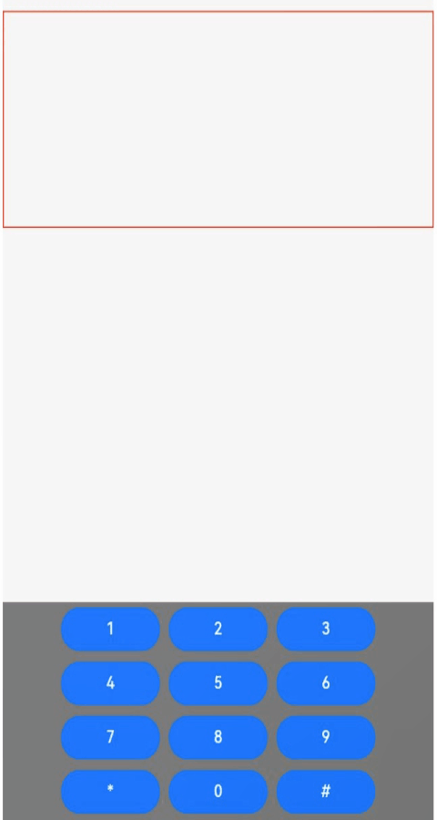
### Example 3
```ts
// xxx.ets
import { BusinessError, pasteboard } from '@kit.BasicServicesKit';
export interface SelectionMenuTheme {
imageSize: number;
buttonSize: number;
menuSpacing: number;
editorOptionMargin: number;
expandedOptionPadding: number;
defaultMenuWidth: number;
imageFillColor: Resource;
backGroundColor: Resource;
iconBorderRadius: Resource;
containerBorderRadius: Resource;
cutIcon: Resource;
copyIcon: Resource;
pasteIcon: Resource;
selectAllIcon: Resource;
shareIcon: Resource;
translateIcon: Resource;
searchIcon: Resource;
arrowDownIcon: Resource;
iconPanelShadowStyle: ShadowStyle;
iconFocusBorderColor: Resource;
}
export const defaultTheme: SelectionMenuTheme = {
imageSize: 24,
buttonSize: 48,
menuSpacing: 8,
editorOptionMargin: 1,
expandedOptionPadding: 3,
defaultMenuWidth: 256,
imageFillColor: $r('sys.color.ohos_id_color_primary'),
backGroundColor: $r('sys.color.ohos_id_color_dialog_bg'),
iconBorderRadius: $r('sys.float.ohos_id_corner_radius_default_m'),
containerBorderRadius: $r('sys.float.ohos_id_corner_radius_card'),
cutIcon: $r("sys.media.ohos_ic_public_cut"),
copyIcon: $r("sys.media.ohos_ic_public_copy"),
pasteIcon: $r("sys.media.ohos_ic_public_paste"),
selectAllIcon: $r("sys.media.ohos_ic_public_select_all"),
shareIcon: $r("sys.media.ohos_ic_public_share"),
translateIcon: $r("sys.media.ohos_ic_public_translate_c2e"),
searchIcon: $r("sys.media.ohos_ic_public_search_filled"),
arrowDownIcon: $r("sys.media.ohos_ic_public_arrow_down"),
iconPanelShadowStyle: ShadowStyle.OUTER_DEFAULT_MD,
iconFocusBorderColor: $r('sys.color.ohos_id_color_focused_outline'),
}
@Entry
@Component
struct SelectionMenu {
@State message: string = 'Hello World'
@State textSize: number = 40
@State sliderShow: boolean = false
@State start: number = -1
@State end: number = -1
@State colorTransparent: Color = Color.Transparent
controller: RichEditorController = new RichEditorController();
options: RichEditorOptions = { controller: this.controller }
private iconArr: Array =
[$r('app.media.icon'), $r("app.media.icon"), $r('app.media.icon'),
$r("app.media.icon"), $r('app.media.icon')]
@State iconBgColor: ResourceColor[] = new Array(this.iconArr.length).fill(this.colorTransparent)
@State pasteEnable: boolean = false
@State visibilityValue: Visibility = Visibility.Visible
@State textStyle: RichEditorTextStyle = {}
private fontWeightTable: string[] = ["100", "200", "300", "400", "500", "600", "700", "800", "900", "bold", "normal", "bolder", "lighter", "medium", "regular"]
private theme: SelectionMenuTheme = defaultTheme;
aboutToAppear() {
if (this.controller) {
let richEditorSelection = this.controller.getSelection()
if (richEditorSelection) {
let start = richEditorSelection.selection[0]
let end = richEditorSelection.selection[1]
if (start === 0 && this.controller.getSpans({ start: end + 1, end: end + 1 }).length === 0) {
this.visibilityValue = Visibility.None
} else {
this.visibilityValue = Visibility.Visible
}
}
}
let sysBoard = pasteboard.getSystemPasteboard()
if (sysBoard && sysBoard.hasDataSync()) {
this.pasteEnable = true
} else {
this.pasteEnable = false
}
}
build() {
Column() {
Column() {
RichEditor(this.options)
.onReady(() => {
this.controller.addTextSpan(this.message, { style: { fontColor: Color.Orange, fontSize: 30 } })
})
.onSelect((value: RichEditorSelection) => {
if (value.selection[0] == -1 && value.selection[1] == -1) {
return
}
this.start = value.selection[0]
this.end = value.selection[1]
})
.bindSelectionMenu(RichEditorSpanType.TEXT, this.panel, ResponseType.LongPress, { onDisappear: () => {
this.sliderShow = false
}})
.bindSelectionMenu(RichEditorSpanType.TEXT, this.panel, ResponseType.RightClick, { onDisappear: () => {
this.sliderShow = false
}})
.borderWidth(1)
.borderColor(Color.Red)
.width(200)
.height(200)
}.width('100%').backgroundColor(Color.White)
}.height('100%')
}
PushDataToPasteboard(richEditorSelection: RichEditorSelection) {
let sysBoard = pasteboard.getSystemPasteboard()
let pasteData = pasteboard.createData(pasteboard.MIMETYPE_TEXT_PLAIN, '')
if (richEditorSelection.spans && richEditorSelection.spans.length > 0) {
let count = richEditorSelection.spans.length
for (let i = count - 1; i >= 0; i--) {
let item = richEditorSelection.spans[i]
if ((item as RichEditorTextSpanResult)?.textStyle) {
let span = item as RichEditorTextSpanResult
let style = span.textStyle
let data = pasteboard.createRecord(pasteboard.MIMETYPE_TEXT_PLAIN, span.value.substring(span.offsetInSpan[0], span.offsetInSpan[1]))
let prop = pasteData.getProperty()
let temp: Record = {
'color': style.fontColor,
'size': style.fontSize,
'style': style.fontStyle,
'weight': this.fontWeightTable[style.fontWeight],
'fontFamily': style.fontFamily,
'decorationType': style.decoration.type,
'decorationColor': style.decoration.color
}
prop.additions[i] = temp;
pasteData.addRecord(data)
pasteData.setProperty(prop)
}
}
}
sysBoard.clearData()
sysBoard.setData(pasteData).then(() => {
console.info('SelectionMenu copy option, Succeeded in setting PasteData.');
this.pasteEnable = true;
}).catch((err: BusinessError) => {
console.error('SelectionMenu copy option, Failed to set PasteData. Cause:' + err.message);
})
}
PopDataFromPasteboard(richEditorSelection: RichEditorSelection) {
let start = richEditorSelection.selection[0]
let end = richEditorSelection.selection[1]
if (start == end && this.controller) {
start = this.controller.getCaretOffset()
end = this.controller.getCaretOffset()
}
let moveOffset = 0
let sysBoard = pasteboard.getSystemPasteboard()
sysBoard.getData((err, data) => {
if (err) {
return
}
let count = data.getRecordCount()
for (let i = 0; i < count; i++) {
const element = data.getRecord(i);
let tex: RichEditorTextStyle = {
fontSize: 16,
fontColor: Color.Black,
fontWeight: FontWeight.Normal,
fontFamily: "HarmonyOS Sans",
fontStyle: FontStyle.Normal,
decoration: { type: TextDecorationType.None, color: "#FF000000", style: TextDecorationStyle.SOLID }
}
if (data.getProperty() && data.getProperty().additions[i]) {
const tmp = data.getProperty().additions[i] as Record;
if (tmp.color) {
tex.fontColor = tmp.color as ResourceColor;
}
if (tmp.size) {
tex.fontSize = tmp.size as Length | number;
}
if (tmp.style) {
tex.fontStyle = tmp.style as FontStyle;
}
if (tmp.weight) {
tex.fontWeight = tmp.weight as number | FontWeight | string;
}
if (tmp.fontFamily) {
tex.fontFamily = tmp.fontFamily as ResourceStr;
}
if (tmp.decorationType && tex.decoration) {
tex.decoration.type = tmp.decorationType as TextDecorationType;
}
if (tmp.decorationColor && tex.decoration) {
tex.decoration.color = tmp.decorationColor as ResourceColor;
}
if (tex.decoration) {
tex.decoration = { type: tex.decoration.type, color: tex.decoration.color }
}
}
if (element && element.plainText && element.mimeType === pasteboard.MIMETYPE_TEXT_PLAIN && this.controller) {
this.controller.addTextSpan(element.plainText,
{
style: tex,
offset: start + moveOffset
}
)
moveOffset += element.plainText.length
}
}
if (this.controller) {
this.controller.setCaretOffset(start + moveOffset)
this.controller.closeSelectionMenu()
}
if (start != end && this.controller) {
this.controller.deleteSpans({ start: start + moveOffset, end: end + moveOffset })
}
})
}
@Builder
panel() {
Column() {
this.iconPanel()
if (!this.sliderShow) {
this.SystemMenu()
} else {
this.sliderPanel()
}
}.width(256)
}
@Builder iconPanel() {
Column() {
Row({ space: 2 }) {
ForEach(this.iconArr, (item:Resource, index ?: number) => {
Flex({ justifyContent: FlexAlign.Center, alignItems: ItemAlign.Center }) {
Image(item).fillColor(this.theme.imageFillColor).width(24).height(24).focusable(true).draggable(false)
}
.borderRadius(this.theme.iconBorderRadius)
.width(this.theme.buttonSize)
.height(this.theme.buttonSize)
.onClick(() => {
if (index as number == 0) {
this.sliderShow = false
if (this.controller) {
let selection = this.controller.getSelection();
let spans = selection.spans
spans.forEach((item: RichEditorTextSpanResult | RichEditorImageSpanResult, index) => {
if (typeof (item as RichEditorTextSpanResult)['textStyle'] != 'undefined') {
let span = item as RichEditorTextSpanResult
this.textStyle = span.textStyle
let start = span.offsetInSpan[0]
let end = span.offsetInSpan[1]
let offset = span.spanPosition.spanRange[0]
if (this.textStyle.fontWeight != 11) {
this.textStyle.fontWeight = FontWeight.Bolder
} else {
this.textStyle.fontWeight = FontWeight.Normal
}
this.controller.updateSpanStyle({
start: offset + start,
end: offset + end,
textStyle: this.textStyle
})
}
})
}
} else if (index as number == 1) {
this.sliderShow = false
if (this.controller) {
let selection = this.controller.getSelection();
let spans = selection.spans
spans.forEach((item: RichEditorTextSpanResult | RichEditorImageSpanResult, index) => {
if (typeof (item as RichEditorTextSpanResult)['textStyle'] != 'undefined') {
let span = item as RichEditorTextSpanResult
this.textStyle = span.textStyle
let start = span.offsetInSpan[0]
let end = span.offsetInSpan[1]
let offset = span.spanPosition.spanRange[0]
if (this.textStyle.fontStyle == FontStyle.Italic) {
this.textStyle.fontStyle = FontStyle.Normal
} else {
this.textStyle.fontStyle = FontStyle.Italic
}
this.controller.updateSpanStyle({
start: offset + start,
end: offset + end,
textStyle: this.textStyle
})
}
})
}
} else if (index as number == 2) {
this.sliderShow = false
if (this.controller) {
let selection = this.controller.getSelection();
let spans = selection.spans
spans.forEach((item: RichEditorTextSpanResult | RichEditorImageSpanResult, index) => {
if (typeof (item as RichEditorTextSpanResult)['textStyle'] != 'undefined') {
let span = item as RichEditorTextSpanResult
this.textStyle = span.textStyle
let start = span.offsetInSpan[0]
let end = span.offsetInSpan[1]
let offset = span.spanPosition.spanRange[0]
if (this.textStyle.decoration) {
if (this.textStyle.decoration.type == TextDecorationType.Underline) {
this.textStyle.decoration.type = TextDecorationType.None
} else {
this.textStyle.decoration.type = TextDecorationType.Underline
}
} else {
this.textStyle.decoration = { type: TextDecorationType.Underline, color: Color.Black, style: TextDecorationStyle.SOLID }
}
this.controller.updateSpanStyle({
start: offset + start,
end: offset + end,
textStyle: this.textStyle
})
}
})
}
} else if (index as number == 3) {
this.sliderShow = !this.sliderShow
} else if (index as number == 4) {
this.sliderShow = false
if (this.controller) {
let selection = this.controller.getSelection();
let spans = selection.spans
spans.forEach((item: RichEditorTextSpanResult | RichEditorImageSpanResult, index) => {
if (typeof (item as RichEditorTextSpanResult)['textStyle'] != 'undefined') {
let span = item as RichEditorTextSpanResult
this.textStyle = span.textStyle
let start = span.offsetInSpan[0]
let end = span.offsetInSpan[1]
let offset = span.spanPosition.spanRange[0]
if (this.textStyle.fontColor == Color.Orange || this.textStyle.fontColor == '#FFFFA500') {
this.textStyle.fontColor = Color.Black
} else {
this.textStyle.fontColor = Color.Orange
}
this.controller.updateSpanStyle({
start: offset + start,
end: offset + end,
textStyle: this.textStyle
})
}
})
}
}
})
.onTouch((event?: TouchEvent | undefined) => {
if(event != undefined){
if (event.type === TouchType.Down) {
this.iconBgColor[index as number] = $r('sys.color.ohos_id_color_click_effect')
}
if (event.type === TouchType.Up) {
this.iconBgColor[index as number] = this.colorTransparent
}
}
})
.onHover((isHover?: boolean, event?: HoverEvent) => {
this.iconBgColor.forEach((icon:ResourceColor, index1) => {
this.iconBgColor[index1] = this.colorTransparent
})
if(isHover != undefined) {
this.iconBgColor[index as number] = $r('sys.color.ohos_id_color_hover')
}
})
.backgroundColor(this.iconBgColor[index as number])
})
}
}
.clip(true)
.width(this.theme.defaultMenuWidth)
.padding(this.theme.expandedOptionPadding)
.borderRadius(this.theme.containerBorderRadius)
.margin({ bottom: this.theme.menuSpacing })
.backgroundColor(this.theme.backGroundColor)
.shadow(this.theme.iconPanelShadowStyle)
}
@Builder
SystemMenu() {
Column() {
Menu() {
if (this.controller) {
MenuItemGroup() {
MenuItem({ startIcon: this.theme.cutIcon, content: "Cut", labelInfo: "Ctrl+X" })
.onClick(() => {
if (!this.controller) {
return
}
let richEditorSelection = this.controller.getSelection()
this.PushDataToPasteboard(richEditorSelection);
this.controller.deleteSpans({
start: richEditorSelection.selection[0],
end: richEditorSelection.selection[1]
})
})
MenuItem({ startIcon: this.theme.copyIcon, content: "Copy", labelInfo: "Ctrl+C" })
.onClick(() => {
if (!this.controller) {
return
}
let richEditorSelection = this.controller.getSelection()
this.PushDataToPasteboard(richEditorSelection);
this.controller.closeSelectionMenu()
})
MenuItem({ startIcon: this.theme.pasteIcon, content: "Paste", labelInfo: "Ctrl+V" })
.enabled(this.pasteEnable)
.onClick(() => {
if (!this.controller) {
return
}
let richEditorSelection = this.controller.getSelection()
this.PopDataFromPasteboard(richEditorSelection)
})
MenuItem({ startIcon: this.theme.selectAllIcon, content: "Select all", labelInfo: "Ctrl+A" })
.visibility(this.visibilityValue)
.onClick(() => {
if (!this.controller) {
return
}
this.controller.setSelection(-1, -1)
this.visibilityValue = Visibility.None
})
MenuItem({ startIcon: this.theme.shareIcon, content: "Share", labelInfo: "" })
.enabled(false)
MenuItem({ startIcon: this.theme.translateIcon, content: "Translate", labelInfo: "" })
.enabled(false)
MenuItem({ startIcon: this.theme.searchIcon, content: "Search", labelInfo: "" })
.enabled(false)
}
}
}
.onVisibleAreaChange([0.0, 1.0], () => {
if (!this.controller) {
return
}
let richEditorSelection = this.controller.getSelection()
let start = richEditorSelection.selection[0]
let end = richEditorSelection.selection[1]
if (start === 0 && this.controller.getSpans({ start: end + 1, end: end + 1 }).length === 0) {
this.visibilityValue = Visibility.None
} else {
this.visibilityValue = Visibility.Visible
}
})
.radius(this.theme.containerBorderRadius)
.clip(true)
.backgroundColor(Color.White)
.width(this.theme.defaultMenuWidth)
}
.width(this.theme.defaultMenuWidth)
}
@Builder sliderPanel() {
Column() {
Flex({ justifyContent: FlexAlign.SpaceBetween, alignItems: ItemAlign.Center }) {
Text('A').fontSize(15)
Slider({ value: this.textSize, step: 10, style: SliderStyle.InSet })
.width(210)
.onChange((value: number, mode: SliderChangeMode) => {
if (this.controller) {
let selection = this.controller.getSelection();
if (mode == SliderChangeMode.End) {
if (this.textSize == undefined) {
this.textSize = 0
}
let spans = selection.spans
spans.forEach((item: RichEditorTextSpanResult | RichEditorImageSpanResult, index) => {
if (typeof (item as RichEditorTextSpanResult)['textStyle'] != 'undefined') {
this.textSize = Math.max(this.textSize, (item as RichEditorTextSpanResult).textStyle.fontSize)
}
})
}
if (mode == SliderChangeMode.Moving || mode == SliderChangeMode.Click) {
this.start = selection.selection[0]
this.end = selection.selection[1]
this.textSize = value
this.controller.updateSpanStyle({
start: this.start,
end: this.end,
textStyle: { fontSize: this.textSize }
})
}
}
})
Text('A').fontSize(20).fontWeight(FontWeight.Medium)
}.borderRadius(this.theme.containerBorderRadius)
}
.shadow(ShadowStyle.OUTER_DEFAULT_MD)
.backgroundColor(Color.White)
.borderRadius(this.theme.containerBorderRadius)
.padding(15)
.height(48)
}
}
```
> **NOTE**
>
> Icons in bold and italics are not preset in the system. The sample code uses the default icons. You need to replace the icons in **iconArr** with the desired icons.
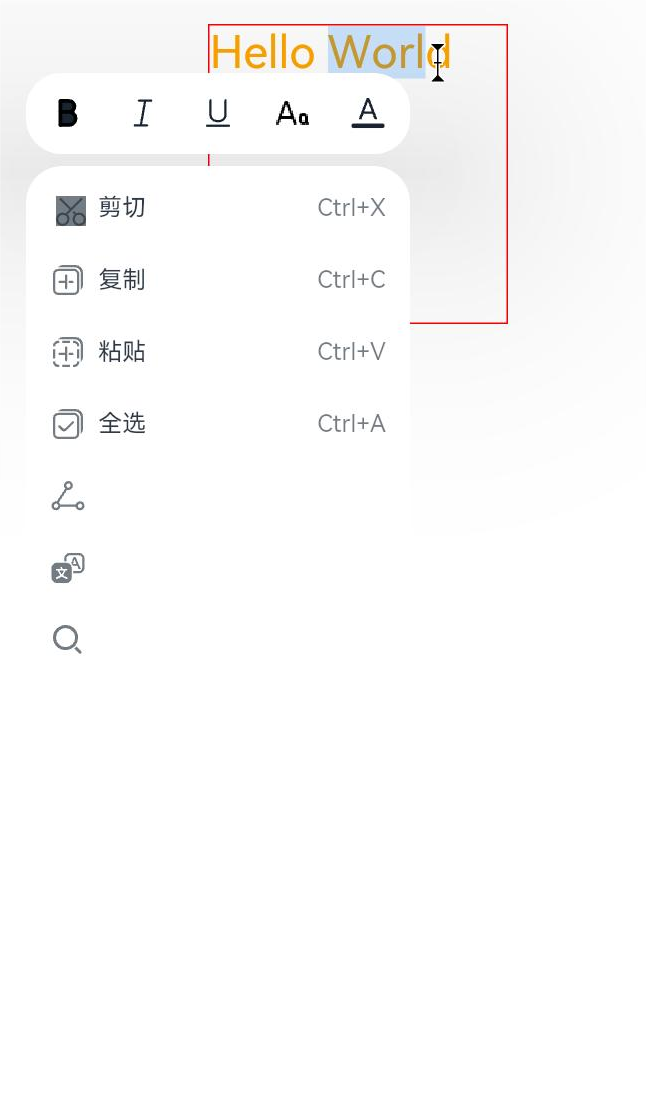
### Example 4
```ts
// xxx.ets
@Entry
@Component
struct Index {
controller: RichEditorController = new RichEditorController();
options: RichEditorOptions = { controller: this.controller };
private start: number = -1;
private end: number = -1;
@State message: string = "[-1, -1]"
@State content: string = ""
@State paddingVal: number = 5
@State borderRad: number = 4
build() {
Column() {
Column() {
Text("selection range:").width("100%")
Text() {
Span(this.message)
}.width("100%")
Text("selection content:").width("100%")
Text() {
Span(this.content)
}.width("100%")
}
.borderWidth(1)
.borderColor(Color.Red)
.width("100%")
.height("20%")
Row() {
Button("updateSpanStyle1")
.fontSize(12)
.onClick(() => {
this.controller.updateSpanStyle({
start: this.start,
textStyle:
{
fontWeight: FontWeight.Bolder
},
imageStyle: {
size: ["80px", "80px"],
layoutStyle: {
borderRadius: undefined,
margin: undefined
}
}
})
})
Button("updateSpanStyle2")
.fontSize(12)
.onClick(() => {
this.controller.updateSpanStyle({
start: this.start,
textStyle:
{
fontWeight: FontWeight.Bolder
},
imageStyle: {
size: ["70px", "70px"],
layoutStyle: {
borderRadius: { topLeft: '100px', topRight: '20px', bottomLeft: '100px', bottomRight: '20px' },
margin: { left: '30px', top: '20px', right: '20px', bottom: '20px' }
}
}
})
})
Button("updateSpanStyle3")
.fontSize(12)
.onClick(() => {
this.controller.updateSpanStyle({
start: this.start,
textStyle:
{
fontWeight: FontWeight.Bolder
},
imageStyle: {
size: ["60px", "60px"],
layoutStyle: {
borderRadius: '-10px',
margin: '-10px'
}
}
})
})
}
.borderWidth(1)
.borderColor(Color.Red)
.width("100%")
.height("10%")
Row() {
Button('addImageSpan1')
.fontSize(12)
.onClick(() => {
this.controller.addImageSpan($r('app.media.app_icon'), {
imageStyle: {
size: ["80px", "80px"],
layoutStyle: {
borderRadius: '50px',
margin: '40px'
}
}
})
})
Button('addImageSpan2')
.fontSize(12)
.onClick(() => {
this.controller.addImageSpan($r('app.media.app_icon'), {
imageStyle: {
size: ["100px", "100px"],
verticalAlign: ImageSpanAlignment.BOTTOM,
layoutStyle: {
borderRadius: undefined,
margin: undefined
}
}
})
})
Button('addImageSpan3')
.fontSize(12)
.onClick(() => {
this.controller.addImageSpan($r('app.media.app_icon'), {
imageStyle: {
size: ["60px", "60px"],
verticalAlign: ImageSpanAlignment.BOTTOM,
layoutStyle: {
borderRadius: { topLeft: '10px', topRight: '20px', bottomLeft: '30px', bottomRight: '40px' },
margin: { left: '10px', top: '20px', right: '30px', bottom: '40px' }
}
}
})
})
}
.borderWidth(1)
.borderColor(Color.Red)
.width("100%")
.height("10%")
Column() {
RichEditor(this.options)
.onReady(() => {
this.controller.addTextSpan("0123456789",
{
style:
{
fontColor: Color.Orange,
fontSize: 30
}
})
this.controller.addImageSpan($r("app.media.app_icon"),
{
imageStyle:
{
size: ["60px", "60px"],
verticalAlign: ImageSpanAlignment.BOTTOM,
layoutStyle: {
borderRadius: { topLeft: '10px', topRight: '20px', bottomLeft: '30px', bottomRight: '40px' },
margin: { left: '10px', top: '20px', right: '30px', bottom: '40px' }
}
}
})
this.controller.addTextSpan("0123456789",
{
style:
{
fontColor: Color.Black,
fontSize: 30
}
})
})
.onSelect((value: RichEditorSelection) => {
this.start = value.selection[0];
this.end = value.selection[1];
this.message = "[" + this.start + ", " + this.end + "]"
})
.aboutToIMEInput((value: RichEditorInsertValue) => {
console.log("---------------------- aboutToIMEInput ----------------------")
console.log("insertOffset:" + value.insertOffset)
console.log("insertValue:" + value.insertValue)
return true;
})
.onIMEInputComplete((value: RichEditorTextSpanResult) => {
console.log("---------------------- onIMEInputComplete ---------------------")
console.log("spanIndex:" + value.spanPosition.spanIndex)
console.log("spanRange:[" + value.spanPosition.spanRange[0] + "," + value.spanPosition.spanRange[1] + "]")
console.log("offsetInSpan:[" + value.offsetInSpan[0] + "," + value.offsetInSpan[1] + "]")
console.log("value:" + value.value)
})
.aboutToDelete((value: RichEditorDeleteValue) => {
console.log("---------------------- aboutToDelete --------------------------")
console.log("offset:" + value.offset)
console.log("direction:" + value.direction)
console.log("length:" + value.length)
value.richEditorDeleteSpans.forEach(item => {
console.log("---------------------- item --------------------------")
console.log("spanIndex:" + item.spanPosition.spanIndex)
console.log("spanRange:[" + item.spanPosition.spanRange[0] + "," + item.spanPosition.spanRange[1] + "]")
console.log("offsetInSpan:[" + item.offsetInSpan[0] + "," + item.offsetInSpan[1] + "]")
if (typeof (item as RichEditorImageSpanResult)['imageStyle'] != 'undefined') {
console.log("image:" + (item as RichEditorImageSpanResult).valueResourceStr)
} else {
console.log("text:" + (item as RichEditorTextSpanResult).value)
}
})
return true;
})
.onDeleteComplete(() => {
console.log("---------------------- onDeleteComplete ------------------------")
})
.borderWidth(1)
.borderColor(Color.Green)
.width("100%")
.height('80.00%')
}
.borderWidth(1)
.borderColor(Color.Red)
.width("100%")
.height("70%")
}
}
}
```

### Example 5
```ts
// xxx.ets
@Entry
@Component
struct Index {
controller: RichEditorController = new RichEditorController()
options: RichEditorOptions = { controller: this.controller };
@State textFlag: string = "TextFlag";
build() {
Column() {
Column() {
Text(this.textFlag)
.copyOption(CopyOptions.InApp)
.fontSize(50)
}
Divider()
Column() {
RichEditor(this.options)
.onReady(() => {
this.controller.addTextSpan('Area1\n', {
style:
{
fontColor: Color.Orange,
fontSize: 50
},
gesture:
{
onClick: () => {
this.textFlag = "Area1 is onClick."
},
onLongPress: () => {
this.textFlag = "Area1 is onLongPress."
}
}
})
this.controller.addTextSpan('Area2\n', {
style:
{
fontColor: Color.Blue,
fontSize: 50
},
gesture:
{
onClick: () => {
this.textFlag = "Area2 is onClick."
},
onLongPress: () => {
this.textFlag = "Area2 is onLongPress."
}
}
})
this.controller.addImageSpan($r("app.media.icon"),
{
imageStyle:
{
size: ["100px", "100px"],
layoutStyle: {
margin: 5,
borderRadius: 15
}
},
gesture:
{
onClick: () => {
this.textFlag = "ImageSpan is onClick."
},
onLongPress: () => {
this.textFlag = "ImageSpan is onLongPress."
}
}
})
})
}
.borderWidth(1)
.borderColor(Color.Red)
.width("100%")
.height("70%")
}
}
}
```

### Example 6
```ts
// xxx.ets
@Entry
@Component
struct Index {
controller: RichEditorController = new RichEditorController();
private spanParagraphs: RichEditorParagraphResult[] = [];
build() {
Column() {
RichEditor({ controller: this.controller })
.onReady(() => {
this.controller.addTextSpan("0123456789\n", {
style: {
fontColor: Color.Pink,
fontSize: "32",
},
paragraphStyle: {
textAlign: TextAlign.Start,
leadingMargin: 16
}
})
this.controller.addTextSpan("0123456789")
})
.width("80%")
.height("30%")
.border({ width: 1, radius: 5 })
.draggable(false)
Column({ space: 5 }) {
Button("Align Left").onClick(() => {
this.controller.updateParagraphStyle({ start: -1, end: -1,
style: {
textAlign: TextAlign.Start,
}
})
})
Button("Align Right").onClick(() => {
this.controller.updateParagraphStyle({ start: -1, end: -1,
style: {
textAlign: TextAlign.End,
}
})
})
Button("Center").onClick(() => {
this.controller.updateParagraphStyle({ start: -1, end: -1,
style: {
textAlign: TextAlign.Center,
}
})
})
Divider()
Button("getParagraphs").onClick(() => {
this.spanParagraphs = this.controller.getParagraphs({ start: -1, end: -1 })
console.log("RichEditor getParagraphs:" + JSON.stringify(this.spanParagraphs))
})
Button("UpdateSpanStyle1").onClick(() => {
this.controller.updateSpanStyle({ start: -1, end: -1,
textStyle: {
fontColor: Color.Brown,
fontSize: 20
}
})
})
Button("UpdateSpanStyle2").onClick(() => {
this.controller.updateSpanStyle({ start: -1, end: -1,
textStyle: {
fontColor: Color.Green,
fontSize: 30
}
})
})
}
}
}
}
```

### Example 7
```ts
// xxx.ets
import { font } from '@kit.ArkUI'
const canvasWidth = 1000
const canvasHeight = 100
const Indentation = 40
class LeadingMarginCreator {
private settings: RenderingContextSettings = new RenderingContextSettings(true)
private offscreenCanvas: OffscreenCanvas = new OffscreenCanvas(canvasWidth, canvasHeight)
private offContext: OffscreenCanvasRenderingContext2D = this.offscreenCanvas.getContext("2d", this.settings)
public static instance: LeadingMarginCreator = new LeadingMarginCreator()
// Obtain the font size level, which ranges from 0 to 4.
public getFontSizeLevel(fontSize: number) {
const fontScaled: number = Number(fontSize) / 16
enum FontSizeScaleThreshold {
SMALL = 0.9,
NORMAL = 1.1,
LEVEL_1_LARGE = 1.2,
LEVEL_2_LARGE = 1.4,
LEVEL_3_LARGE = 1.5
}
let fontSizeLevel: number = 1
if (fontScaled < FontSizeScaleThreshold.SMALL) {
fontSizeLevel = 0
} else if (fontScaled < FontSizeScaleThreshold.NORMAL) {
fontSizeLevel = 1
} else if (fontScaled < FontSizeScaleThreshold.LEVEL_1_LARGE) {
fontSizeLevel = 2
} else if (fontScaled < FontSizeScaleThreshold.LEVEL_2_LARGE) {
fontSizeLevel = 3
} else if (fontScaled < FontSizeScaleThreshold.LEVEL_3_LARGE) {
fontSizeLevel = 4
} else {
fontSizeLevel = 1
}
return fontSizeLevel
}
// Obtain the font size level, which ranges from 0 to 4.
public getmarginLevel(Width: number) {
let marginlevel: number = 1
if (Width == 40) {
marginlevel = 2.0
} else if (Width == 80) {
marginlevel = 1.0
} else if (Width == 120) {
marginlevel = 2/3
} else if (Width == 160) {
marginlevel = 0.5
} else if (Width == 200) {
marginlevel = 0.4
}
return marginlevel
}
public genStrMark(fontSize: number, str: string): PixelMap {
this.offContext = this.offscreenCanvas.getContext("2d", this.settings)
this.clearCanvas()
this.offContext.font = fontSize + 'vp sans-serif'
this.offContext.fillText(str + '.', 0, fontSize * 0.9)
return this.offContext.getPixelMap(0, 0, fontSize * (str.length + 1) / 1.75, fontSize)
}
public genSquareMark(fontSize: number): PixelMap {
this.offContext = this.offscreenCanvas.getContext("2d", this.settings)
this.clearCanvas()
const coordinate = fontSize * (1 - 1 / 1.5) / 2
const sideLength = fontSize / 1.5
this.offContext.fillRect(coordinate, coordinate, sideLength, sideLength)
return this.offContext.getPixelMap(0, 0, fontSize, fontSize)
}
// Generate a circle symbol.
public genCircleMark(fontSize: number, width: number, level?: number ): PixelMap {
const indentLevel = level ?? 1
const offsetLevel = [22, 28, 32, 34, 38]
const fontSizeLevel = this.getFontSizeLevel(fontSize)
const marginlevel = this.getmarginLevel(width)
const newCanvas = new OffscreenCanvas(canvasWidth, canvasHeight)
const newOffContext: OffscreenCanvasRenderingContext2D = newCanvas.getContext("2d", this.settings)
const centerCoordinate = 50
const radius = 10
this.clearCanvas()
newOffContext.ellipse(100 * (indentLevel + 1) - centerCoordinate * marginlevel, offsetLevel[fontSizeLevel], radius * marginlevel, radius, 0, 0, 2 * Math.PI)
newOffContext.fillStyle = '66FF0000'
newOffContext.fill()
return newOffContext.getPixelMap(0, 0, 100 + 100 * indentLevel, 100)
}
private clearCanvas() {
this.offContext.clearRect(0, 0, canvasWidth, canvasHeight)
}
}
@Entry
@Component
struct Index {
controller: RichEditorController = new RichEditorController()
options: RichEditorOptions = { controller: this.controller }
private leadingMarkCreatorInstance = LeadingMarginCreator.instance
private fontNameRawFile: string = 'MiSans-Bold'
@State fs: number = 30
@State cl: number = Color.Black
private leftMargin: Dimension = 0
private richEditorTextStyle: RichEditorTextStyle = {}
aboutToAppear() {
font.registerFont({
familyName: 'MiSans-Bold',
familySrc: '/font/MiSans-Bold.ttf'
})
}
build() {
Scroll() {
Column() {
RichEditor(this.options)
.onReady(() => {
this.controller.addTextSpan("0123456789\n",
{
style:
{
fontWeight: 'medium',
fontFamily: this.fontNameRawFile,
fontColor: Color.Red,
fontSize: 50,
fontStyle: FontStyle.Italic,
decoration: { type: TextDecorationType.Underline, color: Color.Green }
}
})
this.controller.addTextSpan("abcdefg",
{
style:
{
fontWeight: FontWeight.Lighter,
fontFamily: 'HarmonyOS Sans',
fontColor: 'rgba(0,128,0,0.5)',
fontSize: 30,
fontStyle: FontStyle.Normal,
decoration: { type: TextDecorationType.Overline, color: 'rgba(169, 26, 246, 0.50)' }
}
})
})
.borderWidth(1)
.borderColor(Color.Green)
.width("100%")
.height("50%")
Row({ space: 5 }) {
Button('setTypingStyle1')
.fontSize(10)
.onClick(() => {
this.controller.setTypingStyle(
{
fontWeight: 'medium',
fontFamily: this.fontNameRawFile,
fontColor: Color.Blue,
fontSize: 50,
fontStyle: FontStyle.Italic,
decoration: { type: TextDecorationType.Underline, color: Color.Green }
})
})
Button('setTypingStyle2')
.fontSize(10)
.onClick(() => {
this.controller.setTypingStyle(
{
fontWeight: FontWeight.Lighter,
fontFamily: 'HarmonyOS Sans',
fontColor: Color.Green,
fontSize: '30',
fontStyle: FontStyle.Normal,
decoration: { type: TextDecorationType.Overline, color: 'rgba(169, 26, 246, 0.50)' }
})
})
}
Divider()
Button("getTypingStyle").onClick(() => {
this.richEditorTextStyle = this.controller.getTypingStyle()
console.log("RichEditor getTypingStyle:" + JSON.stringify(this.richEditorTextStyle))
})
Divider()
Row({ space: 5 }) {
Button("Increase Bullet Indent").onClick(() => {
let margin = Number(this.leftMargin)
if (margin < 200) {
margin += Indentation
this.leftMargin = margin
}
this.controller.updateParagraphStyle({
start: -10,
end: -10,
style: {
leadingMargin : {
pixelMap : this.leadingMarkCreatorInstance.genCircleMark(100, margin, 1),
size: [margin, 40]
}
}
})
})
Button("Decrease Bullet Indent").onClick(() => {
let margin = Number(this.leftMargin)
if (margin > 0) {
margin -= Indentation
this.leftMargin = margin
}
this.controller.updateParagraphStyle({
start: -10,
end: -10,
style: {
leadingMargin : {
pixelMap : this.leadingMarkCreatorInstance.genCircleMark(100, margin, 1),
size: [margin, 40]
}
}
})
})
}
Divider()
Row({ space: 5 }) {
Button("Increase Indent").onClick(() => {
let margin = Number(this.leftMargin)
if (margin < 200) {
margin += Indentation
this.leftMargin = margin
}
this.controller.updateParagraphStyle({
start: -10,
end: -10,
style: {
leadingMargin: margin
}
})
})
Button("Decrease Indent").onClick(() => {
let margin = Number(this.leftMargin)
if (margin > 0) {
margin -= Indentation
this.leftMargin = margin
}
this.controller.updateParagraphStyle({
start: -10,
end: -10,
style: {
leadingMargin: margin
}
})
})
}
}.borderWidth(1).borderColor(Color.Red)
}
}
}
```
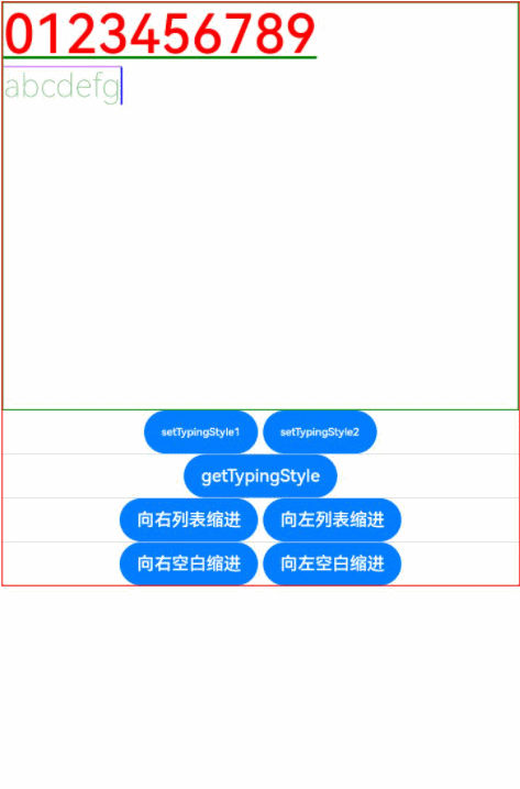
### Example 8
``` ts
@Entry
@Component
struct Index {
controller: RichEditorController = new RichEditorController();
options: RichEditorOptions = { controller: this.controller };
private start: number = -1;
private end: number = -1;
@State message: string = "[-1, -1]"
@State content: string = ""
@State visable :number = 0;
@State index:number = 0;
@State offsetx: number = 0;
@State textShadows : (ShadowOptions | Array ) =
[{ radius: 10, color: Color.Red, offsetX: 10, offsetY: 0 },{ radius: 10, color: Color.Black, offsetX: 20, offsetY: 0 },
{ radius: 10, color: Color.Brown, offsetX: 30, offsetY: 0 },{ radius: 10, color: Color.Green, offsetX: 40, offsetY: 0 },
{ radius: 10, color: Color.Yellow, offsetX: 100, offsetY: 0 }]
@State textshadowOf : ShadowOptions[] = []
build() {
Column() {
Column() {
Text("selection range:").width("100%")
Text() {
Span(this.message)
}.width("100%")
Text("selection content:").width("100%")
Text() {
Span(this.content)
}.width("100%")
}
.borderWidth(1)
.borderColor(Color.Red)
.width("100%")
.height("20%")
Row() {
Button("Update Style: Bold & Text Shadow").onClick(() => {
this.controller.updateSpanStyle({
start: this.start,
end: this.end,
textStyle:
{
fontWeight: FontWeight.Bolder,
textShadow: this.textShadows
}
})
})
}
.borderWidth(1)
.borderColor(Color.Red)
.width("100%")
.height("10%")
Column() {
RichEditor(this.options)
.onReady(() => {
this.controller.addTextSpan("0123456789",
{
style:
{
fontColor: Color.Orange,
fontSize: 30,
textShadow: { radius: 10, color: Color.Blue, offsetX: 10, offsetY: 0 }
}
})
})
.borderWidth(1)
.borderColor(Color.Green)
.width("100%")
.height("30%")
}
.borderWidth(1)
.borderColor(Color.Red)
.width("100%")
.height("70%")
}
}
}
```
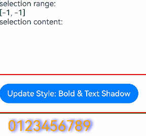
### Example 9
``` ts
@Builder
function placeholderBuilder2() {
Row({ space: 2 }) {
Image($r("app.media.icon")).width(24).height(24).margin({ left: -5 })
Text('okokokok').fontSize(10)
}.width('20%').height(50).padding(10).backgroundColor(Color.Red)
}
// xxx.ets
@Entry
@Component
struct Index {
controller: RichEditorController = new RichEditorController();
option: RichEditorOptions = { controller: this.controller };
private start: number = 2;
private end: number = 4;
@State message: string = "[-1, -1]"
@State content: string = ""
private my_offset: number | undefined = undefined
private my_builder: CustomBuilder = undefined
@BuilderParam my_builder2:() => void = placeholderBuilder2;
@Builder
placeholderBuilder() {
Row({ space: 2 }) {
Image($r("app.media.icon")).width(24).height(24).margin({ left: -5 })
Text('Custom Popup').fontSize(10)
}.width(100).height(50).padding(5)
}
@Builder
placeholderBuilder3() {
Text("hello").padding('20').borderWidth(1).width('100%')
}
@Builder
placeholderBuilder4() {
Column() {
Column({ space: 5 }) {
Text('direction:Row').fontSize(9).fontColor(0xCCCCCC).width('90%')
Flex({ direction: FlexDirection.Row }) { // The child components are arranged in the same direction as the main axis runs along the rows.
Text('1').width('20%').height(50).backgroundColor(0xF5DEB3)
Text('1').width('20%').height(50).backgroundColor(0xD2B48C)
Text('1').width('20%').height(50).backgroundColor(0xF5DEB3)
Text('1').width('20%').height(50).backgroundColor(0xD2B48C)
}
.height(70)
.width('90%')
.padding(10)
.backgroundColor(0xAFEEEE)
Text('direction:RowReverse').fontSize(9).fontColor(0xCCCCCC).width('90%')
Flex({ direction: FlexDirection.RowReverse }) { // The child components are arranged opposite to the Row direction.
Text('1').width('20%').height(50).backgroundColor(0xF5DEB3)
Text('1').width('20%').height(50).backgroundColor(0xD2B48C)
Text('1').width('20%').height(50).backgroundColor(0xF5DEB3)
Text('1').width('20%').height(50).backgroundColor(0xD2B48C)
}
.height(70)
.width('90%')
.padding(10)
.backgroundColor(0xAFEEEE)
Text('direction:Column').fontSize(9).fontColor(0xCCCCCC).width('90%')
Flex({ direction: FlexDirection.Column }) { // The child components are arranged in the same direction as the main axis runs down the columns.
Text('1').width('20%').height(40).backgroundColor(0xF5DEB3)
Text('1').width('20%').height(40).backgroundColor(0xD2B48C)
Text('1').width('20%').height(40).backgroundColor(0xF5DEB3)
Text('1').width('20%').height(40).backgroundColor(0xD2B48C)
}
.height(160)
.width('90%')
.padding(10)
.backgroundColor(0xAFEEEE)
Text('direction:ColumnReverse').fontSize(9).fontColor(0xCCCCCC).width('90%')
Flex({ direction: FlexDirection.ColumnReverse }) { // The child components are arranged opposite to the Column direction.
Text('1').width('20%').height(40).backgroundColor(0xF5DEB3)
Text('1').width('20%').height(40).backgroundColor(0xD2B48C)
Text('1').width('20%').height(40).backgroundColor(0xF5DEB3)
Text('1').width('20%').height(40).backgroundColor(0xD2B48C)
}
.height(160)
.width('90%')
.padding(10)
.backgroundColor(0xAFEEEE)
}.width('100%').margin({ top: 5 })
}.width('100%')
}
@Builder
MyMenu() {
Menu() {
MenuItem({ startIcon: $r("app.media.icon"), content: "Menu option 1" })
MenuItem({ startIcon: $r("app.media.icon"), content: "Menu option 2" })
.enabled(false)
}
}
build() {
Column() {
Column() {
Text("selection range:").width("100%")
Text() {
Span(this.message)
}.width("100%")
Text("selection content:").width("100%")
Text() {
Span(this.content)
}.width("100%")
}
.borderWidth(1)
.borderColor(Color.Red)
.width("100%")
.height("20%")
Row() {
Button("Get Span Info").onClick(() => {
console.info('getSpans='+JSON.stringify(this.controller.getSpans({ start:1, end:5 })))
console.info('getParagraphs='+JSON.stringify(this.controller.getParagraphs({ start:1, end:5 })))
this.content = ""
this.controller.getSpans({
start: this.start,
end: this.end
}).forEach(item => {
if (typeof (item as RichEditorImageSpanResult)['imageStyle'] != 'undefined') {
if ((item as RichEditorImageSpanResult).valueResourceStr == "") {
console.info("builder span index " + (item as RichEditorImageSpanResult).spanPosition.spanIndex + ", range : " + (item as RichEditorImageSpanResult).offsetInSpan[0] + ", " +
(item as RichEditorImageSpanResult).offsetInSpan[1] + ", size : " + (item as RichEditorImageSpanResult).imageStyle[0] + ", " + (item as RichEditorImageSpanResult).imageStyle[1])
} else {
console.info("image span " + (item as RichEditorImageSpanResult).valueResourceStr + ", index : " + (item as RichEditorImageSpanResult).spanPosition.spanIndex + ", range: " +
(item as RichEditorImageSpanResult).offsetInSpan[0] + ", " + (item as RichEditorImageSpanResult).offsetInSpan[1] + ", size : " +
(item as RichEditorImageSpanResult).imageStyle.size[0] + ", " + (item as RichEditorImageSpanResult).imageStyle.size[1])
}
} else {
this.content += (item as RichEditorTextSpanResult).value;
this.content += "\n"
console.info("text span: " + (item as RichEditorTextSpanResult).value)
}
})
})
Button("Get Selection").onClick(() => {
this.content = "";
let select = this.controller.getSelection()
console.info("selection start " + select.selection[0] + " end " + select.selection[1])
select.spans.forEach(item => {
if (typeof (item as RichEditorImageSpanResult)['imageStyle'] != 'undefined') {
if ((item as RichEditorImageSpanResult).valueResourceStr == "") {
console.info("builder span index " + (item as RichEditorImageSpanResult).spanPosition.spanIndex + ", range : " + (item as RichEditorImageSpanResult).offsetInSpan[0] + ", " +
(item as RichEditorImageSpanResult).offsetInSpan[1] + ", size : " + (item as RichEditorImageSpanResult).imageStyle[0] + ", " + (item as RichEditorImageSpanResult).imageStyle[1])
} else {
console.info("image span " + (item as RichEditorImageSpanResult).valueResourceStr + ", index : " + (item as RichEditorImageSpanResult).spanPosition.spanIndex + ", range: " +
(item as RichEditorImageSpanResult).offsetInSpan[0] + ", " + (item as RichEditorImageSpanResult).offsetInSpan[1] + ", size : " +
(item as RichEditorImageSpanResult).imageStyle.size[0] + ", " + (item as RichEditorImageSpanResult).imageStyle.size[1])
}
} else {
this.content += (item as RichEditorTextSpanResult).value;
this.content += "\n"
console.info("text span: " + (item as RichEditorTextSpanResult).value)
}
})
})
Button("Delete Selection").onClick(() => {
this.controller.deleteSpans({
start: this.start,
end: this.end
})
})
}
.borderWidth(1)
.borderColor(Color.Red)
.width("100%")
.height("10%")
Column() {
RichEditor(this.option)
.onReady(() => {
this.controller.addTextSpan("0123456789",
{
style:
{
fontColor: Color.Orange,
fontSize: 30
}
})
this.controller.addImageSpan($r("app.media.icon"),
{
imageStyle:
{
size: ["57px", "57px"]
}
})
})
.onSelect((value: RichEditorSelection) => {
this.start = value.selection[0];
this.end = value.selection[1];
this.message = "[" + this.start + ", " + this.end + "]"
console.info("onSelect="+JSON.stringify(value))
})
.aboutToIMEInput((value: RichEditorInsertValue) => {
console.log("---------------------- aboutToIMEInput --------------------")
console.info("aboutToIMEInput="+JSON.stringify(value))
console.log("insertOffset:" + value.insertOffset)
console.log("insertValue:" + value.insertValue)
return true;
})
.onIMEInputComplete((value: RichEditorTextSpanResult) => {
console.log("---------------------- onIMEInputComplete --------------------")
console.info("onIMEInputComplete="+JSON.stringify(value))
console.log("spanIndex:" + value.spanPosition.spanIndex)
console.log("spanRange:[" + value.spanPosition.spanRange[0] + "," + value.spanPosition.spanRange[1] + "]")
console.log("offsetInSpan:[" + value.offsetInSpan[0] + "," + value.offsetInSpan[1] + "]")
console.log("value:" + value.value)
})
.aboutToDelete((value: RichEditorDeleteValue) => {
value.richEditorDeleteSpans.forEach(item => {
console.log("---------------------- item --------------------")
console.info("spanIndex=" + item.spanPosition.spanIndex)
console.log("spanRange:[" + item.spanPosition.spanRange[0] + "," + item.spanPosition.spanRange[1] + "]")
console.log("offsetInSpan:[" + item.offsetInSpan[0] + "," + item.offsetInSpan[1] + "]")
if (typeof (item as RichEditorImageSpanResult)['imageStyle'] != 'undefined') {
if ((item as RichEditorImageSpanResult).valueResourceStr == "") {
console.info("builder span index " + (item as RichEditorImageSpanResult).spanPosition.spanIndex + ", range : " + (item as RichEditorImageSpanResult).offsetInSpan[0] + ", " +
(item as RichEditorImageSpanResult).offsetInSpan[1] + ", size : " + (item as RichEditorImageSpanResult).imageStyle[0] + ", " + (item as RichEditorImageSpanResult).imageStyle[1])
} else {
console.info("image span " + (item as RichEditorImageSpanResult).valueResourceStr + ", index : " + (item as RichEditorImageSpanResult).spanPosition.spanIndex + ", range: " +
(item as RichEditorImageSpanResult).offsetInSpan[0] + ", " + (item as RichEditorImageSpanResult).offsetInSpan[1] + ", size : " +
(item as RichEditorImageSpanResult).imageStyle.size[0] + ", " + (item as RichEditorImageSpanResult).imageStyle.size[1])
}
} else {
console.info("delete text: " + (item as RichEditorTextSpanResult).value)
}
})
return true;
})
.borderWidth(1)
.borderColor(Color.Green)
.width("100%")
.height("30%")
Button("add span")
.onClick(() => {
let num = this.controller.addBuilderSpan(this.my_builder, { offset: this.my_offset })
console.info('addBuilderSpan return ' + num)
})
Button("add image")
.onClick(() => {
let num = this.controller.addImageSpan($r("app.media.icon"), {
imageStyle: {
size: ["50px", "50px"],
verticalAlign: ImageSpanAlignment.BOTTOM,
layoutStyle: {
borderRadius: undefined,
margin: undefined
}
}
})
console.info('addImageSpan return' + num)
})
Row() {
Button('builder1').onClick(() => {
this.my_builder = () => {
this.placeholderBuilder()
}
})
Button('builder2').onClick(() => {
this.my_builder = () => {
this.my_builder2()
}
})
Button('builder3').onClick(() => {
this.my_builder = () => {
this.placeholderBuilder3()
}
})
Button('builder4').onClick(() => {
this.my_builder = () => {
this.placeholderBuilder4()
}
})
}
}
.borderWidth(1)
.borderColor(Color.Red)
.width("100%")
.height("70%")
}
}
}
```

### Example 10
Example of using **enableDataDetector** and **dataDetectorConfig**
```ts
@Entry
@Component
struct TextExample7 {
controller: RichEditorController = new RichEditorController();
options: RichEditorOptions = { controller: this.controller };
@State phoneNumber: string = '(86) (755) ********';
@State url: string = 'www.********.com';
@State email: string = '***@example.com';
@State address: string = 'Street A, city B, state C';
@State enableDataDetector: boolean = true;
@State enablePreviewText: boolean = false;
@State types: TextDataDetectorType[] = [];
build() {
Row() {
Column() {
RichEditor(this.options)
.onReady(() => {
this.controller.addTextSpan('Phone number:' + this.phoneNumber + '\n',
{
style:
{
fontSize: 30
}
})
this.controller.addTextSpan('URL:' + this.url + '\n',
{
style:
{
fontSize: 30
}
})
this.controller.addTextSpan('Email:' + this.email + '\n',
{
style:
{
fontSize: 30
}
})
this.controller.addTextSpan('Address:' + this.address,
{
style:
{
fontSize: 30
}
})
})
.copyOptions(CopyOptions.InApp)
.enableDataDetector(this.enableDataDetector)
.dataDetectorConfig({types : this.types, onDetectResultUpdate: (result: string)=>{}})
.enablePreviewText(this.enablePreviewText)
.borderWidth(1)
.padding(10)
.width('100%')
}
.width('100%')
}
}
}
```
### Example 11
This example shows how to use **caretColor** and **selectedBackgroundColor**.
``` ts
@Entry
@Component
struct RichEditorDemo {
@State color: Color|string = ""
controller: RichEditorController = new RichEditorController();
build() {
Column() {
Row(){
Button("Change to Red").onClick(() => {
this.color = Color.Red
})
}.margin({top:50})
RichEditor({ controller: this.controller })
.onReady(()=>{
this.controller.addTextSpan('This is for testing')
})
.width("100%")
.border({ width: 1, radius: 5 })
.key('RichEditor')
.caretColor(this.color) // Caret color
.selectedBackgroundColor(this.color) // Background color of the selected content.
.margin({top:50})
}
.width('100%')
}
}
```

### Example 12
This example shows the usage of **lineHeight** and **letterSpacing**.
```ts
@Entry
@Component
struct RichEditorDemo03 {
controller: RichEditorController = new RichEditorController();
options: RichEditorOptions = { controller: this.controller };
@State start: number = -1;
@State end: number = -1;
@State LH:number = 50
@State LS:number = 20
build() {
Column() {
Scroll(){
Column(){
Row() {
Button("Line Height ++").onClick(()=>{
this.LH = this.LH + 5
this.controller.updateSpanStyle({
start: this.start,
end: this.end,
textStyle:
{
lineHeight: this.LH
}
})
})
Button("Line Height --").onClick(()=>{
this.LH = this.LH - 5
this.controller.updateSpanStyle({
start: this.start,
end: this.end,
textStyle:
{
lineHeight: this.LH
}
})
})
Button("Letter Spacing ++").onClick(()=>{
this.LS = this.LS + 5
this.controller.updateSpanStyle({
start: this.start,
end: this.end,
textStyle:
{
letterSpacing: this.LS
}
})
})
Button("Letter Spacing --").onClick(()=>{
this.LS = this.LS - 5
this.controller.updateSpanStyle({
start: this.start,
end: this.end,
textStyle:
{
letterSpacing: this.LS
}
})
})
}
}
}.borderWidth(1)
.borderColor(Color.Red)
.width("100%")
.height("20%")
.margin({top: 20})
Scroll(){
Column() {
Text("LineHeight:" + this.LH).width("100%")
Text("LetterSpacing:" + this.LS).width("100%")
}
}
.borderWidth(1)
.borderColor(Color.Red)
.width("100%")
.height("20%")
.margin({bottom: 20})
Column() {
RichEditor(this.options).clip(true).padding(10)
.onReady(() => {
this.controller.addTextSpan("012345",
{
style:
{
fontColor: Color.Orange,
fontSize: 30,
lineHeight: this.LH,
letterSpacing: this.LS
}
})
this.controller.addTextSpan("6789",
{
style:
{
fontColor: Color.Black,
fontSize: 30,
lineHeight: this.LH,
letterSpacing: this.LS
}
})
})
.borderWidth(1)
.borderColor(Color.Green)
.width(400)
.height(400)
}
.borderWidth(1)
.borderColor(Color.Red)
.width("100%")
.height("60%")
}
}
}
```

### Example 13
This example shows the usage of **preventDefault**.
```ts
@Entry
@Component
struct RichEditorDemo {
controller: RichEditorController = new RichEditorController();
options: RichEditorOptions = { controller: this.controller };
build() {
Column({ space: 2 }) {
RichEditor(this.options)
.onReady(() => {
this.controller.addTextSpan('RichEditor preventDefault')
})
.onPaste((event?: PasteEvent) => {
if (event != undefined && event.preventDefault) {
event.preventDefault();
}
})
.borderWidth(1)
.borderColor(Color.Green)
.width('100%')
.height('40%')
}
}
}
```
### Example 14
This example sets the **FontFeature** attribute to **ss01**, which changes the digit "0" from its original oval shape to a shape with rounded corners.
```ts
@Entry
@Component
struct RichEditorExample {
controller: RichEditorController = new RichEditorController();
options: RichEditorOptions = { controller: this.controller };
@State enableDataDetector: boolean = true;
@State types: TextDataDetectorType[] = [];
build() {
Row() {
Column() {
RichEditor(this.options)
.onReady(() => {
this.controller.addTextSpan('This is ss01 off :' + '0000' + '\n',
{
style:
{
fontSize: 30
}
})
this.controller.addTextSpan('This is ss01 on :' + '0000' + '\n',
{
style:
{
fontSize: 30,
fontFeature: "\"ss01\" 1"
}
})
})
.copyOptions(CopyOptions.InApp)
.enableDataDetector(this.enableDataDetector)
.dataDetectorConfig({types : this.types, onDetectResultUpdate: (result: string)=>{}})
.borderWidth(1)
.padding(10)
.width('100%')
}
.width('100%')
.margin({top:150})
}
}
}
```
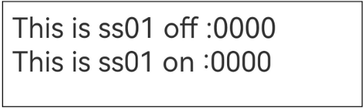
### Example 15
This example shows how to support custom keyboard avoidance.
```ts
@Entry
@Component
struct RichEditorExample {
controller: RichEditorController = new RichEditorController()
@State height1:string|number = '80%'
@State height2:number = 100
@State supportAvoidance:boolean = true;
// Create a custom keyboard component.
@Builder CustomKeyboardBuilder() {
Column() {
Row(){
Button('Add Emoticon').onClick(() => {
this.controller.addTextSpan("\uD83D\uDE0A",
{
style:
{
fontColor: Color.Orange,
}
})
})
}
Grid() {
ForEach([1, 2, 3, 4, 5, 6, 7, 8, 9, '*', 0, '#'], (item: number | string) => {
GridItem() {
Button(item + "")
.width(110).onClick(() => {
this.controller.addTextSpan(item + '', {
offset: this.controller.getCaretOffset(),
style:
{
fontColor: Color.Orange,
fontSize: 30
}
})
this.controller.setCaretOffset(this.controller.getCaretOffset() + item.toString().length)
})
}
})
}.maxCount(3).columnsGap(10).rowsGap(10).padding(5)
}.backgroundColor(Color.Gray)
}
build() {
Column() {
Row(){
Button("20%")
.fontSize(24)
.onClick(()=>{
this.height1 = "20%"
})
Button("80%")
.fontSize(24)
.margin({left:20})
.onClick(()=>{
this.height1 = "80%"
})
}
.justifyContent(FlexAlign.Center)
.alignItems(VerticalAlign.Bottom)
.height(this.height1)
.width("100%")
.padding({bottom:50})
RichEditor({ controller: this.controller })
// Bind the custom keyboard.
.customKeyboard(this.CustomKeyboardBuilder(),{ supportAvoidance: this.supportAvoidance }).margin(10).border({ width: 1 })
.borderWidth(1)
.borderColor(Color.Red)
.width("100%")
}
}
}
```

### Example 16
This example shows the usage of **onEditingChange** and **isEditing**.
```ts
@Entry
@Component
struct RichEditor_onEditingChange {
controller: RichEditorController = new RichEditorController()
@State controllerIsEditing: boolean = false
@Builder
build() {
Column() {
Row() {
Button("View Editing State: isEditing():").onClick(() => {
this.controllerIsEditing = this.controller.isEditing()
})
.padding(5)
Text('' + this.controllerIsEditing)
.width('100%')
.padding(5)
.fontColor(Color.Orange)
.fontSize(20)
}
RichEditor({ controller: this.controller })
.onEditingChange((isEditing: boolean) => {
console.log("Current Editing Status:" + isEditing)
})
.height(400)
.borderWidth(1)
.borderColor(Color.Red)
.width("100%")
}
}
}
```
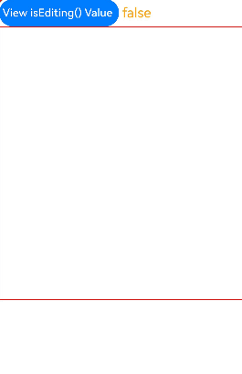
### Example 17
This example shows the usage of **onWillChange**, **onDidChange**, **onCut**, and **onCopy**.
```ts
@Entry
@Component
struct RichEditorExample {
controller: RichEditorController = new RichEditorController()
build() {
Column() {
RichEditor({ controller: this.controller })
.height(200)
.borderWidth(1)
.borderColor(Color.Red)
.width("100%")
.onReady(() => {
this.controller.addTextSpan('TestWord', { style: { fontColor: Color.Orange, fontSize: 30 } })
this.controller.updateSpanStyle({
start: -1,
end: -1,
textStyle:
{
fontWeight: FontWeight.Bolder
}
})
})
.onWillChange((value: RichEditorChangeValue) => {
console.log('Test log: onWillChange')
console.log('rangeBefore: ' + JSON.stringify(value.rangeBefore))
console.log('print replacedSpans')
value.replacedSpans.forEach((item: RichEditorTextSpanResult) => {
console.log('spanPosition:' + JSON.stringify(item.spanPosition))
console.log('value:' + item.value)
console.log('textStyle:' + JSON.stringify(item.textStyle))
console.log('offsetInSpan:' + item.offsetInSpan)
console.log('valueResource:' + item.valueResource)
console.log('paragraphStyle:' + JSON.stringify(item.paragraphStyle))
})
console.log('print replacedImageSpans')
value.replacedImageSpans.forEach((item: RichEditorImageSpanResult) => {
console.log('spanPosition:' + JSON.stringify(item.spanPosition))
console.log('valuePixelMap:' + JSON.stringify(item.valuePixelMap))
console.log('valueResourceStr:' + item.valueResourceStr)
console.log('imageStyle:' + JSON.stringify(item.imageStyle))
console.log('offsetInSpan:' + item.offsetInSpan)
})
console.log('print replacedSymbolSpans')
value.replacedSymbolSpans.forEach((item: RichEditorTextSpanResult) => {
console.log('spanPosition:' + JSON.stringify(item.spanPosition))
console.log('value:' + item.value)
console.log('offsetInSpan:' + item.offsetInSpan)
console.log('symbolSpanStyle:' + JSON.stringify(item.symbolSpanStyle))
console.log('valueResource:' + item.valueResource)
console.log('paragraphStyle:' + JSON.stringify(item.paragraphStyle))
})
return true
})
.onDidChange((rangeBefore: TextRange, rangeAfter: TextRange) => {
console.log('Test log: onDidChange')
console.log('rangeBefore:' + JSON.stringify(rangeBefore))
console.log('rangeAfter:' + JSON.stringify(rangeAfter))
})
.onCut((event:CutEvent) => {
event.preventDefault!()
console.log('Test log: onCut')
})
.onCopy((event:CopyEvent) => {
event.preventDefault!()
console.log('Test log: onCopy')
})
.onPaste(()=>{
console.log('Test log: onPaste')
})
Text('Test text Hello')
.lineHeight(50)
.fontSize(24)
.draggable(true)
.onDragStart(()=>{})
TextInput({text:'Test text NiHao'})
.draggable(true)
.margin(20)
}
}
}
```
### Example 18
This example shows the usage of **enterKeyType**, **onSubmit**, and **stopEditing**.
```ts
@Entry
@Component
struct SoftKeyboardEnterTypeExample {
controller: RichEditorController = new RichEditorController()
build() {
Column() {
Button("Stop Editing").onClick(()=>{
this.controller.stopEditing()
})
RichEditor({ controller: this.controller })
.margin(10)
.border({ width: 1 })
.height(200)
.borderWidth(1)
.borderColor(Color.Red)
.width("100%")
.enterKeyType(EnterKeyType.Search)
.onSubmit((enterKey: EnterKeyType, event: SubmitEvent) => {
console.log("trigger richeditor onsubmit" + enterKey);
this.controller.addTextSpan(" type["+ enterKey +"] triggerred")
event.keepEditableState();
})
}.height("100%").justifyContent(FlexAlign.Center)
}
}
```

### Example 19
This example demonstrates how to set, update, and query the value of **lineBreakStrategy**.
```ts
@Entry
@Component
struct LineBreakStrategyExample {
controller: RichEditorController = new RichEditorController();
private spanParagraphs: RichEditorParagraphResult[] = [];
@State lineBreakOptionStr: string[] = ['GREEDY', 'HIGH_QUALITY', 'BALANCED']
@State attributeValue: string = ""
@State testStr: string = "0123456789,0123456789,0123456789,0123456789,0123456789."
build() {
Column() {
RichEditor({ controller: this.controller })
.onReady(() => {
this.controller.addTextSpan(this.testStr, {
style: {
fontColor: Color.Black,
fontSize: "32",
},
paragraphStyle: {
textAlign: TextAlign.Start,
lineBreakStrategy: LineBreakStrategy.GREEDY
}
})
})
.width(400)
.height(300)
.margin({bottom:20})
.draggable(false)
Column(){
Text('linebreak value: ' + this.attributeValue).fontSize(20).fontColor(Color.Black)
}.margin({bottom: 10})
Column({ space: 10 }) {
Button("Set LineBreakStrategy to GREEDY").onClick(() => {
this.controller.updateParagraphStyle({ start: -1, end: -1,
style: {
lineBreakStrategy: LineBreakStrategy.GREEDY,
}
})
})
Button("Set LineBreakStrategy to HIGH_QUALITY").onClick(() => {
this.controller.updateParagraphStyle({ start: -1, end: -1,
style: {
lineBreakStrategy: LineBreakStrategy.HIGH_QUALITY,
}
})
})
Button("Set LineBreakStrategy to BALANCED").onClick(() => {
this.controller.updateParagraphStyle({ start: -1, end: -1,
style: {
lineBreakStrategy: LineBreakStrategy.BALANCED,
}
})
})
Divider()
Row(){
Button("Get LineBreakStrategy Value").onClick(() => {
this.spanParagraphs = this.controller.getParagraphs({ start: -1, end: -1 })
console.log("RichEditor getParagraphs:" + JSON.stringify(this.spanParagraphs))
this.spanParagraphs.forEach(item => {
if(typeof(item as RichEditorParagraphResult)['style'] != 'undefined'){
this.attributeValue = ""
console.info('lineBreakStrategy:'+ JSON.stringify((item as RichEditorParagraphResult)['style']))
this.attributeValue += this.lineBreakOptionStr[Number((item as RichEditorParagraphResult)['style'].lineBreakStrategy)];
}
})
})
}
}
}
}
}
```
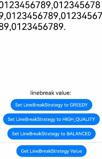
### Example 20
This example shows the usage of a styled string.
```ts
// xxx.ets
import { LengthMetrics } from '@kit.ArkUI'
import { image } from '@kit.ImageKit'
@Entry
@Component
struct Index {
stringLength: number = 0;
imagePixelMap: image.PixelMap | undefined = undefined;
@State selection: string = "";
@State content: string = "";
@State range: string = "";
@State replaceString: string = "";
@State rangeBefore: string = "";
@State rangeAfter: string = "";
richEditorStyledString: MutableStyledString = new MutableStyledString("");
textStyle: TextStyle = new TextStyle({
fontWeight: FontWeight.Lighter,
fontFamily: 'HarmonyOS Sans',
fontColor: Color.Green,
fontSize: LengthMetrics.vp(30),
fontStyle: FontStyle.Normal
})
fontStyle1: TextStyle = new TextStyle({ fontColor: Color.Blue });
fontStyle2: TextStyle = new TextStyle({
fontWeight: FontWeight.Bolder,
fontFamily: 'Arial',
fontColor: Color.Orange,
fontSize: LengthMetrics.vp(30),
fontStyle: FontStyle.Italic
})
controller1: RichEditorController = new RichEditorController()
options1: RichEditorOptions = { controller: this.controller1 };
// Create a styled string object.
mutableStyledString: MutableStyledString = new MutableStyledString("Initial styled string",
[{ start: 0, length: 5, styledKey: StyledStringKey.FONT, styledValue: this.fontStyle1 }]);
styledString: StyledString = new StyledString("Styled string to insert",
[{ start: 2, length: 4, styledKey: StyledStringKey.FONT, styledValue: this.fontStyle2 }]);
controller: RichEditorStyledStringController = new RichEditorStyledStringController();
options: RichEditorStyledStringOptions = {controller: this.controller};
// Text content change callback
contentChangedListener: StyledStringChangedListener = {
onWillChange: (value: StyledStringChangeValue) => {
this.range = '[ ' + value.range.start + ' , ' + value.range.end + ' ]';
this.replaceString = value.replacementString.getString();
return true;
},
onDidChange: (rangeBefore, rangeAfter) => {
this.rangeBefore = '[ ' + rangeBefore.start + ' , ' + rangeBefore.end + ' ]';
this.rangeAfter = '[ ' + rangeAfter.start + ' , ' + rangeAfter.end + ' ]';
}
}
async aboutToAppear() {
console.info("aboutToAppear initial imagePixelMap");
this.imagePixelMap = await this.getPixmapFromMedia($r('app.media.app_icon'));
}
private async getPixmapFromMedia(resource: Resource) {
let unit8Array = await getContext(this)?.resourceManager?.getMediaContent({
bundleName: resource.bundleName,
moduleName: resource.moduleName,
id: resource.id
})
let imageSource = image.createImageSource(unit8Array.buffer.slice(0, unit8Array.buffer.byteLength))
let createPixelMap: image.PixelMap = await imageSource.createPixelMap({
desiredPixelFormat: image.PixelMapFormat.RGBA_8888
})
await imageSource.release()
return createPixelMap
}
build() {
Column({space:6}) {
Column() {
Text("Selection information")
.fontSize(20)
.width("100%")
Text("selection range: " + this.selection).width("100%")
Text("selection content: " + this.content).width("100%")
}
.width("100%")
.height("10%")
Column() {
Text("onWillChange callback")
.fontSize(20)
.width("100%")
Text("range: " + this.range).width("100%")
Text("replacementString: " + this.replaceString).width("100%")
Text("onWillChange callback")
.fontSize(20)
.width("100%")
Text("rangeBefore: " + this.rangeBefore).width("100%")
Text("rangeAfter: " + this.rangeAfter).width("100%")
}
.borderWidth(1)
.borderColor(Color.Black)
.width("100%")
.height("20%")
RichEditor(this.options)
.onReady(() => {
// Register a text change callback.
this.controller.onContentChanged(this.contentChangedListener);
// Set the styled string displayed in the component.
this.controller.setStyledString(this.mutableStyledString);
})
.height("20%")
.width("100%")
RichEditor(this.options1)
.onReady(() => {
this.controller1.addTextSpan("Convert into Styled String");
})
.height("10%")
.width("100%")
.borderWidth(1)
.borderColor(Color.Black)
Row({space:2}) {
Button("Insert Image")
.stateEffect(true)
.onClick(() => {
if (this.imagePixelMap !== undefined) {
let imageStyledString = new MutableStyledString(new ImageAttachment({
value: this.imagePixelMap,
size: { width: 50, height: 50 },
layoutStyle: { borderRadius: LengthMetrics.vp(10) },
verticalAlign: ImageSpanAlignment.BASELINE,
objectFit: ImageFit.Contain
}))
// Obtain the styled string displayed in the component.
this.richEditorStyledString = this.controller.getStyledString();
this.richEditorStyledString.appendStyledString(imageStyledString);
// Display the styled string after the image is inserted on the component.
this.controller.setStyledString(this.richEditorStyledString);
this.controller.setCaretOffset(this.richEditorStyledString.length);
}
})
Button("Insert Text").onClick () => {
// Obtain the styled string displayed in the component.
this.richEditorStyledString = this.controller.getStyledString();
this.richEditorStyledString.appendStyledString(this.styledString);
// Display the styled string after the text is inserted on the component.
this.controller.setStyledString(this.richEditorStyledString);
this.controller.setCaretOffset(this.richEditorStyledString.length);
})
Button("Delete Selected").onClick(() => {
// Obtain the selection.
let richEditorSelection = this.controller.getSelection();
let start = richEditorSelection.start ? richEditorSelection.start : 0;
let end = richEditorSelection.end ? richEditorSelection.end : 0;
// Obtain the styled string displayed in the component.
this.richEditorStyledString = this.controller.getStyledString();
this.richEditorStyledString.removeString(start, end - start);
// Display the styled string after the content is deleted on the component.
this.controller.setStyledString(this.richEditorStyledString);
})
}
Row({space:2}) {
Button("Get Selection").onClick(() => {
// Obtain the selection.
let richEditorSelection = this.controller.getSelection();
let start = richEditorSelection.start ? richEditorSelection.start : 0;
let end = richEditorSelection.end ? richEditorSelection.end : 0;
// Obtain the styled string displayed in the component.
this.richEditorStyledString = this.controller.getStyledString();
this.selection = '[ ' + start + ' , ' + end + ' ]';
if (start == end) {
this.content = "";
} else {
this.content = this.richEditorStyledString.subStyledString(start, end - start).getString();
}
})
Button("Update Selection Style").onClick(() => {
// Obtain the selection.
let richEditorSelection = this.controller.getSelection();
let start = richEditorSelection.start ? richEditorSelection.start : 0;
let end = richEditorSelection.end ? richEditorSelection.end : 0;
// Obtain the styled string displayed in the component.
this.richEditorStyledString = this.controller.getStyledString();
this.richEditorStyledString.setStyle({
start: start,
length: end - start,
styledKey: StyledStringKey.FONT,
styledValue: this.textStyle
})
// Display the styled string after the style change on the component.
this.controller.setStyledString(this.richEditorStyledString);
})
}
Row({space:2}){
// Convert a styled string into a span.
Button("Call fromStyledString").onClick(() => {
this.controller1.addTextSpan("Call fromStyledString: " +JSON.stringify(this.controller1.fromStyledString(this.mutableStyledString)))
})
// Convert the component content within the given range into a styled string.
Button("Call toStyledString").onClick(() => {
this.controller.setStyledString(this.controller1.toStyledString({start:0,end:13}))
})
}
}
}
}
```
.gif)
### Example 21
This example shows the usage of **LayoutManager**.
```ts
@Entry
@Component
export struct Index {
@State lineCount: string = ""
@State glyphPositionAtCoordinate: string = ""
@State lineMetrics: string = ""
controller: RichEditorController = new RichEditorController();
@State textStr: string =
'Hello World!'
build() {
Scroll() {
Column() {
Text('getLayoutManager obtains the layout information relative to the component')
.fontSize(9)
.fontColor(0xCCCCCC)
.width('90%')
.padding(10)
RichEditor({ controller: this.controller })
.borderColor(Color.Red)
.borderWidth(1)
.onReady(() => {
this.controller.addTextSpan(this.textStr)
})
.onAreaChange(() => {
let layoutManager = this.controller.getLayoutManager();
this.lineCount = "LineCount: " + layoutManager.getLineCount()
})
Text('LineCount').fontSize(9).fontColor(0xCCCCCC).width('90%').padding(10)
Text(this.lineCount)
Text('GlyphPositionAtCoordinate').fontSize(9).fontColor(0xCCCCCC).width('90%').padding(10)
Button("Glyph info of relative component coordinates [150, 50]")
.onClick(() => {
let layoutManager: LayoutManager = this.controller.getLayoutManager()
let position = layoutManager.getGlyphPositionAtCoordinate(150, 50)
this.glyphPositionAtCoordinate =
"Relative component coordinates [150, 50] glyphPositionAtCoordinate position: " + position.position + " affinity: " +
position.affinity
})
.margin({ bottom: 20, top: 10 })
Text(this.glyphPositionAtCoordinate)
Text('LineMetrics').fontSize(9).fontColor(0xCCCCCC).width('90%').padding(10)
Button("Line Metrics")
.onClick(() => {
let layoutManager: LayoutManager = this.controller.getLayoutManager()
let lineMetrics = layoutManager.getLineMetrics(0)
this.lineMetrics = "lineMetrics is " + JSON.stringify(lineMetrics) + '\n\n'
let runMetrics = lineMetrics.runMetrics
runMetrics.forEach((value, key) => {
this.lineMetrics += "runMetrics key is " + key + " " + JSON.stringify(value) + "\n\n"
});
})
.margin({ bottom: 20, top: 10 })
Text(this.lineMetrics)
}
.margin({ top: 100, left: 8, right: 8 })
}
}
}
```

### Example: 22
This example shows how to set **editMenuOptions**.
```ts
// xxx.ets
@Entry
@Component
struct RichEditorExample {
controller: RichEditorController = new RichEditorController();
options: RichEditorOptions = { controller: this.controller }
onCreateMenu(menuItems: Array) {
console.log('menuItems size=' + menuItems.length);
menuItems.forEach((value, index) => {
console.log('menuItem' + index + ', id=' + JSON.stringify(value));
})
let extensionMenuItems: Array = [
{
content: 'Extended RichEditor 1', icon: $r('app.media.startIcon'), id: TextMenuItemId.of('extension1')
},
{
content: 'Extended RichEditor 2', icon: $r('app.media.startIcon'), id: TextMenuItemId.of('extension2')
},
{
content: 'Extended RichEditor 3', icon: $r('app.media.startIcon'), id: TextMenuItemId.of('extension3')
},
{
content: 'Extended RichEditor 4', icon: $r('app.media.startIcon'), id: TextMenuItemId.of('extension4')
}
]
return menuItems.concat(extensionMenuItems)
}
onMenuItemClicked(menuItem: TextMenuItem, textRange: TextRange) {
if (menuItem.id.equals(TextMenuItemId.of('extension1'))) {
console.log('click' + menuItem.content + ', textRange=' + JSON.stringify(textRange))
return true;
}
return false;
}
build() {
Row() {
RichEditor(this.options)
.onReady(() => {
this.controller.addTextSpan("Extended RichEditor")
})
.editMenuOptions({
onCreateMenu: (menuItems: Array) => {
return this.onCreateMenu(menuItems)
},
onMenuItemClick: (menuItem: TextMenuItem, textRange: TextRange) => {
return this.onMenuItemClicked(menuItem, textRange)
}
})
.height(200)
.borderWidth(1)
.borderColor(Color.Red)
}
}
}
```
### Example 23
This example shows the usage of **barState**, **enableKeyboardOnFocus**, and **getPreviewText**.
```ts
// xxx.ets
import { JSON } from '@kit.ArkTS';
@Entry
@Component
struct RichEditor_example {
controller: RichEditorController = new RichEditorController()
options: RichEditorOptions = { controller: this.controller };
controller1: RichEditorController = new RichEditorController()
options1: RichEditorOptions = { controller: this.controller1 };
@State e: boolean = true
@State bs_num: number = 0
@State bs: (BarState | undefined)[] = [BarState.Auto, BarState.On, BarState.Off, undefined]
@State bs_string: (String)[] = ["Auto", "On", "Off", "undefined"]
build() {
Column({space: 3}) {
RichEditor(this.options)
.onReady(() => {
this.controller.addTextSpan('This text is for demonstration purposes. This text is for demonstration purposes. This text is for demonstration purposes. ', {
style: {
fontColor: Color.Black,
fontSize: 15
}
})
})
.onDidIMEInput((value: TextRange) => {
this.controller1.addTextSpan("\n" + "onDidIMEInput callback triggered. Input range: (" + value.start + "," + value.end + ")", {
style: {
fontColor: Color.Gray,
fontSize: 10
}
})
})
.onSelectionChange((value: RichEditorRange) => {
this.controller1.addTextSpan("\n" + "onSelectionChange callback triggered. Input range: (" + value.start + "," + value.end + ")", {
style: {
fontColor: Color.Gray,
fontSize: 10
}
})
})
.width(300)
.height(100)
.margin(20)
.barState(this.bs[this.bs_num])
.enableKeyboardOnFocus(this.e)
.enableHapticFeedback(true)
RichEditor(this.options1).width(300)
Button('Set barState to ' + this.bs_string[this.bs_num])
.height(30)
.fontSize(13)
.onClick(() => {
this.bs_num++
if (this.bs_num > (this.bs.length - 1)) {
this.bs_num = 0
}
})
Button('Set enableKeyboardOnFocus to ' + this.e)
.height(30)
.fontSize(13)
.onClick(() => {
this.e = !this.e
})
Button('Get Preview Text')
.height(30)
.fontSize(13)
.onClick(() => {
this.controller1.addTextSpan("\nObtained preview text: " + JSON.stringify(this.controller.getPreviewText()))
})
}
}
}
```
