# TimePicker
The **TimePicker** component allows users to select a time (with the hour and minute) from the given range.
> **NOTE**
>
> This component is supported since API version 8. Updates will be marked with a superscript to indicate their earliest API version.
## Child Components
Not supported
## APIs
TimePicker(options?: TimePickerOptions)
Creates a time picker, which is in 24-hour format by default.
**Atomic service API**: This API can be used in atomic services since API version 11.
**System capability**: SystemCapability.ArkUI.ArkUI.Full
**Parameters**
| Name | Type | Mandatory| Description |
| ------- | ----------------------------------------------- | ---- | ------------------------ |
| options | [TimePickerOptions](#timepickeroptions) | No | Parameters of the time picker.|
## TimePickerOptions
**System capability**: SystemCapability.ArkUI.ArkUI.Full
| Name | Type | Mandatory| Description |
| -------------------- | ----------------------------------------------- | ---- | ------------------------------------------------------------ |
| selected | Date | No | Time of the selected item.
Default value: current system time
Since API version 10, this parameter supports two-way binding through [$$](../../../quick-start/arkts-two-way-sync.md).
**Atomic service API**: This API can be used in atomic services since API version 11.|
| format11+ | [TimePickerFormat](#timepickerformat11)| No | Time format.
Default value: **TimePickerFormat.HOUR_MINUTE**
**Atomic service API**: This API can be used in atomic services since API version 12.|
## TimePickerFormat11+
**Atomic service API**: This API can be used in atomic services since API version 12.
**System capability**: SystemCapability.ArkUI.ArkUI.Full
| Name | Description |
| ------------------ | ------------------------ |
| HOUR_MINUTE | Display hours and minutes. |
| HOUR_MINUTE_SECOND | Display hours, minutes, and seconds.|
## Attributes
In addition to the [universal attributes](ts-universal-attributes-size.md), the following attributes are supported.
### useMilitaryTime
useMilitaryTime(value: boolean)
Sets whether to display time in 24-hour format. When the display time is in 12-hour format, the AM/PM zone does not change depending on the hour portion.
**Atomic service API**: This API can be used in atomic services since API version 11.
**System capability**: SystemCapability.ArkUI.ArkUI.Full
**Parameters**
| Name| Type | Mandatory| Description |
| ------ | ------- | ---- | ------------------------------------------ |
| value | boolean | Yes | Whether the display time is in 24-hour format.
Default value: **false**|
### disappearTextStyle10+
disappearTextStyle(value: PickerTextStyle)
Sets the font color, font size, and font weight for the top and bottom items.
**Atomic service API**: This API can be used in atomic services since API version 11.
**System capability**: SystemCapability.ArkUI.ArkUI.Full
**Parameters**
| Name| Type | Mandatory| Description |
| ------ | ------------------------------------------------------------ | ---- | ------------------------------------------------------------ |
| value | [PickerTextStyle](ts-basic-components-datepicker.md#pickertextstyle10) | Yes | Font color, font size, and font weight of the top and bottom items.
Default value:
{
color: '#ff182431',
font: {
size: '14fp',
weight: FontWeight.Regular
}
} |
### textStyle10+
textStyle(value: PickerTextStyle)
Sets the font color, font size, and font weight for all items except the top, bottom, and selected items.
**Atomic service API**: This API can be used in atomic services since API version 11.
**System capability**: SystemCapability.ArkUI.ArkUI.Full
**Parameters**
| Name| Type | Mandatory| Description |
| ------ | ------------------------------------------------------------ | ---- | ------------------------------------------------------------ |
| value | [PickerTextStyle](ts-basic-components-datepicker.md#pickertextstyle10) | Yes | Font color, font size, and font weight of all items except the top, bottom, and selected items.
Default value:
{
color: '#ff182431',
font: {
size: '16fp',
weight: FontWeight.Regular
}
} |
### selectedTextStyle10+
selectedTextStyle(value: PickerTextStyle)
Sets the font color, font size, and font weight for the selected item.
**Atomic service API**: This API can be used in atomic services since API version 11.
**System capability**: SystemCapability.ArkUI.ArkUI.Full
**Parameters**
| Name| Type | Mandatory| Description |
| ------ | ------------------------------------------------------------ | ---- | ------------------------------------------------------------ |
| value | [PickerTextStyle](ts-basic-components-datepicker.md#pickertextstyle10) | Yes | Font color, font size, and font weight of the selected item.
Default value:
{
color: '#ff007dff',
font: {
size: '20vp',
weight: FontWeight.Medium
}
} |
### loop11+
loop(value: boolean)
Sets whether to enable the loop mode.
**Atomic service API**: This API can be used in atomic services since API version 12.
**System capability**: SystemCapability.ArkUI.ArkUI.Full
**Parameters**
| Name| Type | Mandatory| Description |
| ------ | ------- | ---- | ------------------------------------------------------------ |
| value | boolean | Yes | Whether to enable the loop mode.
Default value: **true**
The value **true** means to enable loop mode, and **false** means the opposite.|
### dateTimeOptions12+
dateTimeOptions(value: DateTimeOptions)
Sets whether to display a leading zero for the hours, minutes, and seconds.
**Atomic service API**: This API can be used in atomic services since API version 12.
**System capability**: SystemCapability.ArkUI.ArkUI.Full
**Parameters**
| Name| Type | Mandatory| Description |
| ------ | ------------------------------------------------------------ | ---- | ------------------------------------------------------------ |
| value | [DateTimeOptions](../../apis-localization-kit/js-apis-intl.md#datetimeoptions) | Yes | Whether to display a leading zero for the hours, minutes, and seconds. Currently only the configuration of the **hour**, **minute**, and **second** parameters is supported.
Default value:
**hour**: In the 24-hour format, it defaults to **2-digit**, which means a leading zero is used; In the 12-hour format, it defaults to **numeric**, which means no leading zero is used.
**minute**: defaults to **2-digit**, which means a leading zero is used.
**second**: defaults to **2-digit**, which means a leading zero is used.
|
### enableHapticFeedback12+
enableHapticFeedback(enable: boolean)
**Atomic service API**: This API can be used in atomic services since API version 12.
**System capability**: SystemCapability.ArkUI.ArkUI.Full
| Name| Type | Mandatory | Description |
| ------ | --------------------------------------------- |-----|-------------------------------------------------------------------------------------|
| enable | boolean | Yes | Whether haptic feedback is enabled.
**true** (default): Haptic feedback is enabled.
**false**: Haptic feedback is disabled.
Whether this parameter takes effect after being set to true depends on hardware support.|
## Events
In addition to the [universal events](ts-universal-events-click.md), the following events are supported.
### onChange
onChange(callback: (value: TimePickerResult ) => void)
Triggered when a time is selected.
**Atomic service API**: This API can be used in atomic services since API version 11.
**System capability**: SystemCapability.ArkUI.ArkUI.Full
**Parameters**
| Name| Type | Mandatory| Description |
| ------ | --------------------------------------------- | ---- | -------------- |
| value | [TimePickerResult](#timepickerresult)| Yes | Time in 24-hour format.|
## TimePickerResult
Describes a time in 24-hour format.
**Atomic service API**: This API can be used in atomic services since API version 11.
**System capability**: SystemCapability.ArkUI.ArkUI.Full
| Name | Type | Read Only| Optional| Description |
| -------------------- | ------ | ---- | ---- | ----------------------------------- |
| hour | number | No | No | Hour portion of the selected time.
Value range: [0-23]|
| minute | number | No | No | Minute portion of the selected time.
Value range: [0-59]|
| second11+ | number | No | No | Second portion of the selected time.
Value range: [0-59]|
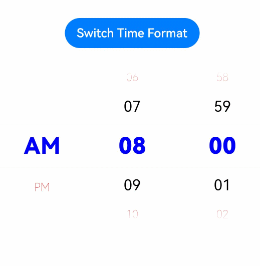
## Example
This example implements a time picker that allows users to switch between 12-hour and 24-hour formats by clicking a button.
```ts
// xxx.ets
@Entry
@Component
struct TimePickerExample {
@State isMilitaryTime: boolean = false
private selectedTime: Date = new Date('2022-07-22T08:00:00')
build() {
Column() {
Button('Switch Time Format')
.margin(30)
.onClick(() => {
this.isMilitaryTime = !this.isMilitaryTime
})
TimePicker({
selected: this.selectedTime,
})
.useMilitaryTime(this.isMilitaryTime)
.onChange((value: TimePickerResult) => {
if(value.hour >= 0) {
this.selectedTime.setHours(value.hour, value.minute)
console.info('select current date is: ' + JSON.stringify(value))
}
})
.disappearTextStyle({color: Color.Red, font: {size: 15, weight: FontWeight.Lighter}})
.textStyle({color: Color.Black, font: {size: 20, weight: FontWeight.Normal}})
.selectedTextStyle({color: Color.Blue, font: {size: 30, weight: FontWeight.Bolder}})
}.width('100%')
}
}
```