# Column
The **Column** component lays out child components vertically.
> **NOTE**
>
> This component is supported since API version 7. Updates will be marked with a superscript to indicate their earliest API version.
## Child Components
Supported
## APIs
Column(value?: {space?: string | number})
**Widget capability**: This API can be used in ArkTS widgets since API version 9.
**Atomic service API**: This API can be used in atomic services since API version 11.
**System capability**: SystemCapability.ArkUI.ArkUI.Full
**Parameters**
| Name| Type| Mandatory| Description|
| -------- | -------- | -------- | -------- |
| space | string \| number | No| Vertical spacing between two adjacent child components.
Since API version 9, this parameter does not take effect when it is set to a negative number or when [justifyContent](ts-container-column.md#justifycontent8) is set to **FlexAlign.SpaceBetween**, **FlexAlign.SpaceAround**, or **FlexAlign.SpaceEvenly**.
Default value: **0**
Unit: vp
**NOTE**
The value can be a number greater than or equal to 0 or a string that can be converted to a number.|
## Attributes
In addition to the [universal attributes](ts-universal-attributes-size.md), the following attributes are supported.
### alignItems
alignItems(value: HorizontalAlign)
Alignment mode of the child components in the horizontal direction.
**Widget capability**: This API can be used in ArkTS widgets since API version 9.
**Atomic service API**: This API can be used in atomic services since API version 11.
**System capability**: SystemCapability.ArkUI.ArkUI.Full
**Parameters**
| Name| Type | Mandatory| Description |
| ------ | ------------------------------------------------------- | ---- | ------------------------------------------------------------ |
| value | [HorizontalAlign](ts-appendix-enums.md#horizontalalign) | Yes | Alignment mode of child components in the horizontal direction.
Default value: **HorizontalAlign.Center**|
### justifyContent8+
justifyContent(value: FlexAlign)
Alignment mode of the child components in the vertical direction.
**Widget capability**: This API can be used in ArkTS widgets since API version 9.
**Atomic service API**: This API can be used in atomic services since API version 11.
**System capability**: SystemCapability.ArkUI.ArkUI.Full
**Parameters**
| Name| Type | Mandatory| Description |
| ------ | ------------------------------------------- | ---- | ---------------------------------------------------------- |
| value | [FlexAlign](ts-appendix-enums.md#flexalign) | Yes | Alignment mode of child components in the vertical direction.
Default value: **FlexAlign.Start**|
> **NOTE**
>
> During column layout, child components do not shrink if [flexShrink](ts-universal-attributes-flex-layout.md#flexshrink) is not set for them. In this case, the total size of the child components on the main axis can exceed the size of the container on the main axis.
### reverse12+
reverse(isReversed: Optional\)
Sets whether to reverse the arrangement of child components on the main axis (vertical direction).
**Widget capability**: This API can be used in ArkTS widgets since API version 12.
**Atomic service API**: This API can be used in atomic services since API version 12.
**System capability**: SystemCapability.ArkUI.ArkUI.Full
**Parameters**
| Name| Type | Mandatory| Description |
| ------ | ------------------------------------------- | ---- | ---------------------------------------------------------- |
| isReversed | Optional\ | Yes | Whether to reverse the arrangement of child components on the main axis (vertical direction).
Default value: **true**|
> **NOTE**
>
> If the **reverse** attribute is not set, the arrangement on the main axis remains in the normal order. If the attribute is set to **undefined**, it defaults to **true**, which reverses the arrangement on the main axis.
The **direction** attribute only changes the cross axis direction of the column and does not impact the main axis direction. Therefore, it is independent of the **reverse** attribute.
## Events
The [universal events](ts-universal-events-click.md) are supported.
## Example
```ts
// xxx.ets
@Entry
@Component
struct ColumnExample {
build() {
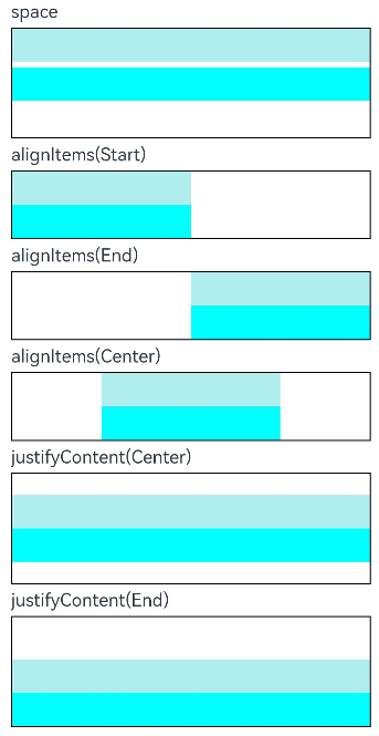
Column({ space: 5 }) {
// Set the vertical spacing between two adjacent child components to 5.
Text('space').width('90%')
Column({ space: 5 }) {
Column().width('100%').height(30).backgroundColor(0xAFEEEE)
Column().width('100%').height(30).backgroundColor(0x00FFFF)
}.width('90%').height(100).border({ width: 1 })
// Set the alignment mode of the child components in the horizontal direction.
Text('alignItems(Start)').width('90%')
Column() {
Column().width('50%').height(30).backgroundColor(0xAFEEEE)
Column().width('50%').height(30).backgroundColor(0x00FFFF)
}.alignItems(HorizontalAlign.Start).width('90%').border({ width: 1 })
Text('alignItems(End)').width('90%')
Column() {
Column().width('50%').height(30).backgroundColor(0xAFEEEE)
Column().width('50%').height(30).backgroundColor(0x00FFFF)
}.alignItems(HorizontalAlign.End).width('90%').border({ width: 1 })
Text('alignItems(Center)').width('90%')
Column() {
Column().width('50%').height(30).backgroundColor(0xAFEEEE)
Column().width('50%').height(30).backgroundColor(0x00FFFF)
}.alignItems(HorizontalAlign.Center).width('90%').border({ width: 1 })
// Set the alignment mode of the child components in the vertical direction.
Text('justifyContent(Center)').width('90%')
Column() {
Column().width('90%').height(30).backgroundColor(0xAFEEEE)
Column().width('90%').height(30).backgroundColor(0x00FFFF)
}.height(100).border({ width: 1 }).justifyContent(FlexAlign.Center)
Text('justifyContent(End)').width('90%')
Column() {
Column().width('90%').height(30).backgroundColor(0xAFEEEE)
Column().width('90%').height(30).backgroundColor(0x00FFFF)
}.height(100).border({ width: 1 }).justifyContent(FlexAlign.End)
}.width('100%').padding({ top: 5 })
}
}
```