# Border Image
You can draw an image around a component.
> **NOTE**
>
> The APIs of this module are supported since API version 9. Updates will be marked with a superscript to indicate their earliest API version.
## borderImage
borderImage(value: BorderImageOption)
Sets the border image of the component.
**Widget capability**: Since API version 9, this feature is supported in ArkTS widgets.
**Atomic service API**: This API can be used in atomic services since API version 11.
**System capability**: SystemCapability.ArkUI.ArkUI.Full
**Parameters**
| Name | Type | Mandatory| Description |
| ----------- | ----------------------------------------------- | ---- | -------------------------------- |
| value | [BorderImageOption](#borderimageoption) | Yes | Border image or border gradient.|
## BorderImageOption
**Widget capability**: Since API version 9, this feature is supported in ArkTS widgets.
| Name | Type | Mandatory| Description |
| ------ | ------------------------------------------------------------ | ---- | ------------------------------------------------------------ |
| source | string \| [Resource](ts-types.md#resource) \| [linearGradient](ts-universal-attributes-gradient-color.md) | No| Source or gradient color of the border image.<br>**NOTE**<br>The border image source applies only to container components, such as [Row](ts-container-row.md), [Column](ts-container-column.md), and [Flex](ts-container-flex.md).<br>**Atomic service API**: This API can be used in atomic services since API version 11.|
| slice | [Length](ts-types.md#length) \| [EdgeWidths](ts-types.md#edgewidths9) \| [LocalizedEdgeWidths](ts-types.md#localizededgewidths12)<sup>12+</sup>| No| Slice width of the upper left corner, upper right corner, lower left corner, and lower right corner of the border image.<br>Default value: **0**<br>**NOTE**<br>If this parameter is set to a negative value, the default value is used.<br>When this parameter is set to a value of the [Length](ts-types.md#length) type, the value applies to the four corners in a unified manner.<br>When this parameter is set to a value of the [EdgeWidths](ts-types.md#edgewidths9) type:<br>- **Top**: slice height of the upper left or upper right corner of the image.<br>- **Bottom**: slice height of the lower left or lower right corner of the image.<br>- **Left**: slice width of the upper left or lower left corner of the image.<br>- **Right**: slice width of the upper right or lower right corner of the image.<br>When the parameter type is [LocalizedEdgeWidths](ts-types.md#localizededgewidths12)<sup>12+</sup>:<br>- **Top**: slice height of the upper left or upper right corner of the image.<br>- **Bottom**: slice height of the lower left or lower right corner of the image.<br>- **Start**: slice width of the upper left or lower left corner of the image for left-to-right scripts;<br>slice width of the upper right or lower right corner of the image for right-to-left scripts.<br>- **End**: slice width of the upper right or lower right corner of the image for left-to-right scripts; slice width of the upper left or lower left corner of the image for right-to-left scripts.<br>**Atomic service API**: This API can be used in atomic services since API version 11.|
| width | [Length](ts-types.md#length) \| [EdgeWidths](ts-types.md#edgewidths9) \| [LocalizedEdgeWidths](ts-types.md#localizededgewidths12)<sup>12+</sup> | No| Width of the border image.<br>Default value: **0**<br>**NOTE**<br>If this parameter is set to a negative value, the default value is used.<br>When this parameter is set to a value of the [Length](ts-types.md#length) type, the value applies to the four corners in a unified manner.<br>When this parameter is set to a value of the [EdgeWidths](ts-types.md#edgewidths9) type:<br>- **Top**: width of the top edge of the border image.<br>- **Bottom**: width of the bottom edge of the border image.<br>- **Left**: width of the left edge of the border image.<br>- **Right**: width of the right edge of the border image.<br>When the parameter type is [LocalizedEdgeWidths](ts-types.md#localizededgewidths12)<sup>12+</sup>:<br>- **Top**: width of the top edge of the border image.<br>- **Bottom**: width of the bottom edge of the border image.<br>- **Start**: width of the left edge of the border image for left-to-right scripts;<br>width of the right edge of the border image for right-to-left scripts.<br>- **End**: width of the right edge of the border image for left-to-right scripts;<br>width of the left edge of the border image for right-to-left scripts.<br>If this parameter is set to a negative value, the value **1** is used.<br>**Atomic service API**: This API can be used in atomic services since API version 11.|
| outset | [Length](ts-types.md#length) \| [EdgeWidths](ts-types.md#edgewidths9) \| [LocalizedEdgeWidths](ts-types.md#localizededgewidths12)<sup>12+</sup> | No| Amount by which the border image is extended beyond the border box.<br>Default value: **0**<br>**NOTE**<br>If this parameter is set to a negative value, the default value is used.<br>When this parameter is set to a value of the [Length](ts-types.md#length) type, the value applies to the four corners in a unified manner.<br>When this parameter is set to a value of the [EdgeWidths](ts-types.md#edgewidths9) type:<br>- **Top**: amount by which the top edge of the border image is extended beyond the border box.<br>- **Bottom**: amount by which the bottom edge of the border image is extended beyond the border box.<br>- **Left**: amount by which the left edge of the border image is extended beyond the border box.<br>- **Right**: amount by which the right edge of the border image is extended beyond the border box.<br>When the parameter type is [LocalizedEdgeWidths](ts-types.md#localizededgewidths12)<sup>12+</sup>:<br>- **Top**: amount by which the top edge of the border image is extended beyond the border box.<br>- **Bottom**: amount by which the bottom edge of the border image is extended beyond the border box.<br>- **Start**: amount by which the left edge of the border image is extended beyond the border box for left-to-right scripts;<br>amount by which the right edge of the border image is extended beyond the border box for right-to-left scripts.<br>- **End**: amount by which the right edge of the border image is extended beyond the border box for left-to-right scripts;<br>amount by which the left edge of the border image is extended beyond the border box for right-to-left scripts.<br>**Atomic service API**: This API can be used in atomic services since API version 11.|
| repeat | [RepeatMode](#repeatmode) | No| Repeat mode of the source image's slices on the border.<br>Default value: **RepeatMode.Stretch**<br>**Atomic service API**: This API can be used in atomic services since API version 11.|
| fill | boolean | No| Whether to fill the center of the border image.<br>Default value: **false**<br>**Atomic service API**: This API can be used in atomic services since API version 11. |
## RepeatMode
**Widget capability**: Since API version 9, this feature is supported in ArkTS widgets.
**Atomic service API**: This API can be used in atomic services since API version 11.
| Name | Description |
| ------- | ----------------------------------- |
| Repeat | The source image's slices are tiled. Tiles beyond the border box will be clipped. |
| Stretch | The source image's slices are stretched to fill the border box. |
| Round | The source image's slices are tiled to fill the border box. Tiles may be compressed when needed.|
| Space | The source image's slices are tiled to fill the border box. Extra space will be distributed in between tiles. |
## Example
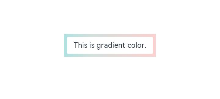
### Example 1
```ts
// xxx.ets
@Entry
@Component
struct Index {
build() {
Row() {
Column() {
Text('This is gradient color.').textAlign(TextAlign.Center).height(50).width(200)
.borderImage({
source: {
angle: 90,
direction: GradientDirection.Left,
colors: [[0xAEE1E1, 0.0], [0xD3E0DC, 0.3], [0xFCD1D1, 1.0]]
},
slice: { top: 10, bottom: 10, left: 10, right: 10 },
width: { top: "10px", bottom: "10px", left: "10px", right: "10px" },
repeat: RepeatMode.Stretch,
fill: false
})
}
.width('100%')
}
.height('100%')
}
}
```
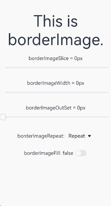
### Example 2
```ts
// xxx.ets
@Entry
@Component
struct BorderImage {
@State WidthValue: number = 0
@State SliceValue: number = 0
@State OutSetValue: number = 0
@State RepeatValue: RepeatMode[] = [RepeatMode.Repeat, RepeatMode.Stretch, RepeatMode.Round, RepeatMode.Space]
@State SelectIndex: number = 0
@State SelectText: string = 'Repeat'
@State FillValue: boolean = false
build() {
Row() {
Column({ space: 20 }) {
Row() {
Text('This is borderImage.').textAlign(TextAlign.Center).fontSize(50)
}
.borderImage({
source: $r('app.media.icon'),
slice: this.SliceValue,
width: this.WidthValue,
outset: this.OutSetValue,
repeat: this.RepeatValue[this.SelectIndex],
fill: this.FillValue
})
Column() {
Text(`borderImageSlice = ${this.SliceValue}px`)
Slider({
value: this.SliceValue,
min: 0,
max: 100,
style: SliderStyle.OutSet
})
.onChange((value: number, mode: SliderChangeMode) => {
this.SliceValue = value
})
}
Column() {
Text(`borderImageWidth = ${this.WidthValue}px`)
Slider({
value: this.WidthValue,
min: 0,
max: 100,
style: SliderStyle.OutSet
})
.onChange((value: number, mode: SliderChangeMode) => {
this.WidthValue = value
})
}
Column() {
Text(`borderImageOutSet = ${this.OutSetValue}px`)
Slider({
value: this.OutSetValue,
min: 0,
max: 100,
style: SliderStyle.OutSet
})
.onChange((value: number, mode: SliderChangeMode) => {
this.OutSetValue = value
})
}
Row() {
Text('borderImageRepeat: ')
Select([{ value: 'Repeat' }, { value: 'Stretch' }, { value: 'Round' }, { value: 'Space' }])
.value(this.SelectText)
.selected(this.SelectIndex)
.onSelect((index: number, value?: string) => {
this.SelectIndex = index
this.SelectText = value as string
})
}
Row() {
Text(`borderImageFill: ${this.FillValue} `)
Toggle({ type: ToggleType.Switch, isOn: this.FillValue })
.onChange((isOn: boolean) => {
this.FillValue = isOn
})
}
}
.width('100%')
}
.height('100%')
}
}
```
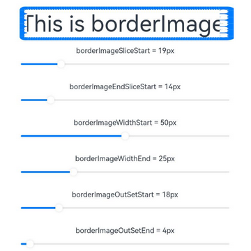
### Example 3
```ts
// xxx.ets
// The slice, width, and outset attributes of borderImage use the LocalizedEdgeWidths type.
import { LengthMetrics } from '@kit.ArkUI'
@Entry
@Component
struct BorderImage {
@State WidthStartValue: number = 0
@State WidthEndValue: number = 0
@State SliceStartValue: number = 0
@State SliceEndValue: number = 0
@State OutSetStartValue: number = 0
@State OutSetEndValue: number = 0
@State RepeatValue: RepeatMode[] = [RepeatMode.Repeat, RepeatMode.Stretch, RepeatMode.Round, RepeatMode.Space]
@State SelectIndex: number = 0
@State SelectText: string = 'Repeat'
@State FillValue: boolean = false
build() {
Row() {
Column({ space: 20 }) {
Row() {
Text('This is borderImage.').textAlign(TextAlign.Center).fontSize(50)
}
.borderImage({
source: $r('app.media.icon'),
slice: {
top: LengthMetrics.px(10),
bottom: LengthMetrics.px(10),
start: LengthMetrics.px(this.SliceStartValue),
end: LengthMetrics.px(this.SliceEndValue) },
width: {
top: LengthMetrics.px(10),
bottom: LengthMetrics.px(10),
start: LengthMetrics.px(this.WidthStartValue),
end: LengthMetrics.px(this.WidthEndValue)
},
outset: {
top: LengthMetrics.px(10),
bottom: LengthMetrics.px(10),
start: LengthMetrics.px(this.OutSetStartValue),
end: LengthMetrics.px(this.OutSetEndValue)
},
repeat: this.RepeatValue[this.SelectIndex],
fill: this.FillValue
})
Column() {
Text(`borderImageSliceStart = ${this.SliceStartValue}px`)
Slider({
value: this.SliceStartValue,
min: 0,
max: 100,
style: SliderStyle.OutSet
})
.onChange((value: number, mode: SliderChangeMode) => {
this.SliceStartValue = value
})
}
Column() {
Text(`borderImageEndSliceStart = ${this.SliceEndValue}px`)
Slider({
value: this.SliceEndValue,
min: 0,
max: 100,
style: SliderStyle.OutSet
})
.onChange((value: number, mode: SliderChangeMode) => {
this.SliceEndValue = value
})
}
Column() {
Text(`borderImageWidthStart = ${this.WidthStartValue}px`)
Slider({
value: this.WidthStartValue,
min: 0,
max: 100,
style: SliderStyle.OutSet
})
.onChange((value: number, mode: SliderChangeMode) => {
this.WidthStartValue = value
})
}
Column() {
Text(`borderImageWidthEnd = ${this.WidthEndValue}px`)
Slider({
value: this.WidthEndValue,
min: 0,
max: 100,
style: SliderStyle.OutSet
})
.onChange((value: number, mode: SliderChangeMode) => {
this.WidthEndValue = value
})
}
Column() {
Text(`borderImageOutSetStart = ${this.OutSetStartValue}px`)
Slider({
value: this.OutSetStartValue,
min: 0,
max: 100,
style: SliderStyle.OutSet
})
.onChange((value: number, mode: SliderChangeMode) => {
this.OutSetStartValue = value
})
}
Column() {
Text(`borderImageOutSetEnd = ${this.OutSetEndValue}px`)
Slider({
value: this.OutSetEndValue,
min: 0,
max: 100,
style: SliderStyle.OutSet
})
.onChange((value: number, mode: SliderChangeMode) => {
this.OutSetEndValue = value
})
}
Row() {
Text('borderImageRepeat: ')
Select([{ value: 'Repeat' }, { value: 'Stretch' }, { value: 'Round' }, { value: 'Space' }])
.value(this.SelectText)
.selected(this.SelectIndex)
.onSelect((index: number, value?: string) => {
this.SelectIndex = index
this.SelectText = value as string
})
}
Row() {
Text(`borderImageFill: ${this.FillValue} `)
Toggle({ type: ToggleType.Switch, isOn: this.FillValue })
.onChange((isOn: boolean) => {
this.FillValue = isOn
})
}
}
.width('100%')
}
.height('100%')
}
}
```
The following shows how the example is represented with left-to-right scripts.
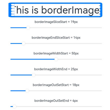
The following shows how the example is represented with right-to-left scripts.