# Click Control
Click control attributes are used to set whether a component can respond to finger interactions such as click and touch events.
> **NOTE**
>
> The APIs of this module are supported since API version 7. Updates will be marked with a superscript to indicate their earliest API version.
## Attributes
| Name | Type| Description |
| ----------- | -------- | ------------------------ |
| touchable(deprecated) | boolean | Whether the component can respond to finger interactions such as click and touch events.
Default value: **true**
**NOTE**
This API is deprecated since API version 9. You are advised to use [hitTestBehavior](ts-universal-attributes-hit-test-behavior.md) instead.|
## Example
```ts
// xxx.ets
@Entry
@Component
struct TouchAbleExample {
@State text1: string = ''
@State text2: string = ''
build() {
Stack() {
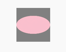
Rect()
.fill(Color.Gray).width(150).height(150)
.onClick(() => {
console.info(this.text1 = 'Rect Clicked')
})
.overlay(this.text1, { align: Alignment.Bottom, offset: { x: 0, y: 20 } })
Ellipse()
.fill(Color.Pink).width(150).height(80)
.touchable(false) // When the Ellipse area is touched, the message "Ellipse Clicked" is not displayed.
.onClick(() => {
console.info(this.text2 = 'Ellipse Clicked')
})
.overlay(this.text2, { align: Alignment.Bottom, offset: { x: 0, y: 20 } })
}.margin(100)
}
}
```