# Hover Event
A hover event is triggered when the mouse slides or a stylus moves over the component on the screen.
> **NOTE**
>
> - The APIs of this module are supported since API version 8. Updates will be marked with a superscript to indicate their earliest API version.
> - Currently, only an external mouse device or stylus can be used to trigger a hover event.
## onHover
onHover(event: (isHover: boolean, event: HoverEvent) => void): T
Triggered when the mouse or stylus enters or leaves the component.
**Atomic service API**: This API can be used in atomic services since API version 11.
**System capability**: SystemCapability.ArkUI.ArkUI.Full
**Parameters**
| Name | Type | Mandatory| Description |
| ------------------- | ----------------------------------- | ---- | ------------------------------------------------------------ |
| isHover | boolean | Yes | Whether the mouse pointer or stylus is hovering over the component. The value **true** means that the mouse pointer or stylus enters the component, and **false** means that the mouse pointer or stylus leaves the component.|
| event11+ | [HoverEvent](#hoverevent11) | Yes | Bubbling of the blocking event. |
**Return value**
| Type| Description|
| -------- | -------- |
| T | Current component.|
## HoverEvent11+
Inherits from [BaseEvent](ts-gesture-customize-judge.md#baseevent).
**Atomic service API**: This API can be used in atomic services since API version 11.
**System capability**: SystemCapability.ArkUI.ArkUI.Full
| Name | Type | Description |
| --------------- | ---------- | ------- |
| stopPropagation | () => void | Stops the event from bubbling upwards or downwards.|
## Example
```ts
// xxx.ets
@Entry
@Component
struct HoverEventExample {
@State hoverText: string = 'no hover';
@State color: Color = Color.Blue;
build() {
Column({ space: 20 }) {
Button(this.hoverText)
.width(180).height(80)
.backgroundColor(this.color)
.onHover((isHover: boolean, event: HoverEvent) => {
// Use the onHover event to dynamically change the text content and background color of a button when the mouse pointer or stylus is hovered on it.
// Use event.sourceTool to determine whether the device is a mouse device or stylus.
if (isHover) {
if (event.sourceTool == SourceTool.Pen) {
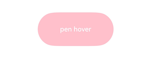
this.hoverText = 'pen hover';
this.color = Color.Pink;
} else if (event.sourceTool == SourceTool.MOUSE) {
this.hoverText = 'mouse hover';
this.color = Color.Red;
}
} else {
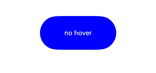
this.hoverText = 'no hover';
this.color = Color.Blue;
}
})
}.padding({ top: 30 }).width('100%')
}
}
```
Diagrams:
The figure below shows how the button looks when not hovered:

The figure below shows how the button looks like when a stylus hovers on it.
