# chart
The **\<chart>** component displays line charts, gauge charts, and bar charts.
> **NOTE**
>
> The APIs of this module are supported since API version 8. Updates will be marked with a superscript to indicate their earliest API version.
## Child Components
Not supported
## Attributes
In addition to the [universal attributes](js-service-widget-common-attributes.md), the following attributes are supported.
| Name | Type | Default Value| Mandatory| Description |
| ----------------- | ---------------------------------- | ------ | ---- | ------------------------------------------------------------ |
| type | string | line | No | Chart type. Dynamic modification is not supported. Available values include:<br>- **bar**: bar chart.<br>- **line**: line chart.<br>- **gauge**: gauge chart.<br>- **progress**: circle chart of progresses<br>- **loading**: circle chart of loading processes<br>- **rainbow**: circle chart of proportions.|
| options | ChartOptions | - | No | Chart parameters. Parameter settings for gauge charts do not take effect. You can set the minimum value, maximum value, scale, and line width of the x-axis or y-axis, whether to display the x-axis and y-axis, and whether the line is smooth. Dynamic modification is not supported.|
| datasets | Array\<ChartDataset> | - | No | Data sets. Data sets for a gauge chart do not take effect. You can set multiple datasets and their background colors. |
| segments | DataSegment \| Array\<DataSegment> | | No | Data structures used by **progress**, **loading**, and **rainbow** charts.<br>The **DataSegment** type is applicable to **progress** and **loading** charts. The **Array\<DataSegment>** type is applicable to **rainbow** charts. A maximum of nine **DataSegment**s are supported.|
| effects | boolean | true | No | Whether to enable the effects for **progress** and **rainbow** charts. |
| animationduration | number | 3000 | No | Animation duration for expanding a **rainbow** chart, in milliseconds. |
**Table 1** ChartOptions
| Name | Type | Default Value | Mandatory | Description |
| ------ | --------- | ---- | ---- | ---------------------------------------- |
| xAxis | ChartAxis | - | Yes | X-axis parameters. You can set the minimum value, maximum value, and scale of the x-axis, and whether to display the x-axis. |
| yAxis | ChartAxis | - | Yes | Y-axis parameters. You can set the minimum value, maximum value, and scale of the y-axis, and whether to display the y-axis. |
| series | ChartAxis | - | No | Data series. Only line charts support this attribute. Available values include:<br>- Line styles, such as the line width and whether the line is smooth.<br>- Style and size of the white point at the start of the line.|
**Table 2** ChartDataset
| Name | Type | Default Value | Mandatory | Description |
| ----------- | ---------------------------------------- | -------- | ---- | -------------------- |
| strokeColor | <color> | \#ff6384 | No | Line color. Only line charts support this attribute. |
| fillColor | <color> | \#ff6384 | No | Fill color. For line charts, this attribute indicates a gradient fill color. |
| data | Array<number> \| Array\<Point> | - | Yes | Data of the drawn line or bar. |
| gradient | boolean | false | No | Whether to display the gradient fill color. Only line charts support this attribute.|
**Table 3** ChartAxis
| Name | Type | Default Value | Mandatory | Description |
| -------- | ------------- | -------- | ---- | ---------------------------------------- |
| min | number | 0 | No | Minimum value of the axis. Negative numbers are not supported. Only line charts support this attribute. |
| max | number | 100 | No | Maximum value of the axis. Negative numbers are not supported. Only line charts support this attribute. |
| axisTick | number | 10 | No | Number of scales displayed on the axis.<br>The value ranges from 1 to 20. The display effect depends on the calculation result of Number of pixels occupied by the image width/(**max**-**min**). In the bar chart, the number of bars in each group of data is the same as the number of scales, and the bars are displayed at the scales.|
| display | boolean | false | No | Whether to display the axis. |
| color | <color> | \#c0c0c0 | No | Axis color. |
**Table 4** ChartSeries
| Name | Type | Default Value | Mandatory | Description |
| ----------- | -------------- | ---- | ---- | -------------------- |
| lineStyle | ChartLineStyle | - | No | Line style, such as the line width and whether the line is smooth. |
| headPoint | PointStyle | - | No | Style and size of the white point at the start of the line. |
| topPoint | PointStyle | - | No | Style and size of the top point. |
| bottomPoint | PointStyle | - | No | Style and size of the bottom point. |
| loop | ChartLoop | - | No | Whether to start drawing again when the screen is looped.|
**Table 5** ChartLineStyle
| Name | Type | Default Value | Mandatory | Description |
| ------ | -------------- | ----- | ---- | ----- |
| width | <length> | 1px | No | Line width.|
| smooth | boolean | false | No | Whether the line is smooth.|
**Table 6** PointStyle
| Name | Type | Default Value | Mandatory | Description |
| ----------- | -------------- | -------- | ---- | ---------------------------------------- |
| shape | string | circle | No | Shape of the highlight point. Available values are as follows:<br>- circle<br>- square<br>- triangle|
| size | <length> | 5px | No | Size of the highlight point. |
| strokeWidth | <length> | 1px | No | Stroke width. |
| strokeColor | <color> | \#ff0000 | No | Stroke color. |
| fillColor | <color> | \#ff0000 | No | Fill color. |
**Table 7** ChartLoop
| Name | Type | Default Value | Mandatory | Description |
| -------- | -------------- | ----- | ---- | ---------------------------------------- |
| margin | <length> | 1 | No | Number of erased points (horizontal distance between the latest drawn point and the earliest point).<br>You are not advised to use **margin** together with **topPoint**, **bottomPoint**, or **headPoint**. If you do so, there is a possibility that the point is in the erase area and is invisible.|
| gradient | boolean | false | No | Whether to perform gradient erase. |
**Table 8** Point
| Name | Type | Default Value | Mandatory | Description |
| ------------ | ------------- | -------- | ---- | ---------------------------------------- |
| value | number | 0 | Yes | Y coordinate of the point to draw. |
| pointStyle | PointStyle | - | No | Style of the point. |
| description | string | - | No | Description of the point. |
| textLocation | string | - | No | Location of the description. Available values are as follows:<br>- **"top"**: The description is above the point.<br>- **"bottom"**: The description is below the point.<br>- **"none"**: The description is not displayed.|
| textColor | <color> | \#000000 | No | Color of the description text. |
| lineDash | string | solid | No | Dashed line pattern. You can set the dash length and space length between the dashes.<br>- **"dashed, 5, 5"**: dashed line with each dash in 5 px and a 5 px space between dashes.<br>- **"solid"**: solid line.|
| lineColor | <color> | \#000000 | No | Line color. If this attribute is not set, the value of **strokeColor** is used. |
**Table 9** DataSegment
| Name | Type | Default Value | Mandatory | Description |
| ---------- | ------ | ---- | ---- | ---------------------------------------- |
| startColor | Color | - | No | Color of the start position. If this attribute is set, **endColor** must be set. If this attribute is not set, the default color array preset in the system is used. For details about the color values, see the following table.|
| endColor | Color | - | No | Color of the end position. If this attribute is set, **startColor** must be set.<br>If this attribute is not set, the default color array preset in the system is used.|
| value | number | 0 | Yes | Percentage for the current data segment. The maximum value is **100**. |
| name | string | - | No | Name of the data segment. |
| Data Segment | Light Theme | Dark Theme |
| ---- | --------------------------- | --------------------------- |
| 0 | Start color: \#f7ce00; end color: \#f99b11| Start color: \#d1a738; end color: \#eb933d|
| 1 | Start color: \#f76223; end color: \#f2400a| Start color: \#e67d50; end color: \#d9542b|
| 2 | Start color: \#f772ac; end color: \#e65392| Start color: \#d5749e; end color: \#d6568d|
| 3 | Start color: \#a575eb; end color: \#a12df7| Start color: \#9973d1; end color: \#5552d9|
| 4 | Start color: \#7b79f7; end color: \#4b48f7| Start color: \#7977d9; end color: \#f99b11|
| 5 | Start color: \#4b8af3; end color: \#007dff| Start color: \#4c81d9; end color: \#217bd9|
| 6 | Start color: \#73c1e6; end color: \#4fb4e3| Start color: \#5ea6d1; end color: \#4895c2|
| 7 | Start color: \#a5d61d; end color: \#69d14f| Start color: \#91c23a; end color: \#70ba5d|
| 8 | Start color: \#a2a2b0; end color: \#8e8e93| Start color: \#8c8c99; end color: \#6b6b76|
For the **gauge** charts, the following attributes are also supported.
| Name | Type | Default Value | Mandatory | Description |
| ------- | ------ | ---- | ---- | ---------------------- |
| percent | number | 0 | No | Percentage of the current value to the total value. The value ranges from 0 to 100.|
## Styles
In addition to the [universal styles](js-service-widget-common-styles.md), the following styles are supported.
| Name | Type | Default Value | Mandatory | Description |
| ------------ | -------------- | -------------------------- | ---- | ---------------------------------------- |
| stroke-width | <length> | 32px (**gauge** charts)<br>24px (**rainbow** charts)| No | Width of the scale bar for **gauge** and **rainbow** charts. |
| start-angle | <deg> | 240 (**gauge** charts)<br>0 (**rainbow** charts) | No | Start angle of the scale bar for **gauge** and **rainbow** charts, which starts from zero o'clock. The value ranges from 0 to 360. |
| total-angle | <deg> | 240 (**gauge** charts)<br>360 (**rainbow** charts) | No | Total length of the scale bar for **gauge** and **rainbow** charts. The value ranges from –360 to 360. A negative number indicates the anticlockwise direction.|
| center-x | <length> | - | No | X-coordinate of the scale bar center position for **gauge** charts. This style takes precedence over the **position** universal style and<br>must be used together with **center-y** and **radius**.|
| center-y | <length> | - | No | Y-coordinate of the scale bar center position for **gauge** charts. This style takes precedence over the **position** universal style and<br>must be used together with **center-x** and **radius**.|
| radius | <length> | - | No | Radius of the scale bar for **gauge** charts. This style takes precedence over the **width** and **height** universal style and<br>must be used together with **center-x** and **center-y**.|
| colors | Array | - | No | Colors of ranges on the scale bar for **gauge** charts.<br>For example, **colors: \#ff0000, \#00ff00**.|
| weights | Array | - | No | Weights of ranges on the scale bar for **gauge** charts.<br>For example, **weights: 2, 2**.|
| font-family | Array | - | No | Font style of the description text. You can use a [custom font](js-service-widget-common-customizing-font.md).|
| font-size | <length> | - | No | Font size of the description text. |
## Events
The [universal events](js-service-widget-common-events.md) are supported.
## Example
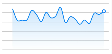
1. Line chart
```html
<!-- xxx.hml -->
<div class="container">
<stack class="chart-region">
<image class="chart-background" src="common/background.png"></image>
<chart class="chart-data" type="line" ref="linechart" options="{{lineOps}}" datasets="{{lineData}}"></chart>
</stack>
</div>
```
```css
/* xxx.css */
.container {
flex-direction: column;
justify-content: center;
align-items: center;
}
.chart-region {
height: 400px;
width: 700px;
}
.chart-background {
object-fit: fill;
}
.chart-data {
width: 700px;
height: 600px;
}
```
```json
// xxx.json
{
"data": {
"lineData": [
{
"strokeColor": "#0081ff",
"fillColor": "#cce5ff",
"data": [
763,
550,
551,
554,
731,
654,
525,
696,
595,
628,
791,
505,
613,
575,
475,
553,
491,
680,
657,
716
],
"gradient": true
}
],
"lineOps": {
"xAxis": {
"min": 0,
"max": 20,
"display": false
},
"yAxis": {
"min": 0,
"max": 1000,
"display": false
},
"series": {
"lineStyle": {
"width": "5px",
"smooth": true
},
"headPoint": {
"shape": "circle",
"size": 20,
"strokeWidth": 5,
"fillColor": "#ffffff",
"strokeColor": "#007aff",
"display": true
},
"loop": {
"margin": 2,
"gradient": true
}
}
}
}
}
```
**4 x 4 widget**
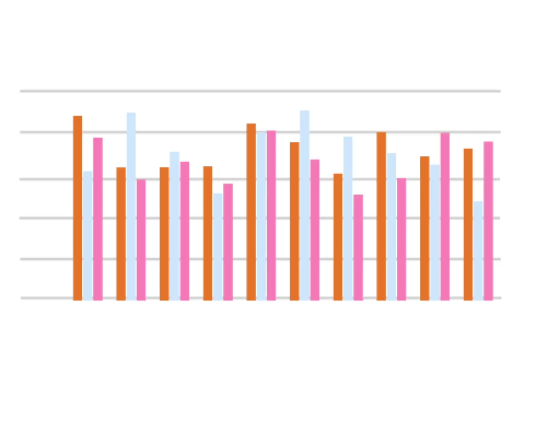
2. Bar chart
```html
<!-- xxx.hml -->
<div class="container">
<stack class="data-region">
<image class="data-background" src="common/background.png"></image>
<chart class="data-bar" type="bar" id="bar-chart" options="{{barOps}}" datasets="{{barData}}"></chart>
</stack>
</div>
```
```css
/* xxx.css */
.container {
flex-direction: column;
justify-content: center;
align-items: center;
}
.data-region {
height: 400px;
width: 700px;
}
.data-background {
object-fit: fill;
}
.data-bar {
width: 700px;
height: 400px;
}
```
```json
{
"data": {
"barData": [
{
"fillColor": "#f07826",
"data": [763, 550, 551, 554, 731, 654, 525, 696, 595, 628]
},
{
"fillColor": "#cce5ff",
"data": [535, 776, 615, 444, 694, 785, 677, 609, 562, 410]
},
{
"fillColor": "#ff88bb",
"data": [673, 500, 574, 483, 702, 583, 437, 506, 693, 657]
}
],
"barOps": {
"xAxis": {
"min": 0,
"max": 20,
"display": false,
"axisTick": 10
},
"yAxis": {
"min": 0,
"max": 1000,
"display": false
}
}
}
}
```
**4 x 4 widget**
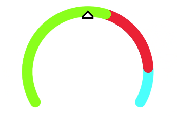
3. Gauge chart
```html
<!-- xxx.hml -->
<div class="container">
<div class="gauge-region">
<chart class="data-gauge" type="gauge" percent = "50"></chart>
</div>
</div>
```
```css
/* xxx.css */
.container {
flex-direction: column;
justify-content: center;
align-items: center;
}
.gauge-region {
height: 400px;
width: 400px;
}
.data-gauge {
colors: #83f115, #fd3636, #3bf8ff;
weights: 4, 2, 1;
}
```
**4 x 4 widget**