# ArkUI Subsystem Changelog
## cl.arkui.1 Changes of Default Focus Behavior
Changed the default focus used when **defaultFocus** is not set.
Versions earlier than API version 11: The default focus is given to the first focusable non-container component on the current page.
API version 11 and later versions: The default focus is given to the root container of the current page.
**Change Impact**
If the **defaultFocus** attribute is not set, the first focusable non-container component on a page will not obtain focus immediately when the page opens for the first time. Instead, it is the root container of the page that obtains the focus.
Example:
1. Here is a page whose first focusable non-container component is a text box, and no component on the page is bound to the **defaultFocus** attribute.
Versions earlier than API version 11: When the page opens, the text box obtains focus and starts the input method.
API version 11 and later versions: When the page opens, the text box does not obtain focus and therefore the input method is not started. The user needs to press the Tab key to focus the text box.
2. Assume that the **onKeyEvent** event is bound to the first focusable non-container component on the page to listen for the key events on the component.
Versions earlier than API version 11: When the page opens, the component is focused by default; the **onKeyEvent** callback can respond to key events on the component without any other operation required.
API version 11 and later versions: When the page opens, the component is not focused; the **onKeyEvent** callback can respond to key events on the component only after the user presses the Tab key to enable the component to obtain focus.
**Adaptation Guide**
To achieve the before-change results, bind the **defaultFocus(true)** attribute to the target component to enable the target component to become the default focus on the page. In this way, when the page opens for the first time, the focus is automatically given to the first component bound to the **defaultFocus(true)** attribute.
## cl.arkui.2 Changes of the Soft Keyboard Interaction Behavior in Text Box Components
When the text box is focused, the input method is started. The soft keyboard of the input method can be closed by touching either the inverted triangle button or the EnterKey button on the keyboard.
Versions earlier than API version 11: When either of the aforementioned button is touched, the soft keyboard is closed, and the text box component remains focused.
API version 11 and later versions: When either of the aforementioned button is touched, the soft keyboard is closed, and the text box component loses focus.
The following text box components are affected: **\<TextInput>**, **\<TextArea>**, **\<Search>**, and **\<RichEditor>**.
**Change Impact**
Logical behavior that affects the focus:
Versions earlier than API version 11: After a button is touched, the text box is still in the focused state. In this case, the **onKeyEvent** event on the text box can still be properly responded to. The application switches from the background to the foreground and starts the input method again. The user can press the Tab key to move the focus to the next component.
API version 11 and later versions: After a button is clicked, the text box loses focus immediately. In this case, the **onKeyEvent** event on the input box cannot respond to. The input method is not started again when the application is in the foreground. Pressing the Tab key enables the text box to obtain focus again, rather than moves the focus to the next component.
**Adaptation Guide**
No adaptation is required. However, you need to check whether the changed behavior affects the overall application logic.
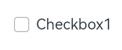
## cl.arkui.3 Change of the \<Checkbox> Component's Default Shape
**Access Level**
Public
**Reason for Change**
The change is made to enhance the visual and interaction experience.
**Change Impact**
This change is a compatible change.
**API Level**
11
**Change Since**
OpenHarmony SDK 4.1.3.2
**Key API/Component Changes**
\<Checkbox>
Changed the **\<Checkbox>** component's default shape used when the **shape** attribute is not set.
**Change Impact**
Default shape policy:
API version 11 and later versions: The **\<Checkbox>** component's default shape is circle.

Versions earlier than API version 11: The **\<Checkbox>** component's default shape is rounded square.
**Adaptation Guide**
If you would like the **\<Checkbox>** component in the rounded square shape, bind the **shape(CheckBoxShape.ROUNDED_SQUARE)** attribute to the component.
## cl.arkui.4 Resource Verification Level Change of the rawfile File
**Access Level**
Resources referenced in **$rawfile()**
**Change Impact**
When **$rawfile()** references a resource that does not exist, an ERROR message, instead of a WARN message in previous versions, is reported.
**Change Since**
OpenHarmony SDK 4.1.3.2
**Example**
```
@Entry
@Component
struct Index {
build() {
Button(){
// ERROR: No such 'app_icon.ong' resource in current module.
Image($rawfile('app_icon.png'))
}
}
}
```
**Key API/Component Changes**
N/A
**Adaptation Guide**
N/A