# Progress
进度æ¡ç»„ä»¶ï¼Œç”¨äºŽæ˜¾ç¤ºå†…å®¹åŠ è½½æˆ–æ“作处ç†ç‰è¿›åº¦ã€‚
> **说明:**
>
> 该组件从API version 7开始支æŒã€‚åŽç»ç‰ˆæœ¬å¦‚æœ‰æ–°å¢žå†…å®¹ï¼Œåˆ™é‡‡ç”¨ä¸Šè§’æ ‡å•ç‹¬æ ‡è®°è¯¥å†…容的起始版本。
## å组件
æ—
## 接å£
Progress(options: ProgressOptions)
创建进度æ¡ç»„件。
**å¡ç‰‡èƒ½åŠ›ï¼š** 从API version 9开始,该接å£æ”¯æŒåœ¨ArkTSå¡ç‰‡ä¸ä½¿ç”¨ã€‚
**原å化æœåŠ¡API:** 从API version 11开始,该接å£æ”¯æŒåœ¨åŽŸå化æœåŠ¡ä¸ä½¿ç”¨ã€‚
**系统能力:** SystemCapability.ArkUI.ArkUI.Full
**å‚数:**
| å‚æ•°å | 类型 | å¿…å¡« | 说明 |
| -------- | -------- | -------- | -------- |
| options | [ProgressOptions](#progressoptionstype对象说明)| 是 | 按进度æ¡ç±»åž‹ä¸åŒï¼Œè®¾ç½®ä¸åŒå±žæ€§çš„进度æ¡ç»„件å‚数。 |
## ProgressOptions\<Type\>对象说明
**原å化æœåŠ¡API:** 从API version 11开始,该接å£æ”¯æŒåœ¨åŽŸå化æœåŠ¡ä¸ä½¿ç”¨ã€‚
**系统能力:** SystemCapability.ArkUI.ArkUI.Full
| å称 | 类型 | å¿…å¡« | 说明 |
| -------------------------- | ----------------------------------- | ---- | ---------------------------------------- |
| value | number | 是 | 指定当å‰è¿›åº¦å€¼ã€‚设置å°äºŽ0的数值时置为0,设置大于total的数值时置为total。<br/>默认值:0<br/>**å¡ç‰‡èƒ½åŠ›ï¼š** 从API version 9开始,该接å£æ”¯æŒåœ¨ArkTSå¡ç‰‡ä¸ä½¿ç”¨ã€‚ |
| total | number | å¦ | 指定进度总长。设置å°äºŽç‰äºŽ0的数值时置为100。<br/>默认值:100<br/>**å¡ç‰‡èƒ½åŠ›ï¼š** 从API version 9开始,该接å£æ”¯æŒåœ¨ArkTSå¡ç‰‡ä¸ä½¿ç”¨ã€‚ |
| type<sup>8+</sup> | [ProgressType](#progresstype8枚举说明) | å¦ | 指定进度æ¡ç±»åž‹ã€‚<br/>默认值:ProgressType.Linear<br/>**å¡ç‰‡èƒ½åŠ›ï¼š** 从API version 9开始,该接å£æ”¯æŒåœ¨ArkTSå¡ç‰‡ä¸ä½¿ç”¨ã€‚ |
| style<sup>(deprecated)</sup> | [ProgressStyle](#progressstyle枚举说明) | å¦ | 指定进度æ¡æ ·å¼ã€‚<br/>该å‚数从API version8开始废弃,建议使用type替代。<br/>默认值:ProgressStyle.Linear |
## ProgressType<sup>8+</sup>枚举说明
**å¡ç‰‡èƒ½åŠ›ï¼š** 从API version 9开始,该接å£æ”¯æŒåœ¨ArkTSå¡ç‰‡ä¸ä½¿ç”¨ã€‚
**原å化æœåŠ¡API:** 从API version 11开始,该接å£æ”¯æŒåœ¨åŽŸå化æœåŠ¡ä¸ä½¿ç”¨ã€‚
**系统能力:** SystemCapability.ArkUI.ArkUI.Full
| å称 | 说明 |
| ---------------------- | ---------------------------------------- |
| Linear | çº¿æ€§æ ·å¼ã€‚从API version9开始,高度大于宽度的时候自适应垂直显示。 |
| Ring | çŽ¯å½¢æ— åˆ»åº¦æ ·å¼ï¼ŒçŽ¯å½¢åœ†çŽ¯é€æ¸æ˜¾ç¤ºè‡³å®Œå…¨å¡«å……效果。 |
| Eclipse | åœ†å½¢æ ·å¼ï¼Œæ˜¾ç¤ºç±»ä¼¼æœˆåœ†æœˆç¼ºçš„进度展示效果,从月牙é€æ¸å˜åŒ–至满月。 |
| ScaleRing | çŽ¯å½¢æœ‰åˆ»åº¦æ ·å¼ï¼Œæ˜¾ç¤ºç±»ä¼¼æ—¶é’Ÿåˆ»åº¦å½¢å¼çš„进度展示效果。从API version9开始,刻度外圈出现é‡å 的时候自动转æ¢ä¸ºçŽ¯å½¢æ— 刻度进度æ¡ã€‚ |
| Capsule | èƒ¶å›Šæ ·å¼ï¼Œå¤´å°¾ä¸¤ç«¯åœ†å¼§å¤„的进度展示效果与Eclipse相åŒï¼›ä¸æ®µå¤„的进度展示效果与Linear相åŒã€‚高度大于宽度的时候自适应垂直显示。 |
## ProgressStyle枚举说明
**å¡ç‰‡èƒ½åŠ›ï¼š** 从API version 9开始,该接å£æ”¯æŒåœ¨ArkTSå¡ç‰‡ä¸ä½¿ç”¨ã€‚
**原å化æœåŠ¡API:** 从API version 11开始,该接å£æ”¯æŒåœ¨åŽŸå化æœåŠ¡ä¸ä½¿ç”¨ã€‚
**系统能力:** SystemCapability.ArkUI.ArkUI.Full
| å称 | 说明 |
| --------- | ---------------------------------------- |
| Linear | çº¿æ€§æ ·å¼ã€‚ |
| Ring<sup>8+</sup> | çŽ¯å½¢æ— åˆ»åº¦æ ·å¼ï¼ŒçŽ¯å½¢åœ†çŽ¯é€æ¸æ˜¾ç¤ºè‡³å®Œå…¨å¡«å……效果。 |
| Eclipse | åœ†å½¢æ ·å¼ï¼Œæ˜¾ç¤ºç±»ä¼¼æœˆåœ†æœˆç¼ºçš„进度展示效果,从月牙é€æ¸å˜åŒ–至满月。 |
| ScaleRing<sup>8+</sup> | çŽ¯å½¢æœ‰åˆ»åº¦æ ·å¼ï¼Œæ˜¾ç¤ºç±»ä¼¼æ—¶é’Ÿåˆ»åº¦å½¢å¼çš„进度展示效果。 |
| Capsule<sup>8+</sup> | èƒ¶å›Šæ ·å¼ï¼Œå¤´å°¾ä¸¤ç«¯åœ†å¼§å¤„的进度展示效果与Eclipse相åŒï¼›ä¸æ®µå¤„的进度展示效果与Linear相åŒã€‚高度大于宽度的时候自适应垂直显示。 |
## ProgressStyleMap对象说明
**原å化æœåŠ¡API:** 从API version 11开始,该接å£æ”¯æŒåœ¨åŽŸå化æœåŠ¡ä¸ä½¿ç”¨ã€‚
**系统能力:** SystemCapability.ArkUI.ArkUI.Full
| å称 | 类型 |
| --------- | ---------------------------------------- |
| ProgressType.Linear | [LinearStyleOptions<sup>10+</sup>](#linearstyleoptions10) \| [ProgressStyleOptions<sup>8+</sup>](#progressstyleoptions8) |
ProgressType.Ring | [RingStyleOptions<sup>10+</sup>](#ringstyleoptions10) \| [ProgressStyleOptions<sup>8+</sup>](#progressstyleoptions8) |
ProgressType.Eclipse | [EclipseStyleOptions<sup>10+</sup>](#eclipsestyleoptions10) \| [ProgressStyleOptions<sup>8+</sup>](#progressstyleoptions8) |
ProgressType.ScaleRing| [ScaleRingStyleOptions<sup>10+</sup>](#scaleringstyleoptions10) \| [ProgressStyleOptions<sup>8+</sup>](#progressstyleoptions8) |
ProgressType.Capsule | [CapsuleStyleOptions<sup>10+</sup>](#capsulestyleoptions10) \| [ProgressStyleOptions<sup>8+</sup>](#progressstyleoptions8)
## 属性
除支æŒ[通用属性](ts-universal-attributes-size.md)外,还支æŒä»¥ä¸‹å±žæ€§ï¼š
> **说明:**
>
> 该组件é‡å†™äº†é€šç”¨å±žæ€§[backgroundColor](ts-universal-attributes-background.md)ï¼Œç›´æŽ¥æ·»åŠ åœ¨Progress组件上,生效进度æ¡çš„底色。如需设置整个Progress组件的背景色,需è¦åœ¨å¤–å±‚å®¹å™¨ä¸Šæ·»åŠ backgroundColor,容器å†åŒ…裹Progress组件。
### value
value(value: number)
设置当å‰è¿›åº¦å€¼ã€‚设置å°äºŽ0的数值时置为0,设置大于total的数值时置为total。éžæ³•æ•°å€¼ä¸ç”Ÿæ•ˆã€‚
**å¡ç‰‡èƒ½åŠ›ï¼š** 从API version 9开始,该接å£æ”¯æŒåœ¨ArkTSå¡ç‰‡ä¸ä½¿ç”¨ã€‚
**原å化æœåŠ¡API:** 从API version 11开始,该接å£æ”¯æŒåœ¨åŽŸå化æœåŠ¡ä¸ä½¿ç”¨ã€‚
**系统能力:** SystemCapability.ArkUI.ArkUI.Full
**å‚数:**
| å‚æ•°å | 类型 | å¿…å¡« | 说明 |
| ------ | ------ | ---- | ------------ |
| value | number | 是 | 当å‰è¿›åº¦å€¼ã€‚<br/> 默认值:0|
### color
color(value: ResourceColor | LinearGradient)
设置进度æ¡å‰æ™¯è‰²ã€‚
从API version 10开始支æŒåˆ©ç”¨LinearGradient设置Ringæ ·å¼çš„æ¸å˜è‰²ã€‚
**å¡ç‰‡èƒ½åŠ›ï¼š** 从API version 9开始,该接å£æ”¯æŒåœ¨ArkTSå¡ç‰‡ä¸ä½¿ç”¨ï¼Œæš‚ä¸æ”¯æŒLinearGradient。
**原å化æœåŠ¡API:** 从API version 11开始,该接å£æ”¯æŒåœ¨åŽŸå化æœåŠ¡ä¸ä½¿ç”¨ã€‚
**系统能力:** SystemCapability.ArkUI.ArkUI.Full
**å‚数:**
| å‚æ•°å | 类型 | å¿…å¡« | 说明 |
| ------ | ------------------------------------------------------------ | ---- | ------------------------------------------------------------ |
| value | [ResourceColor](ts-types.md#resourcecolor) \| [LinearGradient<sup>10+</sup>](ts-basic-components-datapanel.md#lineargradient10) | 是 | 进度æ¡å‰æ™¯è‰²ã€‚<br/>默认值:<br/>- Capsule:<br/> API version 9åŠä»¥ä¸‹ï¼š'\#ff007dff'<br/> API version 10:'\#33006cde'<br/> API version 11åŠä»¥ä¸Šï¼š'\#33007dff'<br/>- Ring:<br/> API version 9åŠä»¥ä¸‹ï¼š'\#ff007dff'<br/> API version 10åŠä»¥ä¸Šï¼šèµ·å§‹ç«¯ï¼š'\#ff86c1ff',结æŸç«¯ï¼š'\#ff254ff7'<br/>- å…¶ä»–æ ·å¼ï¼š'\#ff007dff' |
### style<sup>8+</sup>
style(value: ProgressStyleOptions \| CapsuleStyleOptions \| RingStyleOptions \| LinearStyleOptions \| ScaleRingStyleOptions \| EclipseStyleOptions)
è®¾ç½®ç»„ä»¶çš„æ ·å¼ã€‚
**系统能力:** SystemCapability.ArkUI.ArkUI.Full
**å‚数:**
| å‚æ•°å | 类型 | å¿…å¡« | 说明 |
| ------ | ------------------------------------------------------------ | ---- | ------------------------------------------------------------ |
| value | [ProgressStyleOptions<sup>8+</sup>](#progressstyleoptions8) \| [CapsuleStyleOptions<sup>10+</sup>](#capsulestyleoptions10) \| <br/>[RingStyleOptions<sup>10+</sup>](#ringstyleoptions10) \| [LinearStyleOptions<sup>10+</sup>](#linearstyleoptions10) \| <br/>[ScaleRingStyleOptions<sup>10+</sup>](#scaleringstyleoptions10) \| [EclipseStyleOptions<sup>10+</sup>](#eclipsestyleoptions10) | 是 | ç»„ä»¶çš„æ ·å¼ã€‚<br/>- CapsuleStyleOptions:设置Capsuleçš„æ ·å¼ã€‚<br/>- RingStyleOptions:设置Ringçš„æ ·å¼ã€‚<br/>- LinearStyleOptions:设置Linearçš„æ ·å¼ã€‚<br/>- ScaleRingStyleOptions:设置ScaleRingçš„æ ·å¼ã€‚<br/>- EclipseStyleOptions:设置Eclipseçš„æ ·å¼ã€‚<br/>- ProgressStyleOptions:仅å¯è®¾ç½®å„类型进度æ¡çš„åŸºæœ¬æ ·å¼ã€‚<br/>ProgressStyleOptions,暂ä¸æ”¯æŒå…¶å®ƒçš„å‚数类型。 |
### contentModifier<sup>12+</sup>
contentModifier(modifier:ContentModifier\<ProgressConfiguration\>)
定制progress内容区的方法。
**原å化æœåŠ¡API:** 从API version 12开始,该接å£æ”¯æŒåœ¨åŽŸå化æœåŠ¡ä¸ä½¿ç”¨ã€‚
**系统能力:** SystemCapability.ArkUI.ArkUI.Full
**å‚数:**
| å‚æ•°å | 类型 | å¿…å¡« | 说明 |
| ------ | ------ | ---- | ------------ |
| modifier | [ContentModifier\<ProgressConfiguration\>](#progressconfiguration12) | 是 | 在progress组件上,定制内容区的方法。<br/>modifier: 内容修改器,开å‘者需è¦è‡ªå®šä¹‰class实现ContentModifier接å£ã€‚ |
### privacySensitive<sup>12+</sup>
privacySensitive(isPrivacySensitiveMode: Optional\<boolean\>)
设置éšç§æ•æ„Ÿã€‚
**å¡ç‰‡èƒ½åŠ›ï¼š** 从API version 12开始,该接å£æ”¯æŒåœ¨ArkTSå¡ç‰‡ä¸ä½¿ç”¨ã€‚
**原å化æœåŠ¡API:** 从API version 12开始,该接å£æ”¯æŒåœ¨åŽŸå化æœåŠ¡ä¸ä½¿ç”¨ã€‚
**系统能力:** SystemCapability.ArkUI.ArkUI.Full
**å‚数:**
| å‚æ•°å | 类型 | å¿…å¡« | 说明 |
| ------ | --------------------------------------------------------- | ---- | ----------------------------------------------------- |
| isPrivacySensitiveMode | [Optional\<boolean\>] | 是 | 设置éšç§æ•æ„Ÿï¼Œéšç§æ¨¡å¼ä¸‹è¿›åº¦æ¸…零,文å—将被é®ç½©ã€‚<br/>**说明:** <br/>设置null则ä¸æ•æ„Ÿã€‚<br/>[需è¦å¡ç‰‡æ¡†æž¶æ”¯æŒã€‚](./ts-universal-attributes-obscured.md) |
## ProgressConfiguration<sup>12+</sup>
**原å化æœåŠ¡API:** 从API version 12开始,该接å£æ”¯æŒåœ¨åŽŸå化æœåŠ¡ä¸ä½¿ç”¨ã€‚
**系统能力:** SystemCapability.ArkUI.ArkUI.Full
| å称 | 类型 | å¿…å¡« |说明 |
| ------ | ------ | ------- |------------|
| value | number | 是 | 当å‰è¿›åº¦å€¼ã€‚ |
| total | number | 是 | 进度总长。 |
## CommonProgressStyleOptions<sup>10+</sup>
**原å化æœåŠ¡API:** 从API version 11开始,该接å£æ”¯æŒåœ¨åŽŸå化æœåŠ¡ä¸ä½¿ç”¨ã€‚
**系统能力:** SystemCapability.ArkUI.ArkUI.Full
| å称 | 类型 | å¿…å¡« | 说明 |
| ------------ | ---------------------------- | ---- | ------------------------------------------------------------------------------------------ |
| enableSmoothEffect | boolean | å¦ | 进度平滑动效的开关。开å¯å¹³æ»‘动效åŽè®¾ç½®è¿›åº¦ï¼Œè¿›åº¦ä¼šä»Žå½“å‰å€¼æ¸å˜è‡³è®¾å®šå€¼ï¼Œå¦åˆ™è¿›åº¦ä»Žå½“å‰å€¼çªå˜è‡³è®¾å®šå€¼ã€‚<br/>默认值:true |
## ScanEffectOptions<sup>10+</sup>
**原å化æœåŠ¡API:** 从API version 11开始,该接å£æ”¯æŒåœ¨åŽŸå化æœåŠ¡ä¸ä½¿ç”¨ã€‚
**系统能力:** SystemCapability.ArkUI.ArkUI.Full
| å称 | 类型 | å¿…å¡« | 说明 |
| ------------- | ------- | ---- | -------- |
| enableScanEffect | boolean | å¦ | 扫光效果的开关。<br/>默认值:false |
## ProgressStyleOptions<sup>8+</sup>
继承自[CommonProgressStyleOptions](#commonprogressstyleoptions10)。
**å¡ç‰‡èƒ½åŠ›ï¼š** 从API version 9开始,该接å£æ”¯æŒåœ¨ArkTSå¡ç‰‡ä¸ä½¿ç”¨ã€‚
**原å化æœåŠ¡API:** 从API version 11开始,该接å£æ”¯æŒåœ¨åŽŸå化æœåŠ¡ä¸ä½¿ç”¨ã€‚
**系统能力:** SystemCapability.ArkUI.ArkUI.Full
| å称 | 类型 | å¿…å¡« | 说明 |
| ------------ | ---------------------------- | ---- | ------------------------------------------------------------------------------------------ |
| strokeWidth | [Length](ts-types.md#length) | å¦ | 设置进度æ¡å®½åº¦ï¼ˆä¸æ”¯æŒç™¾åˆ†æ¯”设置)。<br/>默认值:4.0vp |
| scaleCount | number | å¦ | 设置环形进度æ¡æ€»åˆ»åº¦æ•°ã€‚<br/>默认值:120 |
| scaleWidth | [Length](ts-types.md#length) | å¦ | 设置环形进度æ¡åˆ»åº¦ç²—细(ä¸æ”¯æŒç™¾åˆ†æ¯”设置),刻度粗细大于进度æ¡å®½åº¦æ—¶ï¼Œä¸ºç³»ç»Ÿé»˜è®¤ç²—细。<br/>默认值:2.0vp |
## CapsuleStyleOptions<sup>10+</sup>
继承自[ScanEffectOptions](#scaneffectoptions10),[CommonProgressStyleOptions](#commonprogressstyleoptions10)。
**原å化æœåŠ¡API:** 从API version 11开始,该接å£æ”¯æŒåœ¨åŽŸå化æœåŠ¡ä¸ä½¿ç”¨ã€‚
**系统能力:** SystemCapability.ArkUI.ArkUI.Full
| å称 | 类型 | å¿…å¡« | 说明 |
| ------------- | ------- | ---- | -------- |
| borderColor | [ResourceColor](ts-types.md#resourcecolor) | å¦ | 内æ边颜色。<br/>默认值:<br/>API version 10:'\#33006cde'<br/>API version 11åŠä»¥ä¸Šï¼š'\#33007dff' |
| borderWidth | [Length](ts-types.md#length) | å¦ | 内æ边宽度(ä¸æ”¯æŒç™¾åˆ†æ¯”设置)。<br/>默认值:1vp |
| content | string | å¦ | 文本内容,应用å¯è‡ªå®šä¹‰ã€‚ |
| font | [Font](ts-types.md#font) | å¦ | æ–‡æœ¬æ ·å¼ã€‚<br/>默认值:<br/>- 文本大å°ï¼ˆä¸æ”¯æŒç™¾åˆ†æ¯”设置):12fp <br/>其他文本å‚æ•°è·Ÿéštext组件的主题值。|
| fontColor | [ResourceColor](ts-types.md#resourcecolor) | å¦ | 文本颜色。<br/>默认值:'\#ff182431' |
| showDefaultPercentage | boolean | å¦ | 显示百分比文本的开关,开å¯åŽä¼šåœ¨è¿›åº¦æ¡ä¸Šæ˜¾ç¤ºå½“å‰è¿›åº¦çš„百分比。设置了content属性时该属性ä¸ç”Ÿæ•ˆã€‚<br/>默认值:false |
## RingStyleOptions<sup>10+</sup>
继承自[ScanEffectOptions](#scaneffectoptions10),[CommonProgressStyleOptions](#commonprogressstyleoptions10)。
**原å化æœåŠ¡API:** 从API version 11开始,该接å£æ”¯æŒåœ¨åŽŸå化æœåŠ¡ä¸ä½¿ç”¨ã€‚
**系统能力:** SystemCapability.ArkUI.ArkUI.Full
| å称 | 类型 | å¿…å¡« | 说明 |
| ------------- | ---------------------------- | ---- | ------------------------------------------------------------------------------------------ |
| strokeWidth | [Length](ts-types.md#length) | å¦ | 设置进度æ¡å®½åº¦ï¼ˆä¸æ”¯æŒç™¾åˆ†æ¯”设置),宽度大于ç‰äºŽåŠå¾„时,默认修改宽度至åŠå¾„值的二分之一。<br/>默认值:4.0vp |
| shadow | boolean | å¦ | 进度æ¡é˜´å½±å¼€å…³ã€‚<br/>默认值:false |
| status | [ProgressStatus<sup>10+</sup>](#progressstatus10枚举说明) | å¦ | 进度æ¡çŠ¶æ€ï¼Œå½“设置为LOADING时会开å¯æ£€æŸ¥æ›´æ–°åŠ¨æ•ˆï¼Œæ¤æ—¶è®¾ç½®è¿›åº¦å€¼ä¸ç”Ÿæ•ˆã€‚当从LOADING设置为PROGRESSING,检查更新动效会执行到终点å†åœæ¢ã€‚<br/>默认值: ProgressStatus.PROGRESSING |
## LinearStyleOptions<sup>10+</sup>
继承自[ScanEffectOptions](#scaneffectoptions10),[CommonProgressStyleOptions](#commonprogressstyleoptions10)。
**原å化æœåŠ¡API:** 从API version 11开始,该接å£æ”¯æŒåœ¨åŽŸå化æœåŠ¡ä¸ä½¿ç”¨ã€‚
**系统能力:** SystemCapability.ArkUI.ArkUI.Full
| å称 | 类型 | å¿…å¡« | 说明 |
| ------------- | ---------------------------- | ---- | ------------------------------------------------------------------------------------------ |
| strokeWidth | [Length](ts-types.md#length) | å¦ | 设置进度æ¡å®½åº¦ï¼ˆä¸æ”¯æŒç™¾åˆ†æ¯”设置)。<br/>默认值:4.0vp |
| strokeRadius | [PX](ts-types.md#px10) \| [VP](ts-types.md#vp10) \| [LPX](ts-types.md#lpx10) \| [Resource](ts-types.md#resource)| å¦ | 设置线性进度æ¡åœ†è§’åŠå¾„。<br/>å–值范围[0, strokeWidth / 2]。默认值:strokeWidth / 2。 |
## ScaleRingStyleOptions<sup>10+</sup>
继承自[CommonProgressStyleOptions](#commonprogressstyleoptions10)。
**原å化æœåŠ¡API:** 从API version 11开始,该接å£æ”¯æŒåœ¨åŽŸå化æœåŠ¡ä¸ä½¿ç”¨ã€‚
**系统能力:** SystemCapability.ArkUI.ArkUI.Full
| å称 | 类型 | å¿…å¡« | 说明 |
| ------------ | ---------------------------- | ---- | ------------------------------------------------------------------------------------------ |
| strokeWidth | [Length](ts-types.md#length) | å¦ | 设置进度æ¡å®½åº¦ï¼ˆä¸æ”¯æŒç™¾åˆ†æ¯”设置)。<br/>默认值:4.0vp |
| scaleCount | number | å¦ | 设置环形进度æ¡æ€»åˆ»åº¦æ•°ã€‚<br/>默认值:120 |
| scaleWidth | [Length](ts-types.md#length) | å¦ | 设置环形进度æ¡åˆ»åº¦ç²—细(ä¸æ”¯æŒç™¾åˆ†æ¯”设置),刻度粗细大于进度æ¡å®½åº¦æ—¶ï¼Œä¸ºç³»ç»Ÿé»˜è®¤ç²—细。<br/>默认值:2.0vp |
## EclipseStyleOptions<sup>10+</sup>
继承自[CommonProgressStyleOptions](#commonprogressstyleoptions10)。
**原å化æœåŠ¡API:** 从API version 11开始,该接å£æ”¯æŒåœ¨åŽŸå化æœåŠ¡ä¸ä½¿ç”¨ã€‚
**系统能力:** SystemCapability.ArkUI.ArkUI.Full
## ProgressStatus<sup>10+</sup>枚举说明
**原å化æœåŠ¡API:** 从API version 11开始,该接å£æ”¯æŒåœ¨åŽŸå化æœåŠ¡ä¸ä½¿ç”¨ã€‚
**系统能力:** SystemCapability.ArkUI.ArkUI.Full
| å称 | 说明 |
| ----------------------- | ---------------- |
| LOADING | åŠ è½½ä¸ã€‚ |
| PROGRESSING | 进度更新ä¸ã€‚ |
## 事件
支æŒ[通用事件](ts-universal-events-click.md)。
## 示例
### 示例1(设置进度æ¡çš„类型)
该示例通过type属性,实现了设置进度æ¡ç±»åž‹çš„功能。
```ts
// xxx.ets
@Entry
@Component
struct ProgressExample {
build() {
Column({ space: 15 }) {
Text('Linear Progress').fontSize(9).fontColor(0xCCCCCC).width('90%')
Progress({ value: 10, type: ProgressType.Linear }).width(200)
Progress({ value: 20, total: 150, type: ProgressType.Linear }).color(Color.Grey).value(50).width(200)
Text('Eclipse Progress').fontSize(9).fontColor(0xCCCCCC).width('90%')
Row({ space: 40 }) {
Progress({ value: 10, type: ProgressType.Eclipse }).width(100)
Progress({ value: 20, total: 150, type: ProgressType.Eclipse }).color(Color.Grey).value(50).width(100)
}
Text('ScaleRing Progress').fontSize(9).fontColor(0xCCCCCC).width('90%')
Row({ space: 40 }) {
Progress({ value: 10, type: ProgressType.ScaleRing }).width(100)
Progress({ value: 20, total: 150, type: ProgressType.ScaleRing })
.color(Color.Grey).value(50).width(100)
.style({ strokeWidth: 15, scaleCount: 15, scaleWidth: 5 })
}
// scaleCount和scaleWidth效果对比
Row({ space: 40 }) {
Progress({ value: 20, total: 150, type: ProgressType.ScaleRing })
.color(Color.Grey).value(50).width(100)
.style({ strokeWidth: 20, scaleCount: 20, scaleWidth: 5 })
Progress({ value: 20, total: 150, type: ProgressType.ScaleRing })
.color(Color.Grey).value(50).width(100)
.style({ strokeWidth: 20, scaleCount: 30, scaleWidth: 3 })
}
Text('Ring Progress').fontSize(9).fontColor(0xCCCCCC).width('90%')
Row({ space: 40 }) {
Progress({ value: 10, type: ProgressType.Ring }).width(100)
Progress({ value: 20, total: 150, type: ProgressType.Ring })
.color(Color.Grey).value(50).width(100)
.style({ strokeWidth: 20 })
}
Text('Capsule Progress').fontSize(9).fontColor(0xCCCCCC).width('90%')
Row({ space: 40 }) {
Progress({ value: 10, type: ProgressType.Capsule }).width(100).height(50)
Progress({ value: 20, total: 150, type: ProgressType.Capsule })
.color(Color.Grey)
.value(50)
.width(100)
.height(50)
}
}.width('100%').margin({ top: 30 })
}
}
```

### 示例2(设置环形进度æ¡å±žæ€§ï¼‰
该示例通过style接å£çš„strokeWidthã€shadow属性,实现了环形进度æ¡è§†è§‰å±žæ€§è®¾ç½®åŠŸèƒ½ã€‚
```ts
// xxx.ets
@Entry
@Component
struct ProgressExample {
private gradientColor: LinearGradient = new LinearGradient([{ color: Color.Yellow, offset: 0.5 },
{ color: Color.Orange, offset: 1.0 }])
build() {
Column({ space: 15 }) {
Text('Gradient Color').fontSize(9).fontColor(0xCCCCCC).width('90%')
Progress({ value: 70, total: 100, type: ProgressType.Ring })
.width(100).style({ strokeWidth: 20 })
.color(this.gradientColor)
Text('Shadow').fontSize(9).fontColor(0xCCCCCC).width('90%')
Progress({ value: 70, total: 100, type: ProgressType.Ring })
.width(120).color(Color.Orange)
.style({ strokeWidth: 20, shadow: true })
}.width('100%').padding({ top: 5 })
}
}
```

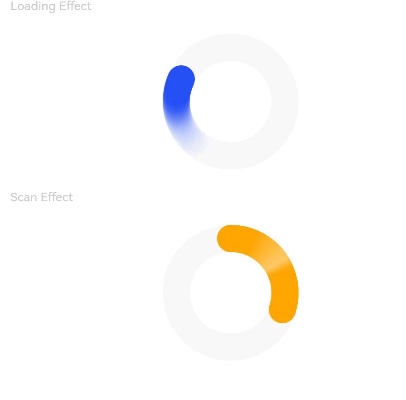
### 示例3(设置环形进度æ¡åŠ¨ç”»ï¼‰
该示例通过style接å£çš„statusã€enableScanEffect属性,实现了环形进度æ¡åŠ¨æ•ˆçš„开关功能。
```ts
// xxx.ets
@Entry
@Component
struct ProgressExample {
build() {
Column({ space: 15 }) {
Text('Loading Effect').fontSize(9).fontColor(0xCCCCCC).width('90%')
Progress({ value: 0, total: 100, type: ProgressType.Ring })
.width(100).color(Color.Blue)
.style({ strokeWidth: 20, status: ProgressStatus.LOADING })
Text('Scan Effect').fontSize(9).fontColor(0xCCCCCC).width('90%')
Progress({ value: 30, total: 100, type: ProgressType.Ring })
.width(100).color(Color.Orange)
.style({ strokeWidth: 20, enableScanEffect: true })
}.width('100%').padding({ top: 5 })
}
}
```
### 示例4(设置胶囊形进度æ¡å±žæ€§ï¼‰
该示例通过style接å£çš„borderColorã€borderWidthã€contentã€fontã€fontColorã€enableScanEffectã€showDefaultPercentage属性,实现了胶囊形进度æ¡è§†è§‰å±žæ€§è®¾ç½®åŠŸèƒ½ã€‚
```ts
// xxx.ets
@Entry
@Component
struct ProgressExample {
build() {
Column({ space: 15 }) {
Row({ space: 40 }) {
Progress({ value: 100, total: 100, type: ProgressType.Capsule }).width(100).height(50)
.style({
borderColor: Color.Blue,
borderWidth: 1,
content: 'Installing...',
font: { size: 13, style: FontStyle.Normal },
fontColor: Color.Gray,
enableScanEffect: false,
showDefaultPercentage: false
})
}
}.width('100%').padding({ top: 5 })
}
}
```

### 示例5(设置进度平滑动效)
该示例通过style接å£çš„enableSmoothEffect属性,实现了进度平滑动效开关的功能。
```ts
// xxx.ets
@Entry
@Component
struct Index {
@State value: number = 0
build() {
Column({ space: 10 }) {
Text('enableSmoothEffect: true')
.fontSize(9)
.fontColor(0xCCCCCC)
.width('90%')
.margin(5)
.margin({ top: 20 })
Progress({ value: this.value, total: 100, type: ProgressType.Linear })
.style({ strokeWidth: 10, enableSmoothEffect: true })
Text('enableSmoothEffect: false').fontSize(9).fontColor(0xCCCCCC).width('90%').margin(5)
Progress({ value: this.value, total: 100, type: ProgressType.Linear })
.style({ strokeWidth: 10, enableSmoothEffect: false })
Button('value +10').onClick(() => {
this.value += 10
})
.width(75)
.height(15)
.fontSize(9)
}
.width('50%')
.height('100%')
.margin({ left: 20 })
}
}
```

### 示例6(设置定制内容区)
该示例通过contentModifier接å£ï¼Œå®žçŽ°äº†è‡ªå®šä¹‰è¿›åº¦æ¡çš„功能,自定义实现星形,其ä¸æ€»è¿›åº¦ä¸º3,且当å‰å€¼å¯é€šè¿‡æŒ‰é’®è¿›è¡Œå¢žå‡ï¼Œè¾¾åˆ°çš„进度被填充自定义颜色。
```ts
// xxx.ets
class MyProgressModifier implements ContentModifier<ProgressConfiguration> {
color: Color = Color.White
constructor(color: Color) {
this.color = color
}
applyContent(): WrappedBuilder<[ProgressConfiguration]> {
return wrapBuilder(myProgress)
}
}
@Builder
function myProgress(config: ProgressConfiguration) {
Column({ space: 30 }) {
Text("当å‰è¿›åº¦ï¼š" + config.value + "/" + config.total).fontSize(20)
Row() {
Flex({ justifyContent: FlexAlign.SpaceBetween }) {
Path()
.width('30%')
.height('30%')
.commands('M108 0 L141 70 L218 78.3 L162 131 L175 205 L108 170 L41.2 205 L55 131 L1 78 L75 68 L108 0 Z')
.fill(config.enabled && config.value >= 1 ? (config.contentModifier as MyProgressModifier).color :
Color.White)
.stroke(Color.Black)
.strokeWidth(3)
Path()
.width('30%')
.height('30%')
.commands('M108 0 L141 70 L218 78.3 L162 131 L175 205 L108 170 L41.2 205 L55 131 L1 78 L75 68 L108 0 Z')
.fill(config.enabled && config.value >= 2 ? (config.contentModifier as MyProgressModifier).color :
Color.White)
.stroke(Color.Black)
.strokeWidth(3)
Path()
.width('30%')
.height('30%')
.commands('M108 0 L141 70 L218 78.3 L162 131 L175 205 L108 170 L41.2 205 L55 131 L1 78 L75 68 L108 0 Z')
.fill(config.enabled && config.value >= 3 ? (config.contentModifier as MyProgressModifier).color :
Color.White)
.stroke(Color.Black)
.strokeWidth(3)
}.width('100%')
}
}.margin({ bottom: 100 })
}
@Entry
@Component
struct Index {
@State currentValue: number = 0
modifier = new MyProgressModifier(Color.Red)
@State myModifier: (MyProgressModifier | undefined) = this.modifier
build() {
Column() {
Progress({ value: this.currentValue, total: 3, type: ProgressType.Ring }).contentModifier(this.modifier)
Button('Progress++').onClick(() => {
if (this.currentValue < 3) {
this.currentValue += 1
}
}).width('30%')
Button('addProgress--').onClick(() => {
if (this.currentValue > 0) {
this.currentValue -= 1
}
}).width('30%')
}.width('100%').height('100%')
}
}
```

### 示例7(设置éšç§éšè—)
该示例通过privacySensitive接å£ï¼Œå®žçŽ°äº†éšç§éšè—效果,效果展示需è¦å¡ç‰‡æ¡†æž¶æ”¯æŒã€‚
```ts
@Entry
@Component
struct ProgressExample {
build() {
Scroll() {
Column({ space: 15 }) {
Row() {
Progress({ value: 50, total: 100, type: ProgressType.Capsule }).width(100).height(50)
.style({
borderColor: Color.Blue,
borderWidth: 1,
content: 'Installing...',
font: { size: 13, style: FontStyle.Normal },
fontColor: Color.Gray,
enableScanEffect: false,
showDefaultPercentage: true
})
.privacySensitive(true)
}
}
}
}
}
```