# 多态样式
设置组件不同状态下的样式。
> **说明:**
>
> 从API Version 8开始支持。后续版本如有新增内容,则采用上角标单独标记该内容的起始版本。
>
> 从API Version 11开始支持另一种写法[attributeModifier](./ts-universal-attributes-attribute-modifier.md),可根据开发者需要动态设置属性。
## stateStyles
stateStyles(value: StateStyles)
设置组件不同状态的样式。
**卡片能力:** 从API version 9开始,该接口支持在ArkTS卡片中使用。
**原子化服务API:** 从API version 11开始,该接口支持在原子化服务中使用。
**系统能力:** SystemCapability.ArkUI.ArkUI.Full
**参数:**
| 参数名 | 类型 | 必填 | 说明 |
| ------ | ----------------------------------- | ---- | ------------------------ |
| value | [StateStyles](#statestyles接口说明) | 是 | 设置组件不同状态的样式。 |
## StateStyles接口说明
**卡片能力:** 从API version 9开始,该接口支持在ArkTS卡片中使用。只支持[通用属性](ts-universal-attributes-size.md)。
**原子化服务API:** 从API version 11开始,该接口支持在原子化服务中使用。
| 状态名称 | 类型 | 必填 | 描述 |
| -------- | -------- | -------- | -------- |
| normal | ()=>void | 否 | 组件无状态时的样式。 |
| pressed | ()=>void | 否 | 组件按下状态的样式。 |
| disabled | ()=>void | 否 | 组件禁用状态的样式。 |
| focused | ()=>void | 否 | 组件获焦状态的样式。 |
| clicked | ()=>void | 否 | 组件点击状态的样式。 |
| selected10+ | ()=>void | 否 | 组件选中状态的样式。
|
**selected选中状态说明**
- 当前多态样式的选中状态样式依赖组件选中属性值,可以使用[onClick](ts-universal-events-click.md)修改属性值,或使用属性自带[$$](../../../quick-start/arkts-two-way-sync.md)双向绑定功能。
- 当前支持selected的组件及其参数/属性值:
| 组件 | 支持的参数/属性 | 起始API版本 |
| ------------------------------------------------------------ | --------------- | ----------- |
| [Checkbox](ts-basic-components-checkbox.md) | select | 10 |
| [CheckboxGroup](ts-basic-components-checkboxgroup.md) | selectAll | 10 |
| [Radio](ts-basic-components-radio.md) | checked | 10 |
| [Toggle](ts-basic-components-toggle.md) | isOn | 10 |
| [ListItem](ts-container-listitem.md) | selected | 10 |
| [GridItem](ts-container-griditem.md) | selected | 10 |
| [MenuItem](ts-basic-components-menuitem.md) | selected | 10 |
## 示例
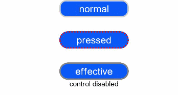
### 示例1(设置Text多态样式)
该示例展示了状态为pressed和disabled时Text组件的样式变化。
```ts
// xxx.ets
@Entry
@Component
struct StyleExample {
@State isEnable: boolean = true
@Styles pressedStyles():void {
.backgroundColor("#ED6F21")
.borderRadius(10)
.borderStyle(BorderStyle.Dashed)
.borderWidth(2)
.borderColor("#33000000")
.width(120)
.height(30)
.opacity(1)
}
@Styles disabledStyles():void {
.backgroundColor("#E5E5E5")
.borderRadius(10)
.borderStyle(BorderStyle.Solid)
.borderWidth(2)
.borderColor("#2a4c1919")
.width(90)
.height(25)
.opacity(1)
}
@Styles normalStyles():void {
.backgroundColor("#0A59F7")
.borderRadius(10)
.borderStyle(BorderStyle.Solid)
.borderWidth(2)
.borderColor("#33000000")
.width(100)
.height(25)
.opacity(1)
}
build() {
Flex({ direction: FlexDirection.Column, alignItems: ItemAlign.Center }) {
Text("normal")
.fontSize(14)
.fontColor(Color.White)
.opacity(0.5)
.stateStyles({
normal: this.normalStyles,
})
.margin({ bottom: 20 })
.textAlign(TextAlign.Center)
Text("pressed")
.backgroundColor("#0A59F7")
.borderRadius(20)
.borderStyle(BorderStyle.Dotted)
.borderWidth(2)
.borderColor(Color.Red)
.width(100)
.height(25)
.opacity(1)
.fontSize(14)
.fontColor(Color.White)
.stateStyles({
pressed: this.pressedStyles,
})
.margin({ bottom: 20 })
.textAlign(TextAlign.Center)
Text(this.isEnable == true ? "effective" : "disabled")
.backgroundColor("#0A59F7")
.borderRadius(20)
.borderStyle(BorderStyle.Solid)
.borderWidth(2)
.borderColor(Color.Gray)
.width(100)
.height(25)
.opacity(1)
.fontSize(14)
.fontColor(Color.White)
.enabled(this.isEnable)
.stateStyles({
disabled: this.disabledStyles,
})
.textAlign(TextAlign.Center)
Text("control disabled")
.onClick(() => {
this.isEnable = !this.isEnable
console.log(`${this.isEnable}`)
})
}
.width(350).height(300)
}
}
```
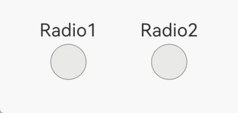
### 示例2(设置Radio多态样式)
该示例展示了状态为selected时Radio组件的样式变化。
```ts
// xxx.ets
@Entry
@Component
struct Index {
@State value: boolean = false
@State value2: boolean = false
@Styles
normalStyles(): void{
.backgroundColor("#E5E5E1")
}
@Styles
selectStyles(): void{
.backgroundColor("#ED6F21")
.borderWidth(2)
}
build() {
Flex({ direction: FlexDirection.Row, justifyContent: FlexAlign.Center, alignItems: ItemAlign.Center }) {
Column() {
Text('Radio1')
.fontSize(25)
Radio({ value: 'Radio1', group: 'radioGroup1' })
.checked(this.value)
.height(50)
.width(50)
.borderWidth(0)
.borderRadius(30)
.onClick(() => {
this.value = !this.value
})
.stateStyles({
normal: this.normalStyles,
selected: this.selectStyles,
})
}
.margin(30)
Column() {
Text('Radio2')
.fontSize(25)
Radio({ value: 'Radio2', group: 'radioGroup2' })
.checked($$this.value2)
.height(50)
.width(50)
.borderWidth(0)
.borderRadius(30)
.stateStyles({
normal: this.normalStyles,
selected: this.selectStyles,
})
}
.margin(30)
}.padding({ top: 30 })
}
}
```