# advanced.Counter
A counter is a component used to accurately adjust values.
> **NOTE**
>
> This component is supported since API version 11. Updates will be marked with a superscript to indicate their earliest API version.
## Modules to Import
```
import { CounterType, CounterComponent, CounterOptions, DateData } from '@kit.ArkUI';
```
## Child Components
Not supported
## CounterComponent
CounterComponent({ options: CounterOptions })
Defines a counter.
**Decorator**: @Component
**Atomic service API**: This API can be used in atomic services since API version 12.
**System capability**: SystemCapability.ArkUI.ArkUI.Full
**Parameters**
| Name | Type | Mandatory| Decorator| Description |
| ------- | --------------------------------- | ---- | ---------- | ----------------------- |
| options | [CounterOptions](#counteroptions) | Yes | @Prop | Parameters of the counter.|
## CounterOptions
Defines the type and style parameters of the counter.
**Atomic service API**: This API can be used in atomic services since API version 12.
**System capability**: SystemCapability.ArkUI.ArkUI.Full
| Name | Type | Mandatory | Description |
| ----------- | ---------- | ------| --------------------------------- |
| type | [CounterType](#countertype) | Yes | Type of the current counter.|
| direction<sup>12+</sup> | [Direction](ts-appendix-enums.md#direction) | No| Layout direction.<br>Default value: **Direction.Auto**|
| numberOptions | [NumberStyleOptions](#numberstyleoptions) | No | Parameters of the number style counter.|
| inlineOptions | [InlineStyleOptions](#inlinestyleoptions) | No| Parameters of the inline number style counter.|
| dateOptions | [DateStyleOptions](#datestyleoptions) | No| Parameters of the inline date style counter.|
A counter type must go with parameters of the matching counter style. Below is a mapping between the counter types and counter styles.
| Counter Type | Counter Style |
| ----------------------- | ------------------ |
| CounterType.LIST | NumberStyleOptions |
| CounterType.COMPACT | NumberStyleOptions |
| CounterType.INLINE | InlineStyleOptions |
| CounterType.INLINE_DATE | DateStyleOptions |
## CounterType
Enumerates the counter types.
**Atomic service API**: This API can be used in atomic services since API version 12.
**System capability**: SystemCapability.ArkUI.ArkUI.Full
| Name | Description |
| ----------- | --------------------------- |
| LIST | List counter. |
| COMPACT | Compact counter. |
| INLINE | Inline number counter.|
| INLINE_DATE | Inline date counter. |
## CommonOptions
Defines common attributes and events of counters.
**Atomic service API**: This API can be used in atomic services since API version 12.
**System capability**: SystemCapability.ArkUI.ArkUI.Full
| Name | Type | Mandatory| Default Value| Description |
| --------------- | ------------------------- | ---- | ------ | ------------------------------------------------------------ |
| focusable | boolean | No | true | Whether the counter is focusable.<br>**NOTE**<br>This attribute takes effect for the number style counter.|
| step | number | No | 1 | Step of the counter.<br>Value range: an integer greater than or equal to 1. |
| onHoverIncrease | (isHover: boolean) =>void | No | - | Callback invoked when the mouse pointer is moved over or away from the Increase button of the counter.<br>**isHover**: whether the mouse pointer hovers over the component. The value **true** means that the mouse pointer enters the component, and the value **false** means that the mouse pointer leaves the component.|
| onHoverDecrease | (isHover: boolean) =>void | No | - | Callback invoked when the mouse pointer is moved over or away from the Decrease button of the counter.<br>**isHover**: whether the mouse pointer hovers over the component. The value **true** means that the mouse pointer enters the component, and the value **false** means that the mouse pointer leaves the component.|
## InlineStyleOptions
Defines the attributes and events of the inline number style counter.
Inherits from [CommonOptions](#commonoptions).
**Atomic service API**: This API can be used in atomic services since API version 12.
**System capability**: SystemCapability.ArkUI.ArkUI.Full
| Name | Type | Mandatory| Default Value| Description |
| --------- | ---------------------- | ---- | ------ | ------------------------------------------------------ |
| value | number | No | 0 | Initial value of the counter. |
| min | number | No | 0 | Minimum value of the counter. |
| max | number | No | 999 | Maximum value of the counter. |
| textWidth | number | No | 0 | Text width of the counter. |
| onChange | (value: number) =>void | No | - | Callback invoked when the value changes. The current value is returned.<br>**value**: current value.|
## NumberStyleOptions
Defines the attributes and events of the number style counter.
Inherits from [InlineStyleOptions](#inlinestyleoptions).
**Atomic service API**: This API can be used in atomic services since API version 12.
**System capability**: SystemCapability.ArkUI.ArkUI.Full
| Name | Type | Mandatory| Default Value| Description |
| --------------- | ------------------------------------------------------------ | ---- | ------ | --------------------------------------------- |
| label | [ResourceStr](ts-types.md#resourcestr) | No | - | Label of the counter. |
| onFocusIncrease | () =>void | No | - | Callback invoked when the Increase button of the counter gains focus.|
| onFocusDecrease | () =>void | No | - | Callback invoked when the Decrease button of the counter gains focus.|
| onBlurIncrease | () =>void | No | - | Callback invoked when the Increase button of the counter loses focus.|
| onBlurDecrease | () =>void | No | - | Callback invoked when the Decrease button of the counter loses focus.|
## DateStyleOptions
Defines the attributes and events of the inline date style counter.
Inherits from [CommonOptions](#commonoptions).
**Atomic service API**: This API can be used in atomic services since API version 12.
**System capability**: SystemCapability.ArkUI.ArkUI.Full
| Name | Type | Mandatory| Default Value| Description |
| ------------ | ----------------------------------- | ---- | ------ | --------------------------------------------------------- |
| year | number | No | 1 | Initial year of the counter. |
| month | number | No | 1 | Initial month of the counter. |
| day | number | No | 1 | Initial day of the counter. |
| onDateChange | (date: [DateData](#datedata))=>void | No | - | Callback invoked when the date changes. The current date is returned.<br>**date**: current date.|
## DateData
Defines common date attributes and methods.
**Atomic service API**: This API can be used in atomic services since API version 12.
**System capability**: SystemCapability.ArkUI.ArkUI.Full
| Name | Type | Description |
| ---------- | ------ | ---------------------------- |
| year | number | Initial year of the counter. |
| month | number | Initial month of the counter. |
| day | number | Initial day of the counter. |
### constructor
constructor(year: number, month: number, day: number)
A constructor used to create a **DateData** object.
**Atomic service API**: This API can be used in atomic services since API version 12.
**System capability**: SystemCapability.ArkUI.ArkUI.Full
| Name| Type| Description|
| ---------- | ------ | ---------------------------- |
| year | number | Initial year of the counter. |
| month | number | Initial month of the counter. |
| day | number | Initial day of the counter. |
### toString
toString(): string
Current date.
**Atomic service API**: This API can be used in atomic services since API version 12.
**System capability**: SystemCapability.ArkUI.ArkUI.Full
**Return value**
| Type| Description|
| -------- | -------- |
| string | Current date.|
## Example
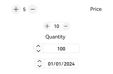
### Example 1
```ts
import { CounterType, CounterComponent } from '@kit.ArkUI';
@Entry
@Component
struct ListCounterExample {
build() {
Column() {
// List counter
CounterComponent({
options: {
type: CounterType.LIST,
numberOptions: {
label: "Price",
min: 0,
value: 5,
max: 10
}
}
})
}
}
}
```

### Example 2
```ts
import { CounterType, CounterComponent } from '@kit.ArkUI';
@Entry
@Component
struct CompactCounterExample {
build() {
Column() {
// Compact counter
CounterComponent({
options: {
type: CounterType.COMPACT,
numberOptions: {
label: "Quantity",
value: 10,
min: 0,
max: 100,
step: 10
}
}
})
}
}
}
```

### Example 3
```ts
import { CounterType, CounterComponent } from '@kit.ArkUI';
@Entry
@Component
struct NumberStyleExample {
build() {
Column() {
// Inline number counter
CounterComponent({
options: {
type: CounterType.INLINE,
inlineOptions: {
value: 100,
min: 10,
step: 2,
max: 1000,
textWidth: 100,
onChange: (value: number) => {
console.log("onDateChange Date: " + value.toString());
}
}
}
})
}
}
}
```

### Example 4
```ts
import { CounterType, CounterComponent, DateData } from '@kit.ArkUI';
@Entry
@Component
struct DataStyleExample {
build() {
Column() {
// Inline date counter
CounterComponent({
options: {
type: CounterType.INLINE_DATE,
dateOptions: {
year: 2016,
onDateChange: (date: DateData) => {
console.log("onDateChange Date: " + date.toString());
}
}
}
})
}
}
}
```

### Example 5
This example shows a mirrored layout of different types of counters.
```ts
// xxx.ets
import { CounterType, CounterComponent, DateData } from '@kit.ArkUI';
@Entry
@Component
struct CounterPage {
@State currentDirection: Direction = Direction.Rtl
build() {
Column({}) {
// List counter
CounterComponent({
options: {
direction: this.currentDirection,
type: CounterType.LIST,
numberOptions: {
label: "Price",
min: 0,
value: 5,
max: 10,
}
}
})
.width('80%')
// Compact counter
CounterComponent({
options: {
direction: this.currentDirection,
type: CounterType.COMPACT,
numberOptions: {
label: "Quantity",
value: 10,
min: 0,
max: 100,
step: 10
}
}
}).margin({ top: 20 })
// Inline number counter
CounterComponent({
options: {
type: CounterType.INLINE,
direction: this.currentDirection,
inlineOptions: {
value: 100,
min: 10,
step: 2,
max: 1000,
textWidth: 100,
onChange: (value: number) => {
console.log("onDateChange Date: " + value.toString());
}
}
}
}).margin({ top: 20 })
// Inline date counter
CounterComponent({
options: {
direction: this.currentDirection,
type: CounterType.INLINE_DATE,
dateOptions: {
year: 2024,
onDateChange: (date: DateData) => {
console.log("onDateChange Date: " + date.toString());
}
}
}
}).margin({ top: 20 })
}
.width('100%')
.height('100%')
.justifyContent(FlexAlign.Center)
.alignItems(HorizontalAlign.Center)
}
}
```