# FoldSplitContainer
**FoldSplitContainer** is a layout container designed to manage regions for two-panel and three-panel arrangements on a foldable device across various states, including the expanded state, the hover state, and the folded state.
> **NOTE**
>
> This component is supported since API version 12. Updates will be marked with a superscript to indicate their earliest API version.
## Child Components
Not supported
## FoldSplitContainer
FoldSplitContainer({
primary: Callback<void>,
secondary: Callback<void>,
extra?: Callback<void>,
expandedLayoutOptions?: ExpandedRegionLayoutOptions,
hoverModeLayoutOptions?: HoverModeRegionLayoutOptions,
foldedLayoutOptions?: FoldedRegionLayoutOptions,
animationOptions?: AnimateParam,
onHoverStatusChange?: onHoverStatusChangeHandler
})
**Decorator**: \@Component
**Atomic service API**: This API can be used in atomic services since API version 12.
**System capability**: SystemCapability.ArkUI.ArkUI.Full
**Parameters**
| Name| Type| Mandatory| Decorator| Description|
| -------- | -------- | -------- | -------- | -------- |
| primary | ()=>void | No| @BuilderParam | Callback function for the primary region.|
| secondary | ()=>void | No| @BuilderParam | Callback function for the secondary region.|
| extra | ()=>void | No| @BuilderParam | Callback function for the extra region. If this parameter is not provided, there is no corresponding region.|
| expandedLayoutOptions | [ExpandedRegionLayoutOptions](#expandedregionlayoutoptions) | No| @Prop | Layout information for the expanded state.|
| hoverModeLayoutOptions | [HoverModeRegionLayoutOptions](#hovermoderegionlayoutoptions) | No| @Prop | Layout information for the hover state.|
| foldedLayoutOptions | [FoldedRegionLayoutOptions](#foldedregionlayoutoptions) | No| @Prop | Layout information for the folded state.|
| animationOptions | [AnimateParam](ts-explicit-animation.md#animateparam) \| null | No| @Prop | Animation settings. The value **null** indicates that the animation is disabled.|
| onHoverStatusChange | [onHoverStatusChangeHandler](#onhoverstatuschangehandler) | No| - | Callback function triggered when the foldable device enters or exits the hover state.|
## ExpandedRegionLayoutOptions
**Decorator**: \@Prop
**Atomic service API**: This API can be used in atomic services since API version 12.
**System capability**: SystemCapability.ArkUI.ArkUI.Full
Defines the layout information for the expanded state.
| Name| Type| Mandatory| Description|
| -------- | -------- | -------- | -------- |
| isExtraRegionPerpendicular | boolean | No| Whether the extra region extends perpendicularly through the entire component from top to bottom. This setting takes effect only when **extra** is effective.
Default value: **true** |
| verticalSplitRatio | number | No| Height ratio between the primary and secondary regions.
Default value: **PresetSplitRatio.LAYOUT_1V1** |
| horizontalSplitRatio | number | No| Width ratio between the primary and extra regions. This setting takes effect only when **extra** is effective.
Default value: **PresetSplitRatio.LAYOUT_3V2** |
| extraRegionPosition | [ExtraRegionPosition](#extraregionposition) | No| Position information of the extra region. This setting takes effect only when **isExtraRegionPerpendicular** is **false**.
Default value: **ExtraRegionPosition.top** |
## HoverModeRegionLayoutOptions
**Decorator**: \@Prop
**Atomic service API**: This API can be used in atomic services since API version 12.
**System capability**: SystemCapability.ArkUI.ArkUI.Full
Defines the layout information for the hover state.
| Name| Type| Mandatory| Description|
| -------- | -------- | -------- | -------- |
| showExtraRegion | boolean | No| Whether to display the extra region in the half-folded state. Default value: **false**|
| horizontalSplitRatio | number | No| Width ratio between the primary and extra regions. This setting takes effect only when **extra** is effective.
Default value: **PresetSplitRatio.LAYOUT_3V2** |
| extraRegionPosition | [ExtraRegionPosition](#extraregionposition) | No| Position information of the extra region. This setting takes effect only when **showExtraRegion** is set.
Default value: **ExtraRegionPosition.top** |
> **NOTE**
>
> 1. When the device is in the hover state, there is an avoid area, and layout calculations need to account for the impact of the avoid area on the layout.
> 2. In the hover state, the upper half screen is used for display, and the lower half is used for interaction.
## FoldedRegionLayoutOptions
**Decorator**: \@Prop
**Atomic service API**: This API can be used in atomic services since API version 12.
**System capability**: SystemCapability.ArkUI.ArkUI.Full
Defines the layout information for the folded state.
| Name| Type| Mandatory| Description|
| -------- | -------- | -------- | -------- |
| verticalSplitRatio | number | Yes| Height ratio between the primary and secondary regions. Default value: **PresetSplitRatio.LAYOUT_1V1**|
## onHoverStatusChangeHandler
**Atomic service API**: This API can be used in atomic services since API version 12.
Implements a handler for the **onHoverStatusChange** event.
| Name| Type| Mandatory| Description|
| -------- | -------- | -------- | -------- |
| callback | (status: [HoverModeStatus](#hovermodestatus)) => void | Yes| Callback function triggered when the foldable device enters or exits the hover state.|
## HoverModeStatus
**Atomic service API**: This API can be used in atomic services since API version 12.
**System capability**: SystemCapability.ArkUI.ArkUI.Full
Provides the layout information of the folded state.
| Name| Type| Mandatory| Description|
| -------- | -------- | -------- | -------- |
| foldStatus | [FoldStatus10+](../js-apis-display.md#foldstatus10) | Yes| Fold status of the device.|
| isHoverMode | boolean | Yes| Whether the application is in the hover state.|
| appRotation | number | Yes| Rotation angle of the application.|
| windowStatusType | [WindowStatusType11+](../js-apis-window.md#windowstatustype11) | Yes| Window mode.|
## ExtraRegionPosition
**Atomic service API**: This API can be used in atomic services since API version 12.
Provides the position information of the extra region.
| Name| Value| Description|
| -------- | -------- | -------- |
| top | 1 | The extra region is in the upper half of the component.|
| bottom | 2 | The extra region is in the lower half of the component.|
## PresetSplitRatio
**Atomic service API**: This API can be used in atomic services since API version 12.
Enumerates the split ratios.
| Name| Value| Description|
| -------- | -------- | -------- |
| LAYOUT_1V1 | 1/1 | 1:1.|
| LAYOUT_3V2 | 3/2 | 3:2.|
| LAYOUT_2V3 | 2/3 | 2:3.|
## Example
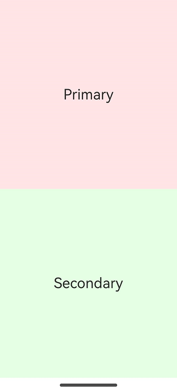
### Example 1
```ts
import { FoldSplitContainer } from '@kit.ArkUI';
@Entry
@Component
struct TwoColumns {
@Builder
privateRegion() {
Text("Primary")
.backgroundColor('rgba(255, 0, 0, 0.1)')
.fontSize(28)
.textAlign(TextAlign.Center)
.height('100%')
.width('100%')
}
@Builder
secondaryRegion() {
Text("Secondary")
.backgroundColor('rgba(0, 255, 0, 0.1)')
.fontSize(28)
.textAlign(TextAlign.Center)
.height('100%')
.width('100%')
}
build() {
RelativeContainer() {
FoldSplitContainer({
primary: () => {
this.privateRegion()
},
secondary: () => {
this.secondaryRegion()
}
})
}
.height('100%')
.width('100%')
}
}
```
| Folded| Expanded| Hover|
| ----- | ------ | ------ |
|  |  |  |
### Example 2
```ts
import { FoldSplitContainer } from '@kit.ArkUI';
@Entry
@Component
struct ThreeColumns {
@Builder
privateRegion() {
Text("Primary")
.backgroundColor('rgba(255, 0, 0, 0.1)')
.fontSize(28)
.textAlign(TextAlign.Center)
.height('100%')
.width('100%')
}
@Builder
secondaryRegion() {
Text("Secondary")
.backgroundColor('rgba(0, 255, 0, 0.1)')
.fontSize(28)
.textAlign(TextAlign.Center)
.height('100%')
.width('100%')
}
@Builder
extraRegion() {
Text("Extra")
.backgroundColor('rgba(0, 0, 255, 0.1)')
.fontSize(28)
.textAlign(TextAlign.Center)
.height('100%')
.width('100%')
}
build() {
RelativeContainer() {
FoldSplitContainer({
primary: () => {
this.privateRegion()
},
secondary: () => {
this.secondaryRegion()
},
extra: () => {
this.extraRegion()
}
})
}
.height('100%')
.width('100%')
}
}
```
| Folded| Expanded| Hover|
| ----- | ------ | ------ |
|  |  |  |
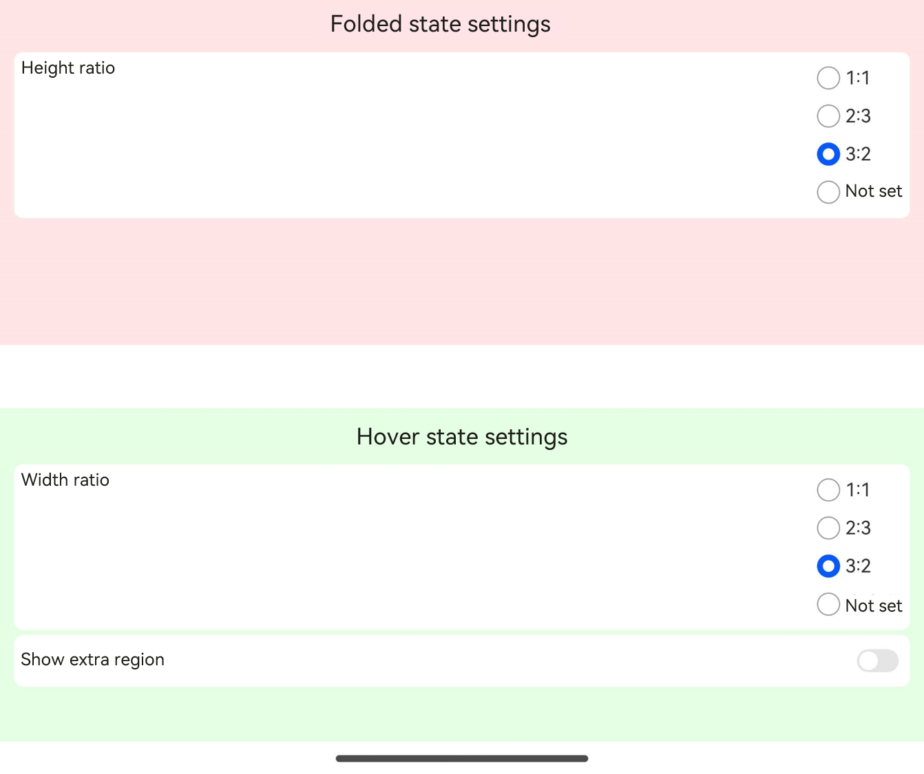
### Example 3
```ts
import {
FoldSplitContainer,
PresetSplitRatio,
ExtraRegionPosition,
ExpandedRegionLayoutOptions,
HoverModeRegionLayoutOptions,
FoldedRegionLayoutOptions
} from '@kit.ArkUI';
@Component
struct Region {
@Prop title: string;
@BuilderParam content: () => void;
@Prop compBackgroundColor: string;
build() {
Column({ space: 8 }) {
Text(this.title)
.fontSize("24fp")
.fontWeight(600)
Scroll() {
this.content()
}
.layoutWeight(1)
.width("100%")
}
.backgroundColor(this.compBackgroundColor)
.width("100%")
.height("100%")
.padding(12)
}
}
const noop = () => {
};
@Component
struct SwitchOption {
@Prop label: string = ""
@Prop value: boolean = false
public onChange: (checked: boolean) => void = noop;
build() {
Row() {
Text(this.label)
Blank()
Toggle({ type: ToggleType.Switch, isOn: this.value })
.onChange((isOn) => {
this.onChange(isOn);
})
}
.backgroundColor(Color.White)
.borderRadius(8)
.padding(8)
.width("100%")
}
}
interface RadioOptions {
label: string;
value: Object | undefined | null;
onChecked: () => void;
}
@Component
struct RadioOption {
@Prop label: string;
@Prop value: Object | undefined | null;
@Prop options: Array;
build() {
Row() {
Text(this.label)
Blank()
Column({ space: 4 }) {
ForEach(this.options, (option: RadioOptions) => {
Row() {
Radio({
group: this.label,
value: JSON.stringify(option.value),
})
.checked(this.value === option.value)
.onChange((checked) => {
if (checked) {
option.onChecked();
}
})
Text(option.label)
}
})
}
.alignItems(HorizontalAlign.Start)
}
.alignItems(VerticalAlign.Top)
.backgroundColor(Color.White)
.borderRadius(8)
.padding(8)
.width("100%")
}
}
@Entry
@Component
struct Index {
@State expandedRegionLayoutOptions: ExpandedRegionLayoutOptions = {
horizontalSplitRatio: PresetSplitRatio.LAYOUT_3V2,
verticalSplitRatio: PresetSplitRatio.LAYOUT_1V1,
isExtraRegionPerpendicular: true,
extraRegionPosition: ExtraRegionPosition.TOP
};
@State foldingRegionLayoutOptions: HoverModeRegionLayoutOptions = {
horizontalSplitRatio: PresetSplitRatio.LAYOUT_3V2,
showExtraRegion: false,
extraRegionPosition: ExtraRegionPosition.TOP
};
@State foldedRegionLayoutOptions: FoldedRegionLayoutOptions = {
verticalSplitRatio: PresetSplitRatio.LAYOUT_1V1
};
@Builder
MajorRegion() {
Region({
title: "Folded state settings",
compBackgroundColor: "rgba(255, 0, 0, 0.1)",
}) {
Column({ space: 4 }) {
RadioOption({
label: "Height ratio",
value: this.foldedRegionLayoutOptions.verticalSplitRatio,
options: [
{
label: "1:1",
value: PresetSplitRatio.LAYOUT_1V1,
onChecked: () => {
this.foldedRegionLayoutOptions.verticalSplitRatio = PresetSplitRatio.LAYOUT_1V1
}
},
{
label: "2:3",
value: PresetSplitRatio.LAYOUT_2V3,
onChecked: () => {
this.foldedRegionLayoutOptions.verticalSplitRatio = PresetSplitRatio.LAYOUT_2V3
}
},
{
label: "3:2",
value: PresetSplitRatio.LAYOUT_3V2,
onChecked: () => {
this.foldedRegionLayoutOptions.verticalSplitRatio = PresetSplitRatio.LAYOUT_3V2
}
},
{
label: "Not set",
value: undefined,
onChecked: () => {
this.foldedRegionLayoutOptions.verticalSplitRatio = undefined
}
}
]
})
}
.constraintSize({ minHeight: "100%" })
}
}
@Builder
MinorRegion() {
Region({
title: "Hover state settings",
compBackgroundColor: "rgba(0, 255, 0, 0.1)"
}) {
Column({ space: 4 }) {
RadioOption({
label: "Width ratio",
value: this.foldingRegionLayoutOptions.horizontalSplitRatio,
options: [
{
label: "1:1",
value: PresetSplitRatio.LAYOUT_1V1,
onChecked: () => {
this.foldingRegionLayoutOptions.horizontalSplitRatio = PresetSplitRatio.LAYOUT_1V1
}
},
{
label: "2:3",
value: PresetSplitRatio.LAYOUT_2V3,
onChecked: () => {
this.foldingRegionLayoutOptions.horizontalSplitRatio = PresetSplitRatio.LAYOUT_2V3
}
},
{
label: "3:2",
value: PresetSplitRatio.LAYOUT_3V2,
onChecked: () => {
this.foldingRegionLayoutOptions.horizontalSplitRatio = PresetSplitRatio.LAYOUT_3V2
}
},
{
label: "Not set",
value: undefined,
onChecked: () => {
this.foldingRegionLayoutOptions.horizontalSplitRatio = undefined
}
},
]
})
SwitchOption({
label: "Show extra region",
value: this.foldingRegionLayoutOptions.showExtraRegion,
onChange: (checked) => {
this.foldingRegionLayoutOptions.showExtraRegion = checked;
}
})
if (this.foldingRegionLayoutOptions.showExtraRegion) {
RadioOption({
label: "Extra region location,"
value: this.foldingRegionLayoutOptions.extraRegionPosition,
options: [
{
label: "Top,"
value: ExtraRegionPosition.TOP,
onChecked: () => {
this.foldingRegionLayoutOptions.extraRegionPosition = ExtraRegionPosition.TOP
}
},
{
label: "Bottom,"
value: ExtraRegionPosition.BOTTOM,
onChecked: () => {
this.foldingRegionLayoutOptions.extraRegionPosition = ExtraRegionPosition.BOTTOM
}
},
{
label: "Not set",
value: undefined,
onChecked: () => {
this.foldingRegionLayoutOptions.extraRegionPosition = undefined
}
},
]
})
}
}
.constraintSize({ minHeight: "100%" })
}
}
@Builder
ExtraRegion() {
Region({
title: "Expanded state settings,"
compBackgroundColor: "rgba(0, 0, 255, 0.1)"
}) {
Column({ space: 4 }) {
RadioOption({
label: "Width ratio,"
value: this.expandedRegionLayoutOptions.horizontalSplitRatio,
options: [
{
label: "1:1",
value: PresetSplitRatio.LAYOUT_1V1,
onChecked: () => {
this.expandedRegionLayoutOptions.horizontalSplitRatio = PresetSplitRatio.LAYOUT_1V1
}
},
{
label: "2:3",
value: PresetSplitRatio.LAYOUT_2V3,
onChecked: () => {
this.expandedRegionLayoutOptions.horizontalSplitRatio = PresetSplitRatio.LAYOUT_2V3
}
},
{
label: "3:2",
value: PresetSplitRatio.LAYOUT_3V2,
onChecked: () => {
this.expandedRegionLayoutOptions.horizontalSplitRatio = PresetSplitRatio.LAYOUT_3V2
}
},
{
label: "Not set",
value: undefined,
onChecked: () => {
this.expandedRegionLayoutOptions.horizontalSplitRatio = undefined
}
},
]
})
RadioOption({
label: "Height ratio",
value: this.expandedRegionLayoutOptions.verticalSplitRatio,
options: [
{
label: "1:1",
value: PresetSplitRatio.LAYOUT_1V1,
onChecked: () => {
this.expandedRegionLayoutOptions.verticalSplitRatio = PresetSplitRatio.LAYOUT_1V1
}
},
{
label: "2:3",
value: PresetSplitRatio.LAYOUT_2V3,
onChecked: () => {
this.expandedRegionLayoutOptions.verticalSplitRatio = PresetSplitRatio.LAYOUT_2V3
}
},
{
label: "3:2",
value: PresetSplitRatio.LAYOUT_3V2,
onChecked: () => {
this.expandedRegionLayoutOptions.verticalSplitRatio = PresetSplitRatio.LAYOUT_3V2
}
},
{
label: "Not set",
value: undefined,
onChecked: () => {
this.expandedRegionLayoutOptions.verticalSplitRatio = undefined
}
}
]
})
SwitchOption({
label: "Show extra region perpendicularly,"
value: this.expandedRegionLayoutOptions.isExtraRegionPerpendicular,
onChange: (checked) => {
this.expandedRegionLayoutOptions.isExtraRegionPerpendicular = checked;
}
})
if (!this.expandedRegionLayoutOptions.isExtraRegionPerpendicular) {
RadioOption({
label: "Extra region location,"
value: this.expandedRegionLayoutOptions.extraRegionPosition,
options: [
{
label: "Top,"
value: ExtraRegionPosition.TOP,
onChecked: () => {
this.expandedRegionLayoutOptions.extraRegionPosition = ExtraRegionPosition.TOP
}
},
{
label: "Bottom,"
value: ExtraRegionPosition.BOTTOM,
onChecked: () => {
this.expandedRegionLayoutOptions.extraRegionPosition = ExtraRegionPosition.BOTTOM
}
},
{
label: "Not set",
value: undefined,
onChecked: () => {
this.expandedRegionLayoutOptions.extraRegionPosition = undefined
}
},
]
})
}
}
.constraintSize({ minHeight: "100%" })
}
}
build() {
Column() {
FoldSplitContainer({
primary: () => {
this.MajorRegion()
},
secondary: () => {
this.MinorRegion()
},
extra: () => {
this.ExtraRegion()
},
expandedLayoutOptions: this.expandedRegionLayoutOptions,
hoverModeLayoutOptions: this.foldingRegionLayoutOptions,
foldedLayoutOptions: this.foldedRegionLayoutOptions,
})
}
.width("100%")
.height("100%")
}
}
```
| Folded| Expanded| Hover|
| ----- | ------ | ------ |
|  |  |  |
| |  |  |
| |  |  |