# Popup
The popup component is used to display popups in a specific style.
> **NOTE**
>
> - This component is supported since API version 11. Updates will be marked with a superscript to indicate their earliest API version.
>
> - Use this component with the custom popup features in [popup control](ts-universal-attributes-popup.md) for best results.
## Modules to Import
```
import { Popup, PopupOptions, PopupTextOptions, PopupButtonOptions, PopupIconOptions } from '@kit.ArkUI';
```
## Child Components
Not supported
## Popup
Popup(options: PopupOptions)
**Decorator**: @Builder
**Atomic service API**: This API can be used in atomic services since API version 12.
**System capability**: SystemCapability.ArkUI.ArkUI.Full
**Parameters**
| Name | Type | Mandatory| Description |
| ------- | ----------------------------- | ---- | --------------------- |
| options | [PopupOptions](#popupoptions) | Yes | Parameters of the popup.|
## PopupOptions
Defines the style parameters of the popup.
**Atomic service API**: This API can be used in atomic services since API version 12.
**System capability**: SystemCapability.ArkUI.ArkUI.Full
| Name | Type | Mandatory | Description |
| ----------- | ---------- | ------| --------------------------------- |
| icon | [PopupIconOptions](#popupiconoptions) | No | Icon of the popup.
**NOTE**
The icon is not displayed when **size** is set to an invalid value or **0**.|
| title | [PopupTextOptions](#popuptextoptions) | No | Title of the popup. |
| message | [PopupTextOptions](#popuptextoptions) | Yes | Content of the popup.
**NOTE**
**fontWeight** is not available for **messages**.|
| showClose | boolean \| [Resource](ts-types.md#resource) | No | Whether to show the close button.
Default value: **true**|
| onClose | () => void | No | Callback for the popup close button.|
| buttons | [[PopupButtonOptions](#popupbuttonoptions)?,[PopupButtonOptions](#popupbuttonoptions)?] | No | Buttons of the popup. A maximum of two buttons can be set.|
| direction12+ | [Direction](ts-appendix-enums.md#direction) | No | Layout direction.
Default value: **Direction.Auto** |
## PopupTextOptions
Defines the text parameters of the popup.
**Atomic service API**: This API can be used in atomic services since API version 12.
**System capability**: SystemCapability.ArkUI.ArkUI.Full
| Name | Type | Mandatory| Description |
| ---------- | ------------------------------------------------------------ | ---- | ------------------ |
| text | [ResourceStr](ts-types.md#resourcestr) | Yes | Text content. |
| fontSize | number \| string \| [Resource](ts-types.md#resource) | No | Text font size.
Default value: **$r('sys.float.ohos_id_text_size_body2')** |
| fontColor | [ResourceColor](ts-types.md#resourcecolor) | No | Text font color.
Default value: **$r('sys.color.ohos_id_color_text_secondary')**|
| fontWeight | number \| [FontWeight](ts-appendix-enums.md#fontweight) \| string | No | Text font weight.
Default value: **FontWeight.Regular**|
## PopupButtonOptions
Defines the button attributes and events.
**Atomic service API**: This API can be used in atomic services since API version 12.
**System capability**: SystemCapability.ArkUI.ArkUI.Full
| Name | Type | Mandatory| Description |
| --------- | ---------------------------------------------------- | ---- | ---------------------- |
| text | [ResourceStr](ts-types.md#resourcestr) | Yes | Text of the button. |
| action | () => void | No | Click callback of the button.|
| fontSize | number \| string \| [Resource](ts-types.md#resource) | No | Font size of the button text.
Default value: **$r('sys.float.ohos_id_text_size_button2')**|
| fontColor | [ResourceColor](ts-types.md#resourcecolor) | No | Font color of the button text.
Default value: **$r('sys.color.ohos_id_color_text_primary_activated')**|
## PopupIconOptions
Defines the attributes of the icon (in the upper right corner).
**Atomic service API**: This API can be used in atomic services since API version 12.
**System capability**: SystemCapability.ArkUI.ArkUI.Full
| Name | Type | Mandatory| Description |
| ------------ | ------------------------------------------------------------ | ---- | ---------------------------------- |
| image | [ResourceStr](ts-types.md#resourcestr) | Yes | Icon content. |
| width | [Dimension](ts-types.md#dimension10) | No | Icon width.
Default value: **32VP**|
| height | [Dimension](ts-types.md#dimension10) | No | Icon height.
Default value: **32VP**|
| fillColor | [ResourceColor](ts-types.md#resourcecolor) | No | Icon fill color. |
| borderRadius | [Length](ts-types.md#length) \| [BorderRadiuses](ts-types.md#borderradiuses9) | No | Rounded corner of the icon.
Default value: **$r('sys.float.ohos_id_corner_radius_default_s')** |
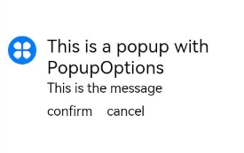
## Example
```ts
// xxx.ets
import { Popup, PopupTextOptions, PopupButtonOptions, PopupIconOptions } from '@kit.ArkUI';
@Entry
@Component
struct PopupExample {
build() {
Row() {
// Define a popup.
Popup({
// Set the icon through PopupIconOptions.
icon: {
image: $r('app.media.icon'),
width:32,
height:32,
fillColor:Color.White,
borderRadius: 16
} as PopupIconOptions,
// Set the text through PopupTextOptions.
title: {
text: 'This is a popup with PopupOptions',
fontSize: 20,
fontColor: Color.Black,
fontWeight: FontWeight.Normal
} as PopupTextOptions,
// Set the text through PopupTextOptions.
message: {
text: 'This is the message',
fontSize: 15,
fontColor: Color.Black
} as PopupTextOptions,
showClose: false,
onClose: () => {
console.info('close Button click')
},
// Set the button through PopupButtonOptions.
buttons: [{
text: 'confirm',
action: () => {
console.info('confirm button click')
},
fontSize: 15,
fontColor: Color.Black,
},
{
text: 'cancel',
action: () => {
console.info('cancel button click')
},
fontSize: 15,
fontColor: Color.Black
},] as [PopupButtonOptions?, PopupButtonOptions?]
})
}
.width(300)
.height(200)
.borderWidth(2)
.justifyContent(FlexAlign.Center)
}
}
```
## Example 2
This example shows a mirrored layout of the popup.
```ts
// xxx.ets
import { Popup, PopupTextOptions, PopupButtonOptions, PopupIconOptions } from '@kit.ArkUI'
@Entry
@Component
struct PopupPage {
@State currentDirection: Direction = Direction.Rtl
build() {
Column() {
// Define a popup.
Popup({
// Set the icon through PopupIconOptions.
direction: this.currentDirection,
icon: {
image: $r('app.media.icon'),
width: 32,
height: 32,
fillColor: Color.White,
borderRadius: 16,
} as PopupIconOptions,
// Set the text through PopupTextOptions.
title: {
text: 'This is a popup with PopupOptions',
fontSize: 20,
fontColor: Color.Black,
fontWeight: FontWeight.Normal,
} as PopupTextOptions,
// Set the text through PopupTextOptions.
message: {
text: 'This is the message',
fontSize: 15,
fontColor: Color.Black,
} as PopupTextOptions,
showClose: true,
onClose: () => {
console.info('close Button click')
},
// Set the button through PopupButtonOptions.
buttons: [{
text: 'confirm',
action: () => {
console.info('confirm button click')
},
fontSize: 15,
fontColor: Color.Black,
},
{
text: 'cancel',
action: () => {
console.info('cancel button click')
},
fontSize: 15,
fontColor: Color.Black,
},] as [PopupButtonOptions?, PopupButtonOptions?],
})
}
.justifyContent(FlexAlign.Center)
.width('100%')
.height('100%')
}
}
```
