# Divider
The **Divider** component is used to separate content blocks and elements.
> **NOTE**
>
> This component is supported since API version 7. Updates will be marked with a superscript to indicate their earliest API version.
## Child Components
Not supported
## APIs
Divider()
**Widget capability**: This API can be used in ArkTS widgets since API version 9.
**Atomic service API**: This API can be used in atomic services since API version 11.
**System capability**: SystemCapability.ArkUI.ArkUI.Full
## Attributes
In addition to the [universal attributes](ts-universal-attributes-size.md), the following attributes are supported.
### vertical
vertical(value: boolean)
Sets the direction of the divider.
**Widget capability**: This API can be used in ArkTS widgets since API version 9.
**Atomic service API**: This API can be used in atomic services since API version 11.
**System capability**: SystemCapability.ArkUI.ArkUI.Full
**Parameters**
| Name| Type | Mandatory| Description |
| ------ | ------- | ---- | ------------------------------------------------------------ |
| value | boolean | Yes | Whether the divider is vertical or horizontal.
**false**: A horizontal divider is used.
**true**: A vertical divider is used.
Default value: **false**|
### color
color(value: ResourceColor)
Sets the color of the divider.
**Widget capability**: This API can be used in ArkTS widgets since API version 9.
**Atomic service API**: This API can be used in atomic services since API version 11.
**System capability**: SystemCapability.ArkUI.ArkUI.Full
**Parameters**
| Name| Type | Mandatory| Description |
| ------ | ------------------------------------------ | ---- | ------------------------------------- |
| value | [ResourceColor](ts-types.md#resourcecolor) | Yes | Color of the divider.
Default value: **'\#33182431'**|
### strokeWidth
strokeWidth(value: number | string)
Sets the stroke width of the divider.
**Widget capability**: This API can be used in ArkTS widgets since API version 9.
**Atomic service API**: This API can be used in atomic services since API version 11.
**System capability**: SystemCapability.ArkUI.ArkUI.Full
**Parameters**
| Name| Type | Mandatory| Description |
| ------ | -------------------------- | ---- | ------------------------------------------------------------ |
| value | number \| string | Yes | Stroke width of the divider.
Default value: **1px**
Unit: vp
**NOTE**
This attribute cannot be set to a percentage. The priority of this attribute is lower than that of the universal attribute [height](ts-universal-attributes-size.md#height). If the value of this attribute is greater than that of **height**, cropping is performed based on the **height** settings. Due to hardware limitations on some devices where 1 px dividers may not display properly after rounding, you are advised to use the **2px** value.|
### lineCap
lineCap(value: LineCapStyle)
Sets the cap style of the divider.
**Widget capability**: This API can be used in ArkTS widgets since API version 9.
**Atomic service API**: This API can be used in atomic services since API version 11.
**System capability**: SystemCapability.ArkUI.ArkUI.Full
**Parameters**
| Name| Type | Mandatory| Description |
| ------ | ------------------------------------------------- | ---- | ------------------------------------------------ |
| value | [LineCapStyle](ts-appendix-enums.md#linecapstyle) | Yes | Cap style of the divider.
Default value: **LineCapStyle.Butt**|
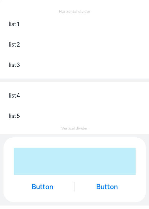
## Example
```ts
// xxx.ets
@Entry
@Component
struct DividerExample {
build() {
Column() {
// Use horizontal dividers.
Text('Horizontal divider').fontSize(9).fontColor(0xCCCCCC)
List() {
ForEach([1, 2, 3], (item: number) => {
ListItem() {
Text('list' + item).width('100%').fontSize(14).fontColor('#182431').textAlign(TextAlign.Start)
}.width(244).height(48)
}, (item: number) => item.toString())
}.padding({ left: 24, bottom: 8 })
Divider().strokeWidth(8).color('#F1F3F5')
List() {
ForEach([4, 5], (item: number) => {
ListItem() {
Text('list' + item).width('100%').fontSize(14).fontColor('#182431').textAlign(TextAlign.Start)
}.width(244).height(48)
}, (item: number) => item.toString())
}.padding({ left: 24, top: 8 })
// Use vertical dividers.
Text('Vertical divider').fontSize(9).fontColor(0xCCCCCC)
Column() {
Column() {
Row().width(288).height(64).backgroundColor('#30C9F0').opacity(0.3)
Row() {
Button('Button')
.width(136)
.height(22)
.fontSize(16)
.fontColor('#007DFF')
.fontWeight(500)
.backgroundColor(Color.Transparent)
Divider().vertical(true).height(22).color('#182431').opacity(0.6).margin({ left: 8, right: 8 })
Button('Button')
.width(136)
.height(22)
.fontSize(16)
.fontColor('#007DFF')
.fontWeight(500)
.backgroundColor(Color.Transparent)
}.margin({ top: 17 })
}
.width(336)
.height(152)
.backgroundColor('#FFFFFF')
.borderRadius(24)
.padding(24)
}
.width('100%')
.height(168)
.backgroundColor('#F1F3F5')
.justifyContent(FlexAlign.Center)
.margin({ top: 8 })
}.width('100%').padding({ top: 24 })
}
}
```