# Rating
The **Rating** component provides a rating bar.
> **NOTE**
>
> This component is supported since API version 7. Updates will be marked with a superscript to indicate their earliest API version.
## Child Components
Not supported
## APIs
Rating(options?: RatingOptions)
**Widget capability**: This API can be used in ArkTS widgets since API version 9.
**Atomic service API**: This API can be used in atomic services since API version 11.
**System capability**: SystemCapability.ArkUI.ArkUI.Full
**Parameters**
| Name| Type | Mandatory| Description |
| ------ | ----------------------------------------- | ---- | -------------- |
| rating | [RatingOptions](#ratingoptions13) | No | Rating bar options.|
## Attributes
### stars
stars(value: number)
Sets the total number of ratings (stars). If the value set is less than or equal to 0, the default value is used.
**Widget capability**: This API can be used in ArkTS widgets since API version 9.
**Atomic service API**: This API can be used in atomic services since API version 11.
**System capability**: SystemCapability.ArkUI.ArkUI.Full
**Parameters**
| Name| Type | Mandatory| Description |
| ------ | ------ | ---- | ---------------------------- |
| value | number | Yes | Total number of ratings.
Default value: **5**|
### stepSize
stepSize(value: number)
Sets the step for rating. A value less than 0.1 evaluates to the default value.
**Widget capability**: This API can be used in ArkTS widgets since API version 9.
**Atomic service API**: This API can be used in atomic services since API version 11.
**System capability**: SystemCapability.ArkUI.ArkUI.Full
**Parameters**
| Name| Type | Mandatory| Description |
| ------ | ------ | ---- | ----------------------------------------------------------- |
| value | number | Yes | Step for rating.
Default value: **0.5**
Value range: [0.1, stars]|
### starStyle
starStyle(options: StarStyleOptions)
Sets the star style. For details about the supported image types, see [Image](ts-basic-components-image.md).
Local and online images are supported, but not **PixelMap** and **Resource** objects.
By default, the image is loaded in asynchronous mode. Synchronous loading is not supported.
**Widget capability**: This API can be used in ArkTS widgets since API version 9.
**Atomic service API**: This API can be used in atomic services since API version 11.
**System capability**: SystemCapability.ArkUI.ArkUI.Full
**Parameters**
| Name | Type | Mandatory| Description |
| ------- | ----------------------------------------------- | ---- | ------------------------------------------------------------ |
| options | [StarStyleOptions](#starstyleoptions13) | Yes | Star style.
**NOTE**
If the path specified for **backgroundUri**, **foregroundUri**, or **secondaryUri** is incorrect, no image is displayed.
If **backgroundUri** or **foregroundUri** is set to **undefined** or an empty string, the **Rating** component loads the default star image source.
If **secondaryUri** is set to **undefined** or an empty string or is not set, **backgroundUri** is prioritized, which is equivalent to where only **foregroundUri** and **backgroundUri** are set.|
> **NOTE**
>
> The drawing area of each rating image is [width/stars, height], wherein **width** and **height** indicate the width and height of the **Rating** component, respectively.
>
> To specify the drawing area as a square, you are advised to customize the width and height in this format: [height * stars, height], width = height * stars.
### contentModifier12+
contentModifier(modifier: ContentModifier\)
Creates a content modifier.
**Atomic service API**: This API can be used in atomic services since API version 12.
**System capability**: SystemCapability.ArkUI.ArkUI.Full
**Parameters**
| Name| Type | Mandatory| Description |
| ------ | --------------------------------------------- | ---- | ------------------------------------------------ |
| modifier | [ContentModifier\](#ratingconfiguration12) | Yes | Content modifier to apply to the current component.
**modifier**: content modifier. You need a custom class to implement the **ContentModifier** API.|
## Events
### onChange
onChange(callback:(value: number) => void)
Triggered when the rating value changes.
**Widget capability**: This API can be used in ArkTS widgets since API version 9.
**Atomic service API**: This API can be used in atomic services since API version 11.
**System capability**: SystemCapability.ArkUI.ArkUI.Full
**Parameters**
| Name| Type | Mandatory| Description |
| ------ | ------ | ---- | -------------- |
| value | number | Yes | Rating value.|
## Sequential Keyboard Navigation Specifications
| Key | Description |
|------------|-----------------------------|
| Tab | Switch the focus between components. |
| Left and right arrow keys | Increase or decrease the rating on preview at the specified step, without changing the actual rating.|
| Home | Move the focus to the first star, without changing the actual rating. |
| End | Move the focus to the last star, without changing the actual rating. |
| Space/Enter | Submit the rating result based on the current rating. |
## RatingConfiguration12+
You need a custom class to implement the **ContentModifier** API.
**Atomic service API**: This API can be used in atomic services since API version 12.
**System capability**: SystemCapability.ArkUI.ArkUI.Full
| Name | Type | Read Only | Optional | Description |
| ------ | ------ | ------ |-------------------------------- |-------------------------------- |
| rating | number | No| No|Value to rate.
Default value: **0**|
| indicator | boolean | No| No| Whether the component is used only as an indicator.
Default value: **false**|
| stars | number | No| No|Total number of ratings.
Default value: **5**|
| stepSize | number | No| No|Step of an operation.
Default value: **0.5**|
| triggerChange | Callback\ | No| No|Callback triggered when the rating value changes.|
## RatingOptions13+
**Widget capability**: This API can be used in ArkTS widgets since API version 13.
**Atomic service API**: This API can be used in atomic services since API version 13.
**System capability**: SystemCapability.ArkUI.ArkUI.Full
| Name | Type | Mandatory| Description |
| --------- | ------- | ---- | ------------------------------------------------------------ |
| rating | number | Yes | Value to rate.
Default value: **0**
Value range: [0, stars]
Values less than 0 are treated as **0**, and values greater than the value of **stars** are treated as the value of **stars**.
This parameter supports two-way binding through [$$](../../../quick-start/arkts-two-way-sync.md).|
| indicator | boolean | No | Whether the component is used only as an indicator.
Default value: **false**
**NOTE**
When **indicator** is set to **true**, the default component height is 12.0 vp, and the component width is calculated as follows: Height x Value of **stars**.
When **indicator** is set to **false**, the default component height is 28.0 vp, and the component width is calculated as follows: Height x Value of **stars**.|
## StarStyleOptions13+
**Widget capability**: This API can be used in ArkTS widgets since API version 13.
**Atomic service API**: This API can be used in atomic services since API version 13.
**System capability**: SystemCapability.ArkUI.ArkUI.Full
| Name | Type | Mandatory| Description |
| ------------- | ------ | ---- | ------------------------------------------------------------ |
| backgroundUri | string | Yes | Image path for the unselected star. You can use the default system image or a custom image. |
| foregroundUri | string | Yes | Image path for the selected star. You can use the default system image or a custom image. |
| secondaryUri | string | No | Image path for the partially selected star. You can use the default system image or a custom image.|
## Example
### Example 1
```ts
// xxx.ets
@Entry
@Component
struct RatingExample {
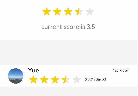
@State rating: number = 3.5
build() {
Column() {
Column() {
Rating({ rating: this.rating, indicator: false })
.stars(5)
.stepSize(0.5)
.margin({ top: 24 })
.onChange((value: number) => {
this.rating = value
})
Text('current score is ' + this.rating)
.fontSize(16)
.fontColor('rgba(24,36,49,0.60)')
.margin({ top: 16 })
}.width(360).height(113).backgroundColor('#FFFFFF').margin({ top: 68 })
Row() {
Image('common/testImage.jpg')
.width(40)
.height(40)
.borderRadius(20)
.margin({ left: 24 })
Column() {
Text('Yue')
.fontSize(16)
.fontColor('#182431')
.fontWeight(500)
Row() {
Rating({ rating: 3.5, indicator: false }).margin({ top: 1, right: 8 })
Text('2021/06/02')
.fontSize(10)
.fontColor('#182431')
}
}.margin({ left: 12 }).alignItems(HorizontalAlign.Start)
Text('1st Floor')
.fontSize(10)
.fontColor('#182431')
.position({ x: 295, y: 8 })
}.width(360).height(56).backgroundColor('#FFFFFF').margin({ top: 64 })
}.width('100%').height('100%').backgroundColor('#F1F3F5')
}
}
```
### Example 2
```ts
// xxx.ets
@Entry
@Component
struct RatingExample {
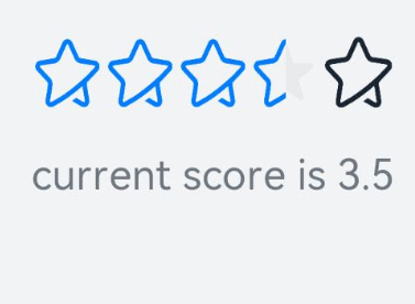
@State rating: number = 3.5
build() {
Column() {
Rating({ rating: this.rating, indicator: false })
.stars(5)
.stepSize(0.5)
.starStyle({
backgroundUri: '/common/imag1.png', // The common folder is at the same level as pages.
foregroundUri: '/common/imag2.png',
secondaryUri: '/common/imag3.png'
})
.margin({ top: 24 })
.onChange((value: number) => {
this.rating = value
})
Text('current score is ' + this.rating)
.fontSize(16)
.fontColor('rgba(24,36,49,0.60)')
.margin({ top: 16 })
}.width('100%').height('100%').backgroundColor('#F1F3F5')
}
}
```
### Example 3
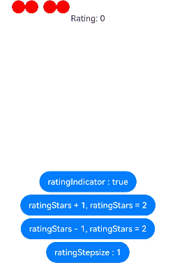
This example implements a custom rating bar, with each circle representing 0.5 point. If **ratingIndicator** is set to **true**, the rating bar is used only as an indicator, and the rating cannot be changed.
if it is set to **false**, the rating can be changed. **ratingStars** sets the rating value. **ratingStepsize** sets the step for rating.
```ts
// xxx.ets
class MyRatingStyle implements ContentModifier {
name: string = ""
style: number = 0
constructor(value1: string, value2: number) {
this.name = value1
this.style = value2
}
applyContent() : WrappedBuilder<[RatingConfiguration]> {
return wrapBuilder(buildRating)
}
}
@Builder function buildRating(config: RatingConfiguration) {
Column() {
Row() {
Circle({ width: 25, height: 25 })
.fill(config.rating >= 0.4 ? Color.Black : Color.Red)
.onClick((event: ClickEvent) => {
if (!config.indicator) {
if (config.stepSize = 0.5) {
config.triggerChange(0.5);
return
}
if (config.stepSize = 1) {
config.triggerChange(1);
return
}
}
}).visibility(config.stars >= 1 ? Visibility.Visible : Visibility.Hidden)
Circle({ width: 25, height: 25 })
.fill(config.rating >= 0.9 ? Color.Black : Color.Red)
.onClick((event: ClickEvent) => {
if (!config.indicator) {
config.triggerChange(1);
}
}).visibility(config.stars >= 1 ? Visibility.Visible : Visibility.Hidden)
Circle({ width: 25, height: 25 })
.fill(config.rating >= 1.4 ? Color.Black : Color.Red)
.onClick((event: ClickEvent) => {
if (!config.indicator) {
if (config.stepSize = 0.5) {
config.triggerChange(1.5);
return
}
if (config.stepSize = 1) {
config.triggerChange(2);
return
}
}
}).visibility(config.stars >= 2 ? Visibility.Visible : Visibility.Hidden).margin({left:10})
Circle({ width: 25, height: 25 })
.fill(config.rating >= 1.9 ? Color.Black : Color.Red)
.onClick((event: ClickEvent) => {
if (!config.indicator) {
config.triggerChange(2);
}
}).visibility(config.stars >= 2 ? Visibility.Visible : Visibility.Hidden)
Circle({ width: 25, height: 25 })
.fill(config.rating >= 2.4 ? Color.Black : Color.Red)
.onClick((event: ClickEvent) => {
if (!config.indicator) {
if (config.stepSize = 0.5) {
config.triggerChange(2.5);
return
}
if (config.stepSize = 1) {
config.triggerChange(3);
return
}
}
}).visibility(config.stars >= 3 ? Visibility.Visible : Visibility.Hidden).margin({left:10})
Circle({ width: 25, height: 25 })
.fill(config.rating >= 2.9 ? Color.Black : Color.Red)
.onClick((event: ClickEvent) => {
if (!config.indicator) {
config.triggerChange(3);
}
}).visibility(config.stars >= 3 ? Visibility.Visible : Visibility.Hidden)
Circle({ width: 25, height: 25 })
.fill(config.rating >= 3.4 ? Color.Black : Color.Red)
.onClick((event: ClickEvent) => {
if (!config.indicator) {
if (config.stepSize = 0.5) {
config.triggerChange(3.5);
return
}
if (config.stepSize = 1) {
config.triggerChange(4);
return
}
}
}).visibility(config.stars >= 4 ? Visibility.Visible : Visibility.Hidden).margin({left:10})
Circle({ width: 25, height: 25 })
.fill(config.rating >= 3.9 ? Color.Black : Color.Red)
.onClick((event: ClickEvent) => {
if (!config.indicator) {
config.triggerChange(4);
}
}).visibility(config.stars >= 4 ? Visibility.Visible : Visibility.Hidden)
Circle({ width: 25, height: 25 })
.fill(config.rating >= 4.4 ? Color.Black : Color.Red)
.onClick((event: ClickEvent) => {
if (!config.indicator) {
if (config.stepSize = 0.5) {
config.triggerChange(4.5);
return
}
if (config.stepSize = 1) {
config.triggerChange(5);
return
}
}
}).visibility(config.stars >= 5 ? Visibility.Visible : Visibility.Hidden).margin({left:10})
Circle({ width: 25, height: 25 })
.fill(config.rating >= 4.9 ? Color.Black : Color.Red)
.onClick((event: ClickEvent) => {
if (!config.indicator) {
config.triggerChange(5);
}
}).visibility(config.stars >= 5 ? Visibility.Visible : Visibility.Hidden)
}
Text("Rating: "+ config.rating)
}
}
@Entry
@Component
struct ratingExample {
@State rating: number = 0;
@State ratingIndicator: boolean = true;
@State ratingStars: number = 0;
@State ratingStepsize: number = 0.5;
@State ratingEnabled: boolean = true;
build() {
Row() {
Column() {
Rating({
rating: 0,
indicator: this.ratingIndicator
})
.stepSize(this.ratingStepsize)
.stars(this.ratingStars)
.backgroundColor(Color.Transparent)
.width('100%')
.height(50)
.onChange((value: number) => {
console.info('Rating change is'+ value);
this.rating = value
})
.contentModifier(new MyRatingStyle("hello", 3))
Button(this.ratingIndicator ? "ratingIndicator : true" : "ratingIndicator : false")
.onClick((event) => {
if (this.ratingIndicator) {
this.ratingIndicator = false
} else {
this.ratingIndicator = true
}
}).margin({top : 5})
Button(this.ratingStars < 5 ? "ratingStars + 1, ratingStars = " + this.ratingStars : "Maximum value of ratingStars: 5")
.onClick((event) => {
if (this.ratingStars < 5) {
this.ratingStars += 1
}
}).margin({top : 5})
Button(this.ratingStars > 0 ? "ratingStars - 1, ratingStars = " + this.ratingStars : "Values less than or equal to 0 are handled as 5")
.onClick((event) => {
if (this.ratingStars > 0) {
this.ratingStars -= 1
}
}).margin({top : 5})
Button(this.ratingStepsize == 0.5 ? "ratingStepsize : 0.5" : "ratingStepsize : 1")
.onClick((event) => {
if (this.ratingStepsize == 0.5) {
this.ratingStepsize = 1
} else {
this.ratingStepsize = 0.5
}
}).margin({top : 5})
}
.width('100%')
.height('100%')
.justifyContent(FlexAlign.Center)
}
.height('100%')
}
}
```