# TextTimer
The **TextTimer** component displays timing information and is controlled in text format.
> **NOTE**
>
> This component is supported since API version 8. Updates will be marked with a superscript to indicate their earliest API version.
## Child Components
Not supported
## APIs
TextTimer(options?: TextTimerOptions)
**Widget capability**: Since API version 10, this API is supported in ArkTS widgets.
**Atomic service API**: This API can be used in atomic services since API version 11.
**Parameters**
| Name| Type| Mandatory| Description|
| -------- | -------- | -------- | -------- |
| options | [TextTimerOptions](#texttimeroptions)| No| Parameters of the **TextTimer** component.|
## TextTimerOptions
**Widget capability**: Since API version 10, this API is supported in ArkTS widgets.
**Atomic service API**: This API can be used in atomic services since API version 11.
| Name | Type | Mandatory | Description |
| ----------- | -------- | -------- | -------- |
| isCountDown | boolean | No | Whether to count down.
Default value: **false**|
| count | number | No | Countdown time, in milliseconds. This parameter is valid only when **isCountDown** is set to **true**. The maximum value is 86400000 ms (24 hours). In the case of 0 < Value of **count** < 86400000, the value of **count** is used as the initial countdown value. In other cases, the default value is used as the initial countdown value.
Default value: **60000**|
| controller | [TextTimerController](#texttimercontroller) | No | **TextTimer** controller.|
## Attributes
Among the [universal attributes](ts-universal-attributes-size.md) and [universal text attributes](ts-universal-attributes-text-style.md), **fontColor**, **fontSize**, **fontStyle**, **fontWeight**, and **fontFamily** are supported. In addition, the following attributes are supported.
### format
format(value: string)
Sets the custom format. The value must contain at least one of the following keywords: **HH**, mm, **ss**, and **SS**. If the specified date format is yy, MM, or dd, the default value is used instead.
**Widget capability**: Since API version 10, this API is supported in ArkTS widgets.
**Atomic service API**: This API can be used in atomic services since API version 11.
**System capability**: SystemCapability.ArkUI.ArkUI.Full
**Parameters**
| Name| Type | Mandatory| Description |
| ------ | ------ | ---- | -------------------------------------- |
| value | string | Yes | Custom format
Default value: **'HH:mm:ss.SS'**|
### textShadow11+
textShadow(value: ShadowOptions | Array<ShadowOptions>)
Sets the text shadow. It supports input parameters in an array to implement multiple text shadows. This API does not work with the **fill** attribute or coloring strategy.
**Atomic service API**: This API can be used in atomic services since API version 12.
**System capability**: SystemCapability.ArkUI.ArkUI.Full
**Parameters**
| Name| Type | Mandatory| Description |
| ------ | ------------------------------------------------------------ | ---- | -------------- |
| value | [ShadowOptions](ts-universal-attributes-image-effect.md#shadowoptions) \| Array<[ShadowOptions](ts-universal-attributes-image-effect.md#shadowoptions)> | Yes | Text shadow.|
### contentModifier12+
contentModifier(modifier: ContentModifier\)
Creates a content modifier.
**Atomic service API**: This API can be used in atomic services since API version 12.
**System capability**: SystemCapability.ArkUI.ArkUI.Full
**Parameters**
| Name| Type | Mandatory| Description |
| ------ | --------------------------------------------- | ---- | ------------------------------------------------ |
| modifier | [ContentModifier\](#texttimerconfiguration12) | Yes | Content modifier to apply to the **TextTimer** component.
**modifier**: content modifier. You need a custom class to implement the **ContentModifier** API.|
## Events
### onTimer
onTimer(event: (utc: number, elapsedTime: number) => void)
Triggered when the time text changes. This event is not triggered when the screen is locked or the application is running in the background.
**Widget capability**: Since API version 10, this API is supported in ArkTS widgets.
**Atomic service API**: This API can be used in atomic services since API version 11.
**System capability**: SystemCapability.ArkUI.ArkUI.Full
**Parameters**
| Name | Type | Mandatory| Description |
| ----------- | ------ | ---- | ------------------------------------------------------------ |
| utc | number | Yes | Linux timestamp, which is the amount of time that has elapsed since January 1, 1970, in the minimum unit of the format.|
| elapsedTime | number | Yes | Elapsed time of the timer, in the minimum unit of the format. |
## TextTimerController
Implements a controller for controlling the **TextTimer** component. A **TextTimer** component can only be bound to one controller, and the relevant commands can only be called after the component has been created.
**Widget capability**: Since API version 10, this API is supported in ArkTS widgets.
**Atomic service API**: This API can be used in atomic services since API version 11.
### Objects to Import
```
textTimerController: TextTimerController = new TextTimerController()
```
### start
start()
Starts the timer.
**Widget capability**: Since API version 10, this API is supported in ArkTS widgets.
**Atomic service API**: This API can be used in atomic services since API version 11.
**System capability**: SystemCapability.ArkUI.ArkUI.Full
### pause
pause()
Pauses the timer.
**Widget capability**: Since API version 10, this API is supported in ArkTS widgets.
**Atomic service API**: This API can be used in atomic services since API version 11.
**System capability**: SystemCapability.ArkUI.ArkUI.Full
### reset
reset()
Resets the timer.
**Widget capability**: Since API version 10, this API is supported in ArkTS widgets.
**Atomic service API**: This API can be used in atomic services since API version 11.
**System capability**: SystemCapability.ArkUI.ArkUI.Full
## TextTimerConfiguration12+
You need a custom class to implement the **ContentModifier** API.
**Atomic service API**: This API can be used in atomic services since API version 12.
**System capability**: SystemCapability.ArkUI.ArkUI.Full
| Name | Type | Default Value | Description |
| ------ | ------ | ------ |-------------------------------- |
| count | number | 60000 | Countdown time, in milliseconds. This parameter is valid only when **isCountDown** is set to **true**. The maximum value is 86400000 ms (24 hours). If the value is between 0 and 86,400,000, it is used as the initial countdown time. Otherwise, the default value is used as the initial countdown time.|
| isCountDown | boolean| false | Whether to count down.|
| started | boolean | - | Whether the countdown has started.|
| elapsedTime | number | - | Elapsed time of the timer, in the minimum unit of the format.|
## Example
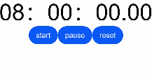
### Example 1
```ts
// xxx.ets
@Entry
@Component
struct TextTimerExample {
textTimerController: TextTimerController = new TextTimerController()
@State format: string = 'mm:ss.SS'
build() {
Column() {
TextTimer({ isCountDown: true, count: 30000, controller: this.textTimerController })
.format(this.format)
.fontColor(Color.Black)
.fontSize(50)
.onTimer((utc: number, elapsedTime: number) => {
console.info('textTimer notCountDown utc is: ' + utc + ', elapsedTime: ' + elapsedTime)
})
Row() {
Button("start").onClick(() => {
this.textTimerController.start()
})
Button("pause").onClick(() => {
this.textTimerController.pause()
})
Button("reset").onClick(() => {
this.textTimerController.reset()
})
}
}
}
}
```
### Example 2
``` ts
// xxx.ets
@Entry
@Component
struct TextTimerExample {
@State textShadows : ShadowOptions | Array = [{ radius: 10, color: Color.Red, offsetX: 10, offsetY: 0 },{ radius: 10, color: Color.Black, offsetX: 20, offsetY: 0 },
{ radius: 10, color: Color.Brown, offsetX: 30, offsetY: 0 },{ radius: 10, color: Color.Green, offsetX: 40, offsetY: 0 },
{ radius: 10, color: Color.Yellow, offsetX: 100, offsetY: 0 }]
build() {
Column({ space: 8 }) {
TextTimer().fontSize(50).textShadow(this.textShadows)
}
}
}
```

### Example 3
This example showcases two simple **TextTimer** components set against a light gray background. Once the timers are activated, they display the time progression in real-time. When the countdown timer starts, the background turns black; when the count-up timer starts, the background turns gray.
``` ts
// xxx.ets
class MyTextTimerModifier implements ContentModifier {
constructor() {
}
applyContent() : WrappedBuilder<[TextTimerConfiguration]>
{
return wrapBuilder(buildTextTimer)
}
}
@Builder function buildTextTimer(config: TextTimerConfiguration) {
Column() {
Stack({ alignContent: Alignment.Center }) {
Circle({ width: 150, height: 150 }).fill(config.started ? (config.isCountDown ? 0xFF232323 : 0xFF717171) : 0xFF929292)
Column(){
Text(config.isCountDown ? "Countdown" : "Count-up").fontColor(Color.White)
Text(
(config.isCountDown ? "Remaining" : "Elapsed") + (config.isCountDown?
(Math.max(config.count / 1000 - config.elapsedTime / 100,0)).toFixed(1) + "/" + (config.count / 1000).toFixed(0)
:((config.elapsedTime / 100).toFixed(0))
) + "s"
).fontColor(Color.White)
}
}
}
}
@Entry
@Component
struct Index {
@State count: number = 10000
@State myTimerModifier: MyTextTimerModifier = new MyTextTimerModifier()
countDownTextTimerController: TextTimerController = new TextTimerController()
countUpTextTimerController: TextTimerController = new TextTimerController()
build() {
Row() {
Column() {
TextTimer({isCountDown: true, count: this.count, controller: this.countDownTextTimerController})
.contentModifier(this.myTimerModifier)
.onTimer((utc: number, elapsedTime: number) => {
console.info('textTimer onTimer utc is:' + utc + ', elapsedTime: ' + elapsedTime)
})
.margin(10)
TextTimer({isCountDown: false, controller: this.countUpTextTimerController})
.contentModifier(this.myTimerModifier)
.onTimer((utc: number, elapsedTime: number) => {
console.info('textTimer onTimer utc is:' + utc + ', elapsedTime: ' + elapsedTime)
})
Row() {
Button("start").onClick(()=>{
this.countDownTextTimerController.start()
this.countUpTextTimerController.start()
}).margin(10)
Button("pause").onClick(()=>{
this.countDownTextTimerController.pause()
this.countUpTextTimerController.pause()
}).margin(10)
Button("reset").onClick(()=>{
this.countDownTextTimerController.reset()
this.countUpTextTimerController.reset()
}).margin(10)
}.margin(20)
}.width('100%')
}.height('100%')
}
}
```
### Example 4
In this example, the **TextTimer** component is set to execute immediately after it is created.
``` ts
@Entry
@Component
struct textTimerStart {
textTimerController: TextTimerController = new TextTimerController()
@State format: string = 'mm:ss.SS'
build() {
Column() {
Scroll()
.height('20%')
TextTimer({ isCountDown: true, count: 30000, controller: this.textTimerController })
.format(this.format)
.fontColor(Color.Black)
.fontSize(50)
.onTimer((utc: number, elapsedTime: number) => {
console.info('textTimer notCountDown utc is: ' + utc + ', elapsedTime: ' + elapsedTime)
})
.onAppear(()=>{
this.textTimerController.start()
})
}
}
}
```