# Click Effect
You can set the click effect for a component to define how it behaves when clicked.
> **NOTE**
>
> The APIs of this module are supported since API version 10. Updates will be marked with a superscript to indicate their earliest API version.
## clickEffect
clickEffect(value: ClickEffect | null)
Click effect of the component.
**System capability**: SystemCapability.ArkUI.ArkUI.Full
**Parameters**
| Name| Type | Mandatory| Description |
| ------ | ----------------------------------------------------- | ---- | ------------------------------------------------------------ |
| value | [ClickEffect](#clickeffect) \| null | Yes | Click effect of the component.
**NOTE**
You can remove the click effect by setting this attribute to **undefined** or **null**.
Avoid using this attribute in scenarios where the component size dynamically changes.
This attribute is not supported when the component cannot trigger a universal event.|
## ClickEffect
| Name | Type | Mandatory| Description |
| ----- | ----------------------------------------------------------- | ---- | ------------------------------------------------------------ |
| level | [ClickEffectLevel](ts-appendix-enums.md#clickeffectlevel10) | Yes | Click effect of the component.
**NOTE**
If **level** is set to **undefined** or **null**, the click effect corresponding to **ClickEffectLevel.LIGHT** will be used. For details about the zoom ratio, see the description of **scale**.|
| scale | number | No | Zoom ratio. This parameter works based on the setting of **ClickEffectLevel**.
**NOTE**
The default value of this parameter varies by the value of **level**.
If **level** is set to **ClickEffectLevel.LIGHT**, the default value is **0.90**.
If **level** is set to **ClickEffectLevel.MIDDLE** or **ClickEffectLevel.HEAVY**, the default value is **0.95**.
If **level** is set to **undefined** or **null** (both of which evaluate to **ClickEffectLevel.LIGHT**), the default value is **0.90**.
If **scale** is set to **undefined** or **null**, the default zoom ratio for the set level will be used.
|
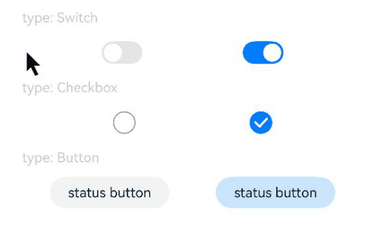
## Example
```ts
// xxx.ets
@Entry
@Component
struct ToggleExample {
build() {
Column({ space: 10 }) {
Text('type: Switch').fontSize(12).fontColor(0xcccccc).width('90%')
Flex({ justifyContent: FlexAlign.SpaceEvenly, alignItems: ItemAlign.Center }) {
Toggle({ type: ToggleType.Switch, isOn: false })
.clickEffect({level:ClickEffectLevel.LIGHT})
.selectedColor('#007DFF')
.switchPointColor('#FFFFFF')
.onChange((isOn: boolean) => {
console.info('Component status:' + isOn)
})
Toggle({ type: ToggleType.Switch, isOn: true })
.clickEffect({level:ClickEffectLevel.LIGHT, scale: 0.5})
.selectedColor('#007DFF')
.switchPointColor('#FFFFFF')
.onChange((isOn: boolean) => {
console.info('Component status:' + isOn)
})
}
Text('type: Checkbox').fontSize(12).fontColor(0xcccccc).width('90%')
Flex({ justifyContent: FlexAlign.SpaceEvenly, alignItems: ItemAlign.Center }) {
Toggle({ type: ToggleType.Checkbox, isOn: false })
.clickEffect({level:ClickEffectLevel.MIDDLE})
.size({ width: 20, height: 20 })
.selectedColor('#007DFF')
.onChange((isOn: boolean) => {
console.info('Component status:' + isOn)
})
Toggle({ type: ToggleType.Checkbox, isOn: true })
.clickEffect({level:ClickEffectLevel.MIDDLE, scale: 0.5})
.size({ width: 20, height: 20 })
.selectedColor('#007DFF')
.onChange((isOn: boolean) => {
console.info('Component status:' + isOn)
})
}
Text('type: Button').fontSize(12).fontColor(0xcccccc).width('90%')
Flex({ justifyContent: FlexAlign.SpaceEvenly, alignItems: ItemAlign.Center }) {
Toggle({ type: ToggleType.Button, isOn: false }) {
Text('status button').fontColor('#182431').fontSize(12)
}.width(106)
.clickEffect({level:ClickEffectLevel.HEAVY})
.selectedColor('rgba(0,125,255,0.20)')
.onChange((isOn: boolean) => {
console.info('Component status:' + isOn)
})
Toggle({ type: ToggleType.Button, isOn: true }) {
Text('status button').fontColor('#182431').fontSize(12)
}.width(106)
.clickEffect({level:ClickEffectLevel.HEAVY, scale: 0.5})
.selectedColor('rgba(0,125,255,0.20)')
.onChange((isOn: boolean) => {
console.info('Component status:' + isOn)
})
}
}.width('100%').padding(24)
}
}
```