# Toggle
The **Toggle** component provides a clickable element in the check box, button, or switch type, typically used to switch between two states. For details, see [Toggle](../reference/apis-arkui/arkui-ts/ts-basic-components-toggle.md).
## Creating a Toggle
You can create a toggle by calling the following API:
```ts
Toggle(options: { type: ToggleType, isOn?: boolean })
```
In this API, **ToggleType** indicates the toggle type, which can be **Button**, **Checkbox**, or **Switch**, and **isOn** specifies whether the toggle is turned on.
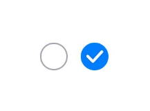
Since API version 11, the default style of the **Checkbox** component is changed from rounded square to circle.
The API can be called in either of the following ways:
- Create a toggle that does not contain child components.
This can be achieved by calling the API with **ToggleType** set to **Checkbox** or **Switch**.
```ts
Toggle({ type: ToggleType.Checkbox, isOn: false })
Toggle({ type: ToggleType.Checkbox, isOn: true })
```
```ts
Toggle({ type: ToggleType.Switch, isOn: false })
Toggle({ type: ToggleType.Switch, isOn: true })
```

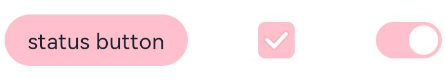
- Create a toggle that contains a child component.
When **ToggleType** is set to **Button**, only one child component is allowed. If the child component has text set, the text content is displayed on the button.
```ts
Toggle({ type: ToggleType.Button, isOn: false }) {
Text('status button')
.fontColor('#182431')
.fontSize(12)
}.width(100)
Toggle({ type: ToggleType.Button, isOn: true }) {
Text('status button')
.fontColor('#182431')
.fontSize(12)
}.width(100)
```

## Setting Styles
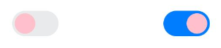
- Use the **selectedColor** attribute to set the background color of the toggle for when it is turned on.
```ts
Toggle({ type: ToggleType.Button, isOn: true }) {
Text('status button')
.fontColor('#182431')
.fontSize(12)
}.width(100).selectedColor(Color.Pink)
Toggle({ type: ToggleType.Checkbox, isOn: true })
.selectedColor(Color.Pink)
Toggle({ type: ToggleType.Switch, isOn: true })
.selectedColor(Color.Pink)
```
- Use the **switchPointColor** attribute to set the color of the circular slider. This attribute is valid only when **type** of the toggle is set to **ToggleType.Switch**.
```ts
Toggle({ type: ToggleType.Switch, isOn: false })
.switchPointColor(Color.Pink)
Toggle({ type: ToggleType.Switch, isOn: true })
.switchPointColor(Color.Pink)
```
## Adding Events
The **Toggle** component supports the [universal events](../reference/apis-arkui/arkui-ts/ts-universal-events-click.md). In addition, it can be bound to the **onChange** event so that it responds with custom behavior after being turned on or off.
```ts
Toggle({ type: ToggleType.Switch, isOn: false })
.onChange((isOn: boolean) => {
if(isOn) {
// Operation
}
})
```
## Example Scenario
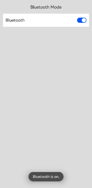
In this example, the **Toggle** component is used to enable or disable Bluetooth.
```ts
// xxx.ets
import { promptAction } from '@kit.ArkUI';
@Entry
@Component
struct ToggleExample {
@State BOnSt:promptAction.ShowToastOptions = {'message': 'Bluetooth is on.'}
@State BOffSt:promptAction.ShowToastOptions = {'message': 'Bluetooth is off.'}
build() {
Column() {
Row() {
Text("Bluetooth Mode")
.height(50)
.fontSize(16)
}
Row() {
Text("Bluetooth")
.height(50)
.padding({left: 10})
.fontSize(16)
.textAlign(TextAlign.Start)
.backgroundColor(0xFFFFFF)
Toggle({ type: ToggleType.Switch })
.margin({left: 200, right: 10})
.onChange((isOn: boolean) => {
if(isOn) {
promptAction.showToast(this.BOnSt)
} else {
promptAction.showToast(this.BOffSt)
}
})
}
.backgroundColor(0xFFFFFF)
}
.padding(10)
.backgroundColor(0xDCDCDC)
.width('100%')
.height('100%')
}
}
```