# ArkUI Subsystem Changelog
## cl.arkui.1 Visibility Change of the menus Attribute in \<Navigation>
**Change Impact**
The **value** sub-attribute of the **menus** attribute is not displayed. To display the value, you can use a custom builder.
**Example**
```ts
@Entry
@Component
struct Index {
build() {
Column() {
Navigation() {
Text('Navigation')
}.title("Navigation Menu")
.menus([
{icon: 'common/image/icon.png', value: 'menu1'},
{icon: 'common/image/icon.png', value: 'menu2'},
{icon: 'common/image/icon.png', value: 'menu3'}
])
}
}
}
```
In API version 9, the **value** sub-attribute of the **menus** attribute is displayed.
In API version 10, the **value** sub-attribute of the **menus** attribute is not displayed.
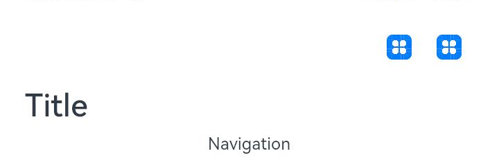
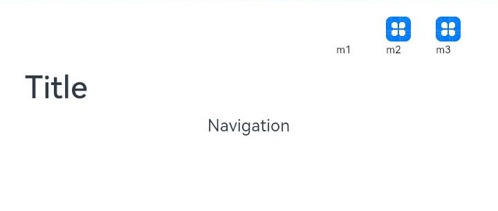
## cl.arkui.2 Change of the Default Display Position for Free Mode of the titleMode Attribute in \<Navigation>
**Change Impact**
1. In the **\<Navigation>** component, the display position of a custom title with **titleMode** set to **Full** is the same as that with **titleMode** set to **Free**.
2. If a custom title is used with a label in Free mode, the label is deviated rightwards.
**Example**
```ts
@Entry
@Component
struct Index {
@Builder NavigationTile() {
Column() {
Text('title').fontColor('#182431').fontSize(30).lineHeight(41)
Text('subTitle').fontColor('#182431').fontSize(14).lineHeight(19).margin(top:2, bottom: 20)
}
}
build() {
Column() {
Navigation() {
Text('Navigation')
}.title(this.NavigationTitle)
.titleMode(NavigationTitleMode.Free)
.menus([
{icon: 'common/image/icon.png', value: 'menu1'}
])
}
}
}
```
Display position in Free mode in API version 9

Display position in Free mode in API version 10, which is the same as that in Full mode

## cl.arkui.3 Change of Handling of Invalid Strings
**Change Impact**
An invalid string that contains digits is not parsed into digits. Instead, it is regarded as an invalid value and is set to the default value according to predefined rules.
**Example**
```ts
@Entry
@Component
struct GridRowExample {
@State bgColors: Color[] = [Color.Red, Color.Orange, Color.Yellow, Color.Green, Color.Pink, Color.Grey, Color.Blue, Color.Brown]
@State currentBp: string = 'unknown'
build() {
Column() {
GridRow({
columns: 5,
gutter: { x: 5, y: 10 },
breakpoints: { value: ["400vp", "600vp", "800vp"],
reference: BreakpointsReference.WindowSize },
direction: GridRowDirection.Row
}) {
ForEach(this.bgColors, (color) => {
GridCol({ span: { xs: 1, sm: 2, md: 3, lg: 4 } }) {
Row().width("100%").height("20vp")
}.borderColor(color).borderWidth(2)
})
}.width("100%").height("100%")
}.width("80pv").margin({ left: 10, top: 5, bottom: 5 }).height(200)
.border({ color: '#880606', width: 2 })
}
}
```
API version 9: In the preceding example, the value **"80pv"** of the **width** attribute in **\<GridRow>** is equivalent to **80**.
API version 10: In the preceding example, the value **"80pv"** is regarded as an invalid value. Therefore, the **width** attribute in **\<GridRow>** is set to the default value, which means that the attribute is not set.
## cl.arkui.4 Change of Invalid Values of the loop Attribute in \<Swiper> to true
**Change Impact**
The value used in place of any invalid value of the **loop** attribute in the **\<Swiper>** component is changed from **false** to **true**.
API version 9: The value **false** is used when the **loop** attribute is set to an invalid value.
API version 10: The value **true** is used when the **loop** attribute is set to an invalid value.
## cl.arkui.5 Change of Speed Threshold for Page Turning from 180 px/s to 1200 px/s in \<Swiper>
**Change Impact**
A faster speed is required to turn pages.
## cl.arkui.6 Renaming of the isShowBackground Attribute in the \<Swiper> Component
**Change Impact**
Renamed the **isShowBackground** attribute in the **\<Swiper>** component **showBackground**.
**Example**
```ts
class MyDataSource implements IDataSource {
private list: number[] = []
private listener: DataChangeListener
constructor(list: number[]) {
this.list = list
}
totalCount(): number {
return this.list.length
}
getData(index: number): any {
return this.list[index]
}
registerDataChangeListener(listener: DataChangeListener): void {
this.listener = listener
}
unregisterDataChangeListener() {
}
}
@Entry
@Component
struct SwiperExample {
private swiperController: SwiperController = new SwiperController()
private data: MyDataSource = new MyDataSource([])
aboutToAppear(): void {
let list = []
for (var i = 1; i <= 10; i++) {
list.push(i.toString());
}
this.data = new MyDataSource(list)
}
build() {
Column({ space: 5 }) {
Swiper(this.swiperController) {
LazyForEach(this.data, (item: string) => {
Text(item)
.width('90%')
.height(160)
.backgroundColor(0xAFEEEE)
.textAlign(TextAlign.Center)
.fontSize(30)
}, item => item)
}
.cachedCount(2)
.index(1)
.autoPlay(true)
.indicator(true)
.displayArrow({
showBackground: true,
isSidebarMiddle: true,
backgroundSize: 24,
backgroundColor: Color.White,
arrowSize: 18,
arrowColor: Color.Blue
}, false)
Row({ space: 12 }) {
Button('showNext')
.onClick(() => {
this.swiperController.showNext()
})
Button('showPrevious')
.onClick(() => {
this.swiperController.showPrevious()
})
}.margin(5)
}.width('100%')
.margin({ top: 5 })
}
}
```
## cl.arkui.7 Changing of the Right Margin of the Rightmost Menu Icons in the \<Navigation> Component
**Change Impact**
Changed the right margin of the rightmost menu icons in the **\<Navigation>** component menus from 36 vp to 24 vp, to account for the offset of menus by 12 vp on the right.
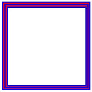
## cl.arkui.8 Change in Pixel Rounding
**Change Impact**
Coordinates, widths, and heights with decimals are rounded off to integers.
API version 9: The pixel coordinates, component widths and heights, and border widths are not rounded.
API version 10: The pixel coordinates, component widths and heights, and border widths are rounded off to integers.
**Example**
```ts
@Entry
@Component
struct Index {
build() {
Column() {
Row() {
Row() {
Row() {
Row() {
Row()
.width('100%')
.height('100%')
.border({width: '1', color: 'blue'})
}
.width('100%')
.height('100%')
.border({width: '1', color: 'red'})
}
.width('100%')
.height('100%')
.border({width: '1', color: 'blue'})
}
.width('100%')
.height('100%')
.border({width: '1', color: 'red'})
}
.width('81')
.height('81')
.border({width: '1', color: 'blue'})
}
.width('100%')
.height('100%')
}
}
```
API version 9: The pixel coordinates, component widths and heights, and border widths are not rounded.

API version 10: The widths of the left and top borders are rounded up, and the widths of the right and bottom borders are rounded down.