# Span
作为[Text](ts-basic-components-text.md)、[ContainerSpan](ts-basic-components-containerspan.md)组件的子组件,用于显示行内文本的组件。
> **说明:**
>
> 该组件从API Version 7开始支持。后续版本如有新增内容,则采用上角标单独标记该内容的起始版本。
>
> 该组件从API Version 10开始支持继承父组件Text的属性,即如果子组件未设置属性且父组件设置属性,则继承父组件设置的属性。支持继承的属性仅包括:fontColor、fontSize、fontStyle、fontWeight、decoration、letterSpacing、textCase、fontfamily、textShadow。
## 子组件
无
## 接口
Span(value: string | Resource)
**卡片能力:** 从API version 9开始,该接口支持在ArkTS卡片中使用。
**原子化服务API:** 从API version 11开始,该接口支持在原子化服务中使用。
**系统能力:** SystemCapability.ArkUI.ArkUI.Full
**参数:**
| 参数名 | 类型 | 必填 | 说明 |
| -------- | -------- | -------- | -------- |
| value | string \| [Resource](ts-types.md#resource) | 是 | 文本内容。 |
## 属性
属性继承自[BaseSpan](#basespan)。
### decoration
decoration(value: DecorationStyleInterface)
设置文本装饰线样式及其颜色。
**卡片能力:** 从API version 9开始,该接口支持在ArkTS卡片中使用。
**原子化服务API:** 从API version 11开始,该接口支持在原子化服务中使用。
**系统能力:** SystemCapability.ArkUI.ArkUI.Full
**参数:**
| 参数名 | 类型 | 必填 | 说明 |
| ------ | -------- | ---- | -------------- |
| value | [DecorationStyleInterface12+](ts-universal-styled-string.md#decorationstyleinterface对象说明) | 是 | 文本装饰线样式对象。
默认值:
{
type: TextDecorationType.None,
color: Color.Black,
style: TextDecorationStyle.SOLID
}
**说明:**
style参数不支持卡片能力。 |
### letterSpacing
letterSpacing(value: number | string)
设置文本字符间距。取值小于0,字符聚集重叠,取值大于0且随着数值变大,字符间距越来越大,稀疏分布。
**卡片能力:** 从API version 9开始,该接口支持在ArkTS卡片中使用。
**原子化服务API:** 从API version 11开始,该接口支持在原子化服务中使用。
**系统能力:** SystemCapability.ArkUI.ArkUI.Full
**参数:**
| 参数名 | 类型 | 必填 | 说明 |
| ------ | ------- | ---- | -------------- |
| value | number \| string | 是 | 文本字符间距。 |
### textCase
textCase(value: TextCase)
设置文本大小写。
**卡片能力:** 从API version 9开始,该接口支持在ArkTS卡片中使用。
**原子化服务API:** 从API version 11开始,该接口支持在原子化服务中使用。
**系统能力:** SystemCapability.ArkUI.ArkUI.Full
**参数:**
| 参数名 | 类型 | 必填 | 说明 |
| ------ | ------- | ---- | ------- |
| value | [TextCase](ts-appendix-enums.md#textcase) | 是 | 文本大小写。
默认值:TextCase.Normal |
### fontColor
fontColor(value: ResourceColor)
设置字体颜色。
**卡片能力:** 从API version 9开始,该接口支持在ArkTS卡片中使用。
**原子化服务API:** 从API version 11开始,该接口支持在原子化服务中使用。
**系统能力:** SystemCapability.ArkUI.ArkUI.Full
**参数:**
| 参数名 | 类型 | 必填 | 说明 |
| ------ | ------------------------------------------ | ---- | ---------- |
| value | [ResourceColor](ts-types.md#resourcecolor) | 是 | 字体颜色。 |
### fontSize
fontSize(value: number | string | Resource)
设置字体大小。
**卡片能力:** 从API version 9开始,该接口支持在ArkTS卡片中使用。
**原子化服务API:** 从API version 11开始,该接口支持在原子化服务中使用。
**系统能力:** SystemCapability.ArkUI.ArkUI.Full
**参数:**
| 参数名 | 类型 | 必填 | 说明 |
| ------ | ------------------------------------------------------------ | ---- | ------------------------------------------------------------ |
| value | number \| string\| [Resource](ts-types.md#resource) | 是 | 字体大小。fontSize为number类型时,使用fp单位。字体默认大小16fp。不支持设置百分比字符串。 |
### fontStyle
fontStyle(value: FontStyle)
设置字体样式。
**卡片能力:** 从API version 9开始,该接口支持在ArkTS卡片中使用。
**原子化服务API:** 从API version 11开始,该接口支持在原子化服务中使用。
**系统能力:** SystemCapability.ArkUI.ArkUI.Full
**参数:**
| 参数名 | 类型 | 必填 | 说明 |
| ------ | ------------------------------------------- | ---- | --------------------------------------- |
| value | [FontStyle](ts-appendix-enums.md#fontstyle) | 是 | 字体样式。
默认值:FontStyle.Normal |
### fontWeight
fontWeight(value: number | FontWeight | string)
设置文本的字体粗细,设置过大可能会在不同字体下有截断。
**卡片能力:** 从API version 9开始,该接口支持在ArkTS卡片中使用。
**原子化服务API:** 从API version 11开始,该接口支持在原子化服务中使用。
**系统能力:** SystemCapability.ArkUI.ArkUI.Full
**参数:**
| 参数名 | 类型 | 必填 | 说明 |
| ------ | ------------------------------------------------------------ | ---- | ------------------------------------------------------------ |
| value | number \| [FontWeight](ts-appendix-enums.md#fontweight) \| string | 是 | 文本的字体粗细,number类型取值[100, 900],取值间隔为100,默认为400,取值越大,字体越粗。string类型仅支持number类型取值的字符串形式,例如"400",以及"bold"、"bolder"、"lighter"、"regular"、"medium",分别对应FontWeight中相应的枚举值。
默认值:FontWeight.Normal |
### fontFamily
fontFamily(value: string | Resource)
设置字体列表。
**卡片能力:** 从API version 9开始,该接口支持在ArkTS卡片中使用。
**原子化服务API:** 从API version 11开始,该接口支持在原子化服务中使用。
**系统能力:** SystemCapability.ArkUI.ArkUI.Full
**参数:**
| 参数名 | 类型 | 必填 | 说明 |
| ------ | ---------------------------------------------------- | ---- | ------------------------------------------------------------ |
| value | string \| [Resource](ts-types.md#resource) | 是 | 字体列表。默认字体'HarmonyOS Sans'。
应用当前支持'HarmonyOS Sans'字体和[注册自定义字体](../js-apis-font.md)。
卡片当前仅支持'HarmonyOS Sans'字体。 |
### lineHeight10+
lineHeight(value: Length)
设置文本行高。
**原子化服务API:** 从API version 11开始,该接口支持在原子化服务中使用。
**系统能力:** SystemCapability.ArkUI.ArkUI.Full
**参数:**
| 参数名 | 类型 | 必填 | 说明 |
| ------ | ------ | ---- | ---- |
| value | [Length](ts-types.md#length) | 是 | 文本行高。 |
### font10+
font(value: Font)
设置文本样式。包括字体大小、字体粗细、字体族和字体风格。
**原子化服务API:** 从API version 11开始,该接口支持在原子化服务中使用。
**系统能力:** SystemCapability.ArkUI.ArkUI.Full
**参数:**
| 参数名 | 类型 | 必填 | 说明 |
| ------ | ------------------------ | ---- | ---------- |
| value | [Font](ts-types.md#font) | 是 | 文本样式。 |
### textShadow11+
textShadow(value: ShadowOptions | Array<ShadowOptions>)
设置文字阴影效果。该接口支持以数组形式入参,实现多重文字阴影。不支持fill字段, 不支持智能取色模式。
**原子化服务API:** 从API version 12开始,该接口支持在原子化服务中使用。
**系统能力:** SystemCapability.ArkUI.ArkUI.Full
**参数:**
| 参数名 | 类型 | 必填 | 说明 |
| ------ | ----- | ---- | --- |
| value | [ShadowOptions](ts-universal-attributes-image-effect.md#shadowoptions对象说明) \| Array<[ShadowOptions](ts-universal-attributes-image-effect.md#shadowoptions对象说明)> | 是 | 文字阴影效果。 |
## 事件
通用事件仅支持[点击事件](ts-universal-events-click.md)。
> **说明:**
>
> 由于Span组件无尺寸信息,因此点击事件返回的ClickEvent对象的target属性无效。
## BaseSpan
定义BaseSpan基础类,包含Span的通用属性。
**系统能力:** SystemCapability.ArkUI.ArkUI.Full
**原子化服务API:** 从API version 12开始,该接口支持在原子化服务中使用。
### textBackgroundStyle11+
textBackgroundStyle(style: TextBackgroundStyle): T
设置背景样式。作为[ContainerSpan](ts-basic-components-containerspan.md)的子组件时可以继承它的此属性值,优先使用其自身的此属性。
**原子化服务API:** 从API version 12开始,该接口支持在原子化服务中使用。
**系统能力:** SystemCapability.ArkUI.ArkUI.Full
**参数:**
| 参数名 | 类型 | 必填 | 说明 |
| ----- | ---- | ---- | ---- |
| style | [TextBackgroundStyle](#textbackgroundstyle11对象说明) | 是 | 背景样式。
默认值:
{
color: Color.Transparent,
radius: 0
} |
**返回值:**
| 类型 | 说明 |
| ---------------------------------------- | ------- |
| T | 返回当前Span的属性。 |
### baselineOffset12+
baselineOffset(value: LengthMetrics): T
设置Span基线的偏移量。此属性与父组件的baselineOffset是共存的。
**原子化服务API:** 从API version 12开始,该接口支持在原子化服务中使用。
**系统能力:** SystemCapability.ArkUI.ArkUI.Full
**参数:**
| 参数名 | 类型 | 必填 | 说明 |
| ----- | ---- | ---- | ---- |
| value | [LengthMetrics](../js-apis-arkui-graphics.md#lengthmetrics12) | 是 | 设置Span基线的偏移量,设置该值为百分比时,按默认值显示。
正数内容向上偏移,负数向下偏移。
默认值:0
在ImageSpan中,设置为非0时会导致设置verticalAlign失效。 |
**返回值:**
| 类型 | 说明 |
| ---------------------------------------- | ------- |
| T | 返回当前Span的属性。 |
## TextBackgroundStyle11+对象说明
**原子化服务API:** 从API version 12开始,该接口支持在原子化服务中使用。
**系统能力:** SystemCapability.ArkUI.ArkUI.Full
| 名称 | 类型 | 必填 | 说明 |
| ------ | ------- | ---- | ------------ |
| color | [ResourceColor](ts-types.md#resourcecolor) | 否 | 文本背景色。 |
| radius | [Dimension](ts-types.md#dimension10) \| [BorderRadiuses](ts-universal-attributes-border.md#borderradiuses9对象说明) | 否 | 文本背景圆角。 |
## 示例
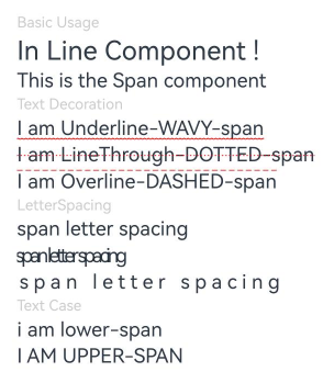
### 示例1(设置文本样式)
该示例通过decoration、letterSpacing、textCase属性展示了不同样式的文本效果。
```ts
// xxx.ets
@Entry
@Component
struct SpanExample {
build() {
Flex({ direction: FlexDirection.Column, alignItems: ItemAlign.Start, justifyContent: FlexAlign.SpaceBetween }) {
Text('Basic Usage').fontSize(9).fontColor(0xCCCCCC)
Text() {
Span('In Line')
Span(' Component')
Span(' !')
}
Text() {
Span('This is the Span component').fontSize(12).textCase(TextCase.Normal)
.decoration({ type: TextDecorationType.None, color: Color.Red })
}
// 文本横线添加
Text('Text Decoration').fontSize(9).fontColor(0xCCCCCC)
Text() {
Span('I am Underline-WAVY-span').decoration({ type: TextDecorationType.Underline, color: Color.Red, style: TextDecorationStyle.WAVY }).fontSize(12)
}
Text() {
Span('I am LineThrough-DOTTED-span')
.decoration({ type: TextDecorationType.LineThrough, color: Color.Red, style: TextDecorationStyle.DOTTED })
.fontSize(12)
}
Text() {
Span('I am Overline-DASHED-span').decoration({ type: TextDecorationType.Overline, color: Color.Red, style: TextDecorationStyle.DASHED }).fontSize(12)
}
// 文本字符间距
Text('LetterSpacing').fontSize(9).fontColor(0xCCCCCC)
Text() {
Span('span letter spacing')
.letterSpacing(0)
.fontSize(12)
}
Text() {
Span('span letter spacing')
.letterSpacing(-2)
.fontSize(12)
}
Text() {
Span('span letter spacing')
.letterSpacing(3)
.fontSize(12)
}
// 文本大小写展示设置
Text('Text Case').fontSize(9).fontColor(0xCCCCCC)
Text() {
Span('I am Lower-span').fontSize(12)
.textCase(TextCase.LowerCase)
.decoration({ type: TextDecorationType.None })
}
Text() {
Span('I am Upper-span').fontSize(12)
.textCase(TextCase.UpperCase)
.decoration({ type: TextDecorationType.None })
}
}.width('100%').height(250).padding({ left: 35, right: 35, top: 35 })
}
}
```
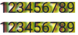
### 示例2(设置文本阴影)
该示例通过textShadow属性展示了文本设置阴影的效果。
``` ts
// xxx.ets
@Entry
@Component
struct SpanExample {
@State textShadows : ShadowOptions | Array = [{ radius: 10, color: Color.Red, offsetX: 10, offsetY: 0 },{ radius: 10, color: Color.Black, offsetX: 20, offsetY: 0 },
{ radius: 10, color: Color.Brown, offsetX: 30, offsetY: 0 },{ radius: 10, color: Color.Green, offsetX: 40, offsetY: 0 },
{ radius: 10, color: Color.Yellow, offsetX: 100, offsetY: 0 }]
build() {
Column({ space: 8 }) {
Text() {
Span('123456789').fontSize(50).textShadow(this.textShadows)
}
Text() {
Span('123456789') // span can inherit text shadow & font size from outer text
}.fontSize(50).textShadow(this.textShadows)
}
}
}
```
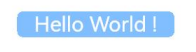
### 示例3(设置背景样式)
该示例通过textBackgroundStyle属性展示了文本设置背景样式的效果。
``` ts
// xxx.ets
@Component
@Entry
struct SpanExample {
build() {
Column() {
Text() {
Span(' Hello World ! ')
.fontSize('20fp')
.textBackgroundStyle({color: "#7F007DFF", radius: "5vp"})
.fontColor(Color.White)
}
}.width('100%').margin({bottom: '5vp'}).alignItems(HorizontalAlign.Center)
}
}
```
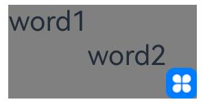
### 示例4(设置文本基线偏移量)
该示例通过baselineOffset属性展示了文本设置不同基线偏移量的效果。
```ts
import { LengthUnit, LengthMetrics } from '@kit.ArkUI';
@Entry
@Component
struct SpanExample {
build() {
Row() {
Column() {
Text(){
Span('word1')
.baselineOffset(new LengthMetrics(20,LengthUnit.VP))
Span('word2')
.baselineOffset(new LengthMetrics(0,LengthUnit.VP))
ImageSpan($r("app.media.icon"))
.width('45px')
.baselineOffset(new LengthMetrics(-20,LengthUnit.VP))
}
.backgroundColor(Color.Gray)
}
.width('100%')
}
.height('100%')
}
}
```