# 隐私遮罩
用于对组件内容进行隐私遮罩处理。
> **说明:**
>
> 从API Version 10开始支持。后续版本如有新增内容,则采用上角标单独标记该内容的起始版本。
## obscured
obscured(reasons: Array<ObscuredReasons>)
设置组件内容的遮罩类型。
**原子化服务API:** 从API version 11开始,该接口支持在原子化服务中使用。
**系统能力:** SystemCapability.ArkUI.ArkUI.Full
**参数:**
| 参数名 | 类型 | 必填 | 描述 |
| -----| ------------------------------------------ | ------------------------------------ | ------------------------------------ |
| reasons | Array<[ObscuredReasons](ts-appendix-enums.md#obscuredreasons10)> | 是 | 设置组件内容的遮罩类型。
默认值:[]
该接口支持在ArkTS卡片中使用。
仅支持[Image](ts-basic-components-image.md)组件、[Text](ts-basic-components-text.md)组件和[Formcompnent](ts-basic-components-formcomponent-sys.md)组件12+的隐私遮罩处理。
**说明:**
如需在图片加载过程中显示隐私遮罩,需要设置Image组件的宽度和高度。
Text组件设置子组件或设置[属性字符串](ts-universal-styled-string.md#属性字符串)时,不支持隐私遮罩。 |
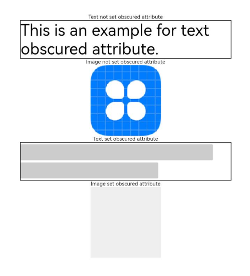
## 示例
该示例通过obscured对Text、Image组件实现了隐私遮罩效果。
```ts
// xxx.ets
@Entry
@Component
struct ObscuredExample {
build() {
Row() {
Column() {
Text('Text not set obscured attribute').fontSize(10).fontColor(Color.Black)
Text('This is an example for text obscured attribute.')
.fontSize(30)
.width('600px')
.fontColor(Color.Black)
.border({ width: 1 })
Text('Image not set obscured attribute').fontSize(10).fontColor(Color.Black)
Image($r('app.media.icon'))
.width('200px')
.height('200px')
Text('Text set obscured attribute').fontSize(10).fontColor(Color.Black)
Text('This is an example for text obscured attribute.')
.fontSize(30)
.width('600px')
.fontColor(Color.Black)
.border({ width: 1 })
.obscured([ObscuredReasons.PLACEHOLDER])
Text('Image set obscured attribute').fontSize(10).fontColor(Color.Black)
Image($r('app.media.icon'))
.width('200px')
.height('200px')
.obscured([ObscuredReasons.PLACEHOLDER])
}
.width('100%')
}
.height('100%')
}
}
```