# 悬浮事件
光标滑动,或者手写笔在屏幕上悬浮移动扫过组件时触发。
> **说明:**
>
> - 从API Version 8开始支持。后续版本如有新增内容,则采用上角标单独标记该内容的起始版本。
> - 目前支持通过外接鼠标、手写笔以及触控板触发。
## onHover
onHover(event: (isHover: boolean, event: HoverEvent) => void): T
鼠标或手写笔进入或退出组件时触发hover事件。
**原子化服务API:** 从API version 11开始,该接口支持在原子化服务中使用。
**系统能力:** SystemCapability.ArkUI.ArkUI.Full
**参数:**
| 参数名 | 类型 | 必填 | 说明 |
| ------------------- | ----------------------------------- | ---- | ------------------------------------------------------------ |
| isHover | boolean | 是 | 表示鼠标或手写笔是否悬浮在组件上,鼠标或手写笔进入组件时为true, 离开组件时为false。 |
| event11+ | [HoverEvent](#hoverevent11对象说明) | 是 | 设置阻塞事件冒泡属性。 |
**返回值:**
| 类型 | 说明 |
| -------- | -------- |
| T | 返回当前组件。 |
## HoverEvent11+对象说明
继承于[BaseEvent](ts-gesture-customize-judge.md#baseevent对象说明)。
**原子化服务API:** 从API version 11开始,该接口支持在原子化服务中使用。
**系统能力:** SystemCapability.ArkUI.ArkUI.Full
| 名称 | 属性类型 | 描述 |
| --------------- | ---------- | ------- |
| stopPropagation | () => void | 阻塞事件冒泡。 |
## 示例
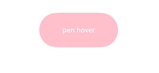
该示例通过按钮设置了悬浮事件,鼠标悬浮可触发onHover事件修改按钮颜色。
```ts
// xxx.ets
@Entry
@Component
struct HoverEventExample {
@State hoverText: string = 'no hover';
@State color: Color = Color.Blue;
build() {
Column({ space: 20 }) {
Button(this.hoverText)
.width(180).height(80)
.backgroundColor(this.color)
.onHover((isHover: boolean, event: HoverEvent) => {
// 通过onHover事件动态修改按钮在是否有鼠标或手写笔悬浮时的文本内容与背景颜色
// 通过event.sourceTool区分设备是鼠标还是手写笔
if (isHover) {
if (event.sourceTool == SourceTool.Pen) {
this.hoverText = 'pen hover';
this.color = Color.Pink;
} else if (event.sourceTool == SourceTool.MOUSE) {
this.hoverText = 'mouse hover';
this.color = Color.Red;
}
} else {
this.hoverText = 'no hover';
this.color = Color.Blue;
}
})
}.padding({ top: 30 }).width('100%')
}
}
```
示意图:
未悬浮时的文本内容与背景颜色:

手写笔悬浮时改变文本内容与背景颜色: